
What is a Shopify Dashboard?
If you are running a Shopify store, you already have data coming at you from every direction. Orders, refunds, discounts, shipping, product categories, and monthly trends. The native Shopify analytics give you some of it, but not in a way that lets you see everything together, filter by month, compare categories, or understand which shipping mode is actually the most profitable.
A Shopify analytics dashboard built in Power BI changes that. It takes all of your store data and turns it into one connected view that tells you where your revenue is coming from, where your profit is going, which products and sub-categories are driving sales, and where discounting is eating into your margins.
We built this Shopify Dashboard in Power BI for ecommerce teams and store owners who want to go beyond the default Shopify reports and actually understand what is driving their numbers month by month.
Why Shopify Store Owners Are Still Missing the Full Picture
Here is what we hear from ecommerce managers before they have a proper analytics setup. Revenue figures are checked inside Shopify but there is no easy way to see how profit trends across the year. Category performance lives in export files that somebody has to manually update. Discount impact is tracked loosely if at all. And when someone asks which shipping mode generates the most profit, the answer usually involves a spreadsheet that takes a few hours to pull together.
None of this is a Shopify problem. It is just the reality of running a store where the data is transactional and the analytics tools are not built for cross-dimensional analysis. That is the gap this dashboard was designed to close.
The Dashboard We Built
This dashboard was built for Shopify store teams who need to see revenue, profit, discount, quantity, and shipping performance in one place, filterable by month. The layout is clean and intentional. Five KPI cards sit at the top so you get the summary first, and the five visuals below each answer a specific commercial question that store managers and owners deal with every week.
The month slicer on the left panel runs from January through to the end of the year. Selecting any month instantly updates every chart, KPI card, and visual on the page. A store manager checking performance for July can do that in one click.
Here is the interactive version of the Shopify Dashboard : Shopify Dashboard | Power BI Ecommerce Analytics by Versich
What the Dashboard Actually Shows
There are five main visuals in this dashboard, and each one answers a specific question that ecommerce teams deal with every single day. Here is a breakdown of what you are looking at and why each one was built the way it was.
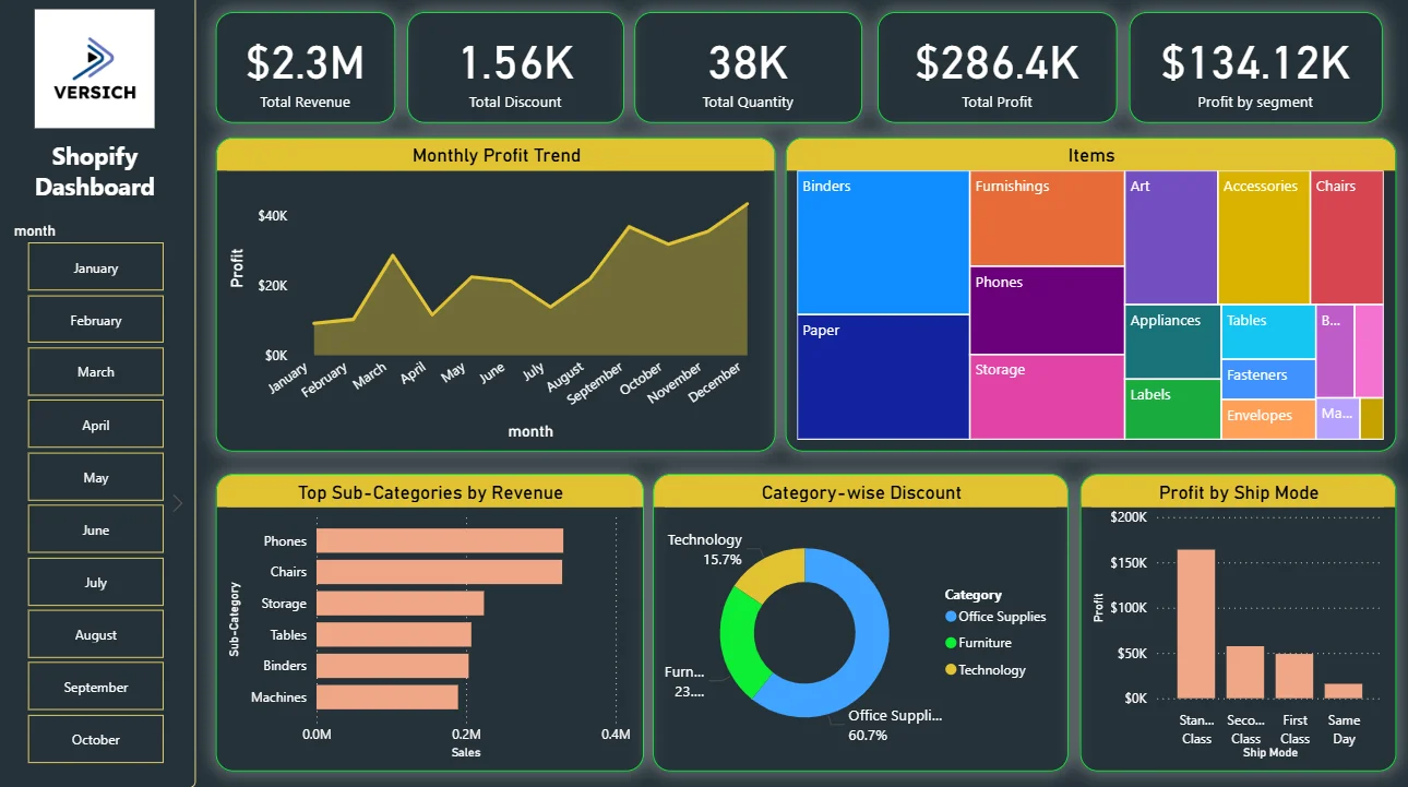
1. KPI Row — The Five Numbers That Tell You Where You Stand
The top of the dashboard shows five KPI cards: Total Revenue ($2.3M), Total Discount (1.56K), Total Quantity (38K), Total Profit ($286.4K), and Profit by Segment ($134.12K). Before anything else, you know the store has generated $2.3M in revenue but only $286.4K in profit, which is a margin worth paying attention to. The discount figure of 1.56K sitting next to the revenue number immediately raises the question of how much discounting is compressing that margin. These five numbers together set the context for everything else on the page.
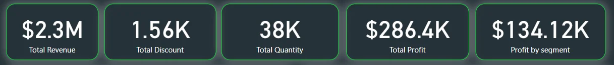
2. Monthly Profit Trend
The area chart on the top left tracks profit across all twelve months of the year. Looking at the chart, profit starts relatively low in January and February, dips in May and June, then climbs significantly from August through to December with a strong peak at the end of the year. That end-of-year surge is consistent with seasonal ecommerce patterns, but the dip in the middle of the year is the more interesting signal. For a store owner, that dip tells you exactly which months need either a promotional push or a cost review. Seeing it as a trend line makes it impossible to miss.
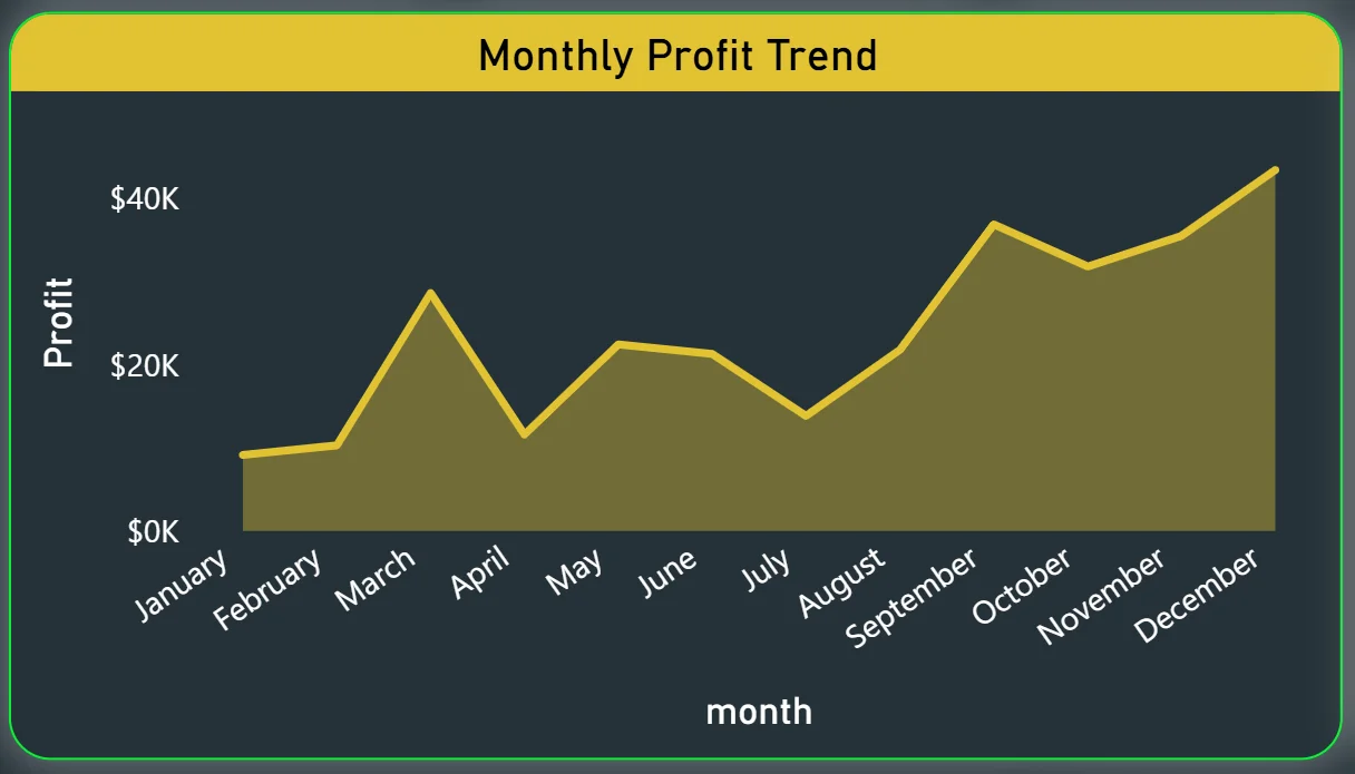
3. Items Treemap
The treemap on the top right shows every product category sized by its contribution to the overall mix. Binders and Paper take up the largest tiles, meaning they represent the highest volume categories. Furnishings, Phones, Storage, Art, Accessories, and Chairs follow in descending size. Smaller tiles like Appliances, Tables, Labels, Fasteners, and Envelopes represent lower volume categories. The visual immediately tells you where the bulk of the product mix lives and where the long tail is. For buying and inventory decisions, that is extremely useful to see at a glance rather than in a table.
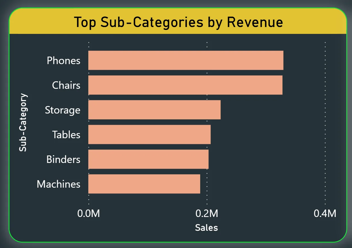
4. Top Sub-Categories by Revenue
The horizontal bar chart on the bottom left ranks sub-categories by sales value. Phones sit at the top with the highest revenue, followed by Chairs, Storage, Tables, Binders, and Machines. This chart is valuable precisely because sub-category performance is one of the hardest things to see clearly in native Shopify reports. Knowing that Phones are your highest revenue sub-category but Binders are your highest volume category from the treemap tells you something important about the difference between units sold and revenue generated. Combining those two visuals gives you a product mix story that no single chart could tell on its own.
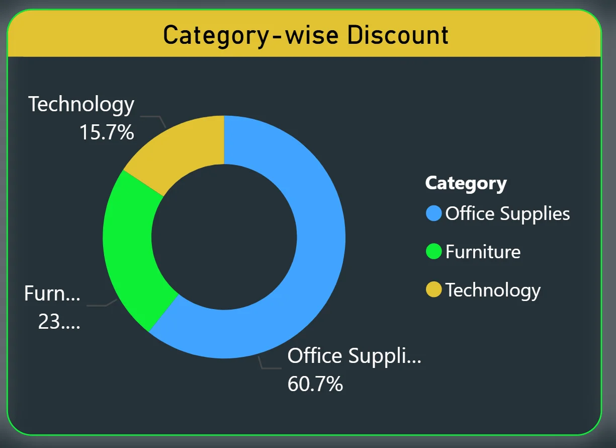
5. Category-wise Discount
The donut chart in the bottom centre shows how total discounting is split across three categories: Office Supplies at 60.7%, Furniture at 23%, and Technology at 15.7%. More than half of all discounts are going to Office Supplies. Whether that is intentional promotional strategy or a sign that the category needs price adjustments is a question for the commercial team, but the dashboard surfaces it immediately. If your Technology category is generating strong profit but only getting 15.7% of the discount budget, that might be exactly right. If Office Supplies are getting 60.7% of discounts but sitting in the middle of the revenue rankings, that is worth investigating.
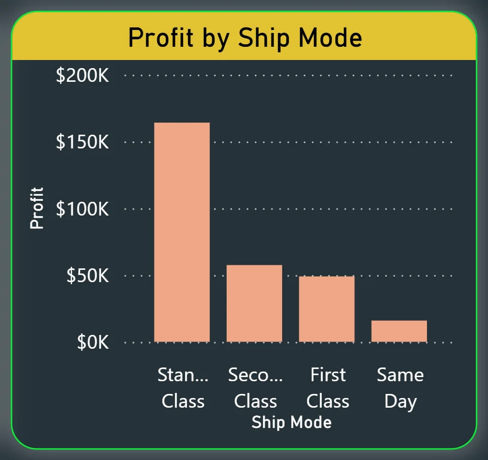
6. Profit by Ship Mode
The bar chart on the bottom right breaks profit down by shipping method: Standard Class, Second Class, First Class, and Same Day. Standard Class is the clear profit leader by a significant margin, generating close to $150K in profit on its own. Second Class and First Class are materially lower, and Same Day delivery generates almost no profit at all. For operations and pricing decisions, this chart is direct. If Same Day shipping is a feature the store offers but it generates negligible profit, that pricing model needs a review. If Standard Class is where the margin lives, that should inform how the store structures its default shipping options at checkout.
How It Works Under the Hood
The dashboard connects to Shopify order data exported into a structured data model in Power BI. DAX measures calculate revenue, profit, discount totals, and segment breakdowns dynamically so every filter interaction updates all visuals instantly. The month slicer on the left drives the entire page, meaning a single click filters every chart simultaneously without any manual refresh.
Business Benefits
Moving from native Shopify reports to a Power BI analytics dashboard changes how ecommerce teams make decisions week to week. Here is what that looks like in practice.
What changes when your team has this dashboard
- Monthly performance reviews start with everyone looking at the same profit trend instead of different exports pulled at different times.
- Category mix decisions are made with the treemap in view, not from memory or a spreadsheet.
- Discount strategy is informed by actual category-level data, not gut feel about where promotions are running.
- Shipping profitability is visible in one chart instead of requiring a custom finance report.
- Seasonal dips in the profit trend are spotted early enough to act on rather than discovered after the quarter closes.
- Sub-category revenue rankings are available in seconds instead of requiring an export and pivot table.
Strategic Advantages for Store Leaders
Beyond the day-to-day improvements, having this kind of ecommerce analytics dashboard available over months and quarters starts to change how store leaders make longer-term decisions, too.
When you can see profit trending downward through May and June on the monthly trend chart, you can plan a targeted promotion before that dip becomes a bad quarter rather than after. When you can see that Same Day shipping is consistently generating near-zero profit across every month you filter, you can reprice it before the margin erosion compounds. When discount spend keeps clustering in Office Supplies while Technology revenue sits underserved, you can restructure your promotional calendar with actual data behind the decision.
This is the difference between a dashboard that helps you manage today and one that helps you run a smarter ecommerce operation over time. The Shopify Dashboard is designed to do both.
Conclusion
Most Shopify store teams are not short of data. They are short of a way to see it all together, updated, and filterable in seconds. That is what this dashboard solves.
In one screen, you get total revenue and profit context, a full year of monthly profit trend, product mix at the category and sub-category level, discount distribution across your three main categories, and a clear breakdown of which shipping modes are actually generating margin. Everything updates when you click a month. Nothing requires an export, a pivot table, or a request to the finance team.
If you are running a Shopify store and making decisions about product mix, promotions, or shipping strategy without this kind of visibility, you are working harder than you need to. The data is already there. A well-built Power BI dashboard just makes it usable.