What is a Project Budget Tracking Dashboard?
Project finance teams and PMO offices are managing budgets across dozens of projects simultaneously, each with its own approved budget, actual cost tracking, forecast, and remaining balance. The problem is that all of this data typically lives in different spreadsheets, finance systems, and project tools that nobody can see together in one place until a project is already over budget.
A project budget tracking dashboard built in Power BI changes that. It brings total budget, actual cost, profit, remaining budget, and cost distribution across initiatives and departments into one connected view, filterable by month, department, project name, and project status so any budget question gets answered before it becomes a financial problem.
We built this Project Budget Tracking Dashboard in Power BI for finance teams, project managers, and CFOs who need to see how $283M in project budget is being spent, where it is going by initiative and department, and which projects still have budget remaining versus which are running close to their limits.
Why Budget Tracking Breaks Down at Scale
Here is what we hear from project finance managers and PMO leads before they have a proper dashboard. Budget vs actual comparisons are built manually in Excel every month and take days to compile. Cost distribution across initiatives like Upgrade, Maintenance, Research, and New Development is unknown until someone runs a custom report. Department-level cost splits between internal and external resources are tracked separately from project-level budgets. And remaining budget by project requires opening individual project records one by one.
With $283M across multiple projects, departments, and initiatives, that manual approach produces reports that are already outdated by the time they reach leadership. This dashboard was built to replace that entire process.
The Dashboard We Built
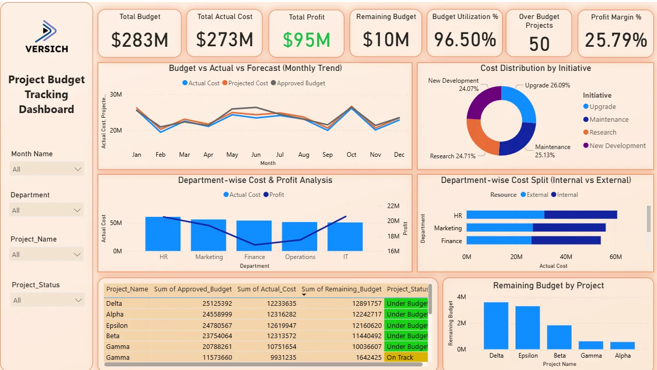
This is a single-page project budget tracking dashboard designed for finance teams who need the full picture without switching between tools. Four filters sit on the left panel: Month Name, Department, Project Name, and Project Status. Every visual on the page updates simultaneously when any filter is applied. A CFO checking remaining budget for On Track projects in the IT department can do that in three clicks.
Here is the interactive version of the Project Budget Tracking Dashboard : Project Budget Tracking Dashboard | Financial Insights | Versich
What the Dashboard Actually Shows
There are seven main visuals in this dashboard and each one is answering a specific financial question that project teams and finance leads deal with every single week.
1. KPI Row Seven Numbers That Define Project Financial Health
Total Budget ($283M), Total Actual Cost ($273M), Total Profit ($95M) in green, Remaining Budget ($10M), Budget Utilisation % (96.50%), Over Budget Projects (50), and Profit Margin % (25.79%) sit across the top. At 96.50% budget utilisation with $10M remaining across the portfolio, the organisation is tracking very close to its total approved budget. The 50 Over Budget Projects figure sitting alongside the $10M remaining budget tells you the portfolio is not uniformly under budget. Some projects have headroom while others have already exceeded their limits. That combination of portfolio-level figures and individual project counts is exactly what leadership needs before a budget review meeting.

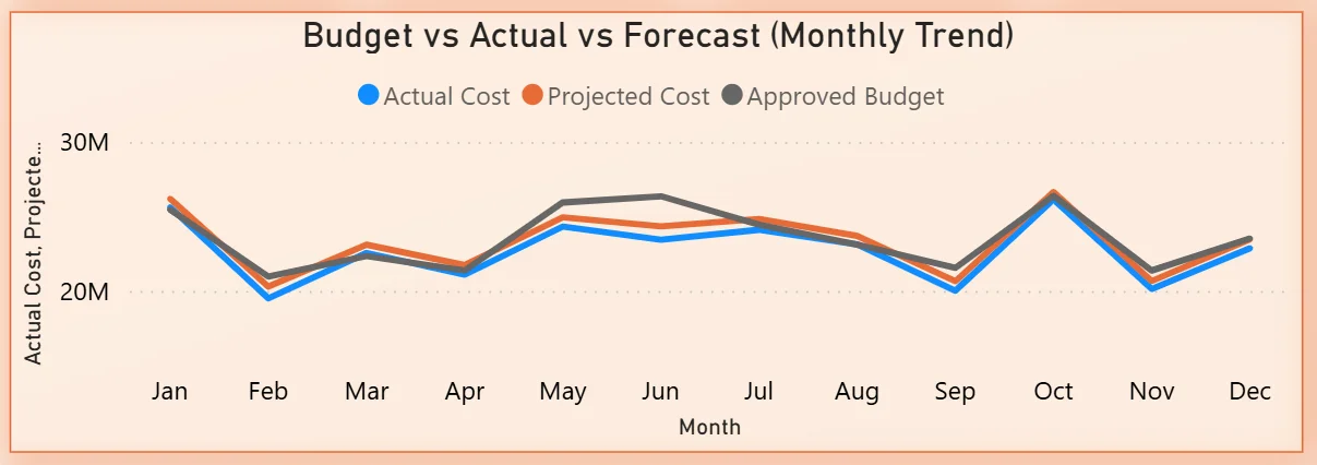
2. Budget vs Actual vs Forecast Monthly Trend
The combo chart plots three lines across all twelve months: Actual Cost in blue, Projected Cost in orange, and Approved Budget in grey. All three lines track closely together throughout the year, oscillating between $20M and $30M per month. The close alignment between actual and projected cost tells you forecasting is reasonably accurate. The months where actual cost rises above the approved budget line are the months that need investigation. Any sustained period where actuals exceed budget without a corresponding budget revision is a financial risk signal. The chart makes those moments visible month by month rather than discoverable only at year end.
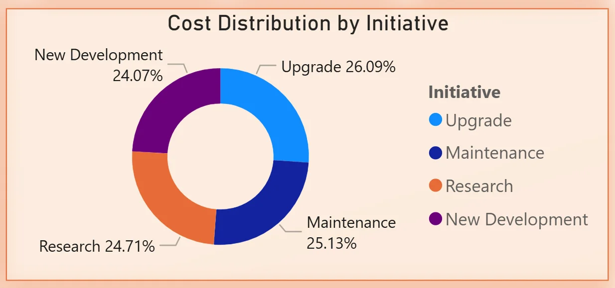
3. Cost Distribution by Initiative
The donut chart breaks total cost across four initiative types: Upgrade at 26.09%, Research at 24.71%, Maintenance at 25.13%, and New Development at 24.07%. The distribution is remarkably even across all four initiative types with less than two percentage points separating the largest from the smallest. For a CFO asking whether the portfolio is appropriately balanced between growth investment and maintenance spend, this chart answers that question directly. No single initiative is consuming a disproportionate share of the budget, which either reflects deliberate portfolio balance or suggests that initiative categorisation needs more granularity to be strategically useful.
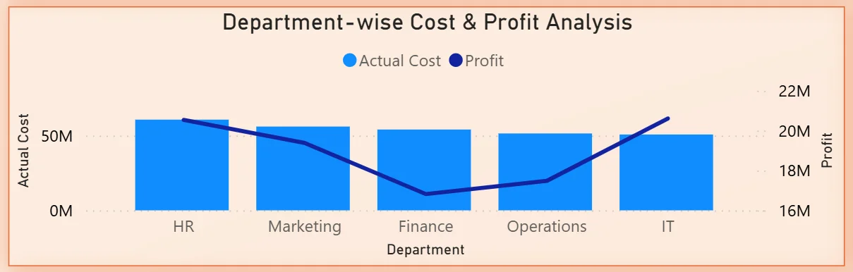
4. Department-wise Cost and Profit Analysis
The combo chart shows actual cost bars and a profit line across five departments: HR, Marketing, Finance, Operations, and IT. HR and Marketing show the highest actual cost bars. The profit line tells the more interesting story, with Finance showing the lowest profit contribution despite being in the middle of the cost ranking. IT shows the highest profit relative to its cost bar, making it the most cost-efficient department in the portfolio. For resource allocation decisions, understanding which departments are generating the most profit per dollar spent is more valuable than knowing which departments are spending the most.
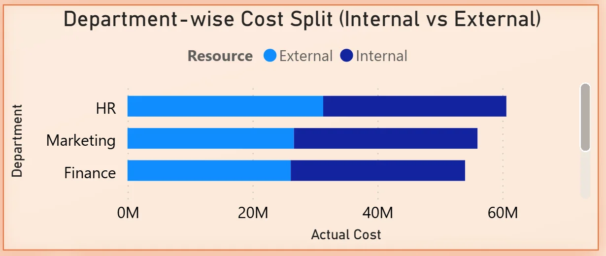
5. Department-wise Cost Split Internal vs External
The stacked bar chart shows three departments: HR, Marketing, and Finance with their total costs split between External (light blue) and Internal (dark blue) resources. HR has the highest total cost and a significant external component. Marketing and Finance follow with similar total costs but different internal-external splits. For a finance director reviewing vendor spend versus headcount costs, this chart immediately shows which departments are most dependent on external resources and where insourcing decisions could reduce cost without reducing output.
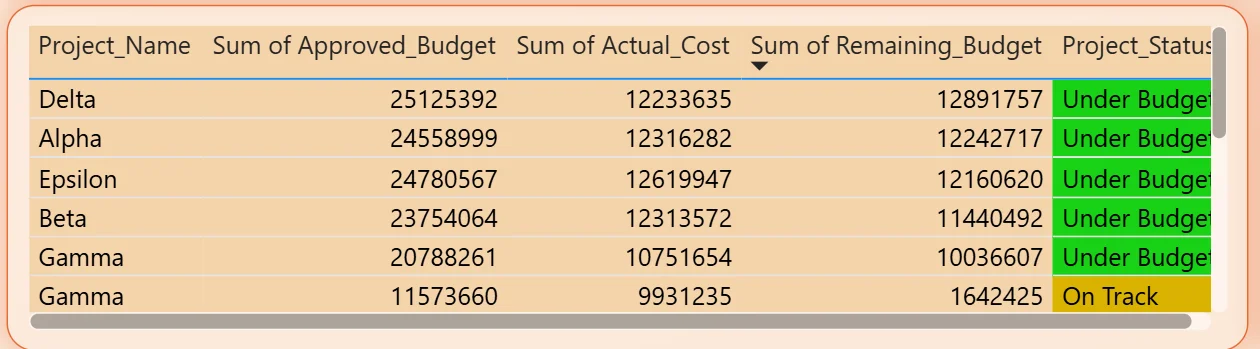
6. Project Budget Detail Table
The table shows every project with its approved budget, actual cost, remaining budget, and project status colour-coded as Under Budget in green or On Track in yellow. Delta leads the table with $25.1M approved budget and $12.2M actual cost, leaving $12.9M remaining. All visible projects in the table are either Under Budget or On Track, but the 50 Over Budget Projects KPI confirms that scrolling further reveals projects in a different financial position. Filtering by Project Status to show only Over Budget projects narrows the table to the specific projects that need immediate attention.
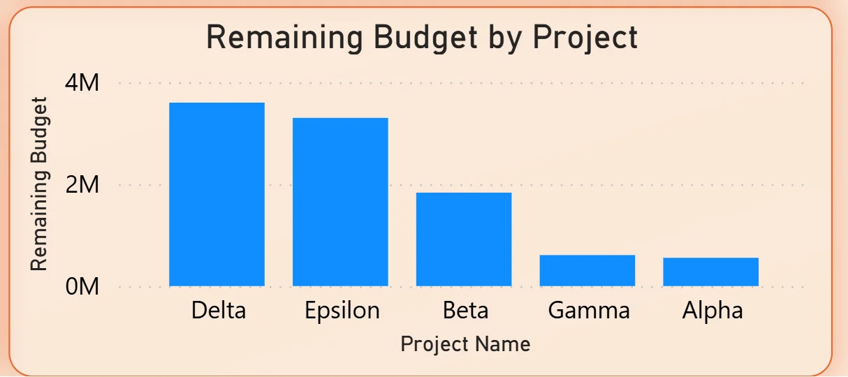
7. Remaining Budget by Project
The bar chart on the bottom right ranks five projects by remaining budget: Delta leading, followed by Epsilon, Beta, Gamma, and Alpha with the smallest remaining balance. Delta having the most remaining budget alongside the highest approved budget in the table confirms it is tracking well below its approved limit. Alpha sitting at the bottom of the remaining budget chart tells you it has the least financial headroom left in the current period. For project managers, this chart immediately shows which projects need budget conversations and which have room to absorb scope changes.
How It Works Under the Hood
The dashboard connects to project finance data from ERP systems, accounting tools, or structured budget exports through a Power BI data model. DAX measures calculate budget utilisation, profit margins, remaining balances, and initiative-level cost distributions consistently across all projects and departments. The four filters on the left panel connect to every visual simultaneously so any month, department, project, or status selection updates the entire dashboard in one action.
The combination of the Budget Utilisation KPI at 96.50% and the Over Budget Projects figure of 50 tells a more nuanced story than either number alone. High portfolio utilisation with 50 projects already over budget means some projects are carrying the headroom that others have already consumed. The project detail table and remaining budget chart together show exactly which projects are on which side of that divide.
Business Benefits
What changes when your team has this dashboard
- Monthly budget reviews start with live data on screen rather than waiting for a compiled finance report that is already two weeks old.
- The 50 Over Budget Projects are identifiable by name, department, and remaining balance in seconds using the Project Status filter.
- Initiative cost distribution is visible in the donut chart so portfolio balance conversations are grounded in actual spend rather than planned allocation.
- The internal vs external cost split tells finance teams exactly where vendor dependency is highest before a cost reduction review begins.
- IT being the most profit-efficient department is visible in the combo chart, making resource allocation arguments data-driven rather than political.
- Remaining budget by project is ranked in one chart so scope change conversations happen with full financial context rather than approximations.
Strategic Advantages for Finance and PMO Leaders
Beyond the monthly reporting cycle, having this kind of budget tracking dashboard available throughout the year changes how finance and PMO leaders make longer term decisions.
When you can see the Budget vs Actual vs Forecast trend showing actuals creeping above the approved budget line in the same months every year, you can adjust the annual budget submission to reflect that pattern rather than presenting a plan that always gets exceeded in the same predictable way. When the initiative distribution donut consistently shows New Development and Upgrade consuming more than their planned share while Maintenance is underspent, you can recalibrate how the next year's budget is allocated across initiative types before the year starts rather than reconciling the drift at year end. When the remaining budget chart shows Alpha consistently with the least headroom across multiple periods, you can flag that project for a scope conversation before it crosses the over budget threshold.
This is the difference between a dashboard that closes the books and one that drives better financial planning over time. The Project Budget Tracking Dashboard is built to do both.
Conclusion
Project finance teams managing portfolios in the hundreds of millions are not short of budget data. They are short of a way to see approved budgets, actual costs, forecasts, initiative distribution, department performance, and remaining balances all connected and filterable in one place.
This dashboard puts all of it on one screen. Seven KPIs give the portfolio financial headline. The three-line trend chart shows budget adherence month by month. The initiative donut shows portfolio balance. The department combo chart shows where profit is being generated per dollar spent. The internal vs external split shows vendor dependency. The project table and remaining budget chart show exactly where the financial risk and headroom sit at the individual project level.
If your finance team is still compiling project budget reports manually or discovering over-budget projects after the fact, the data is already in your finance and project systems. A well-built Power BI dashboard just makes it visible when it can still be acted on.