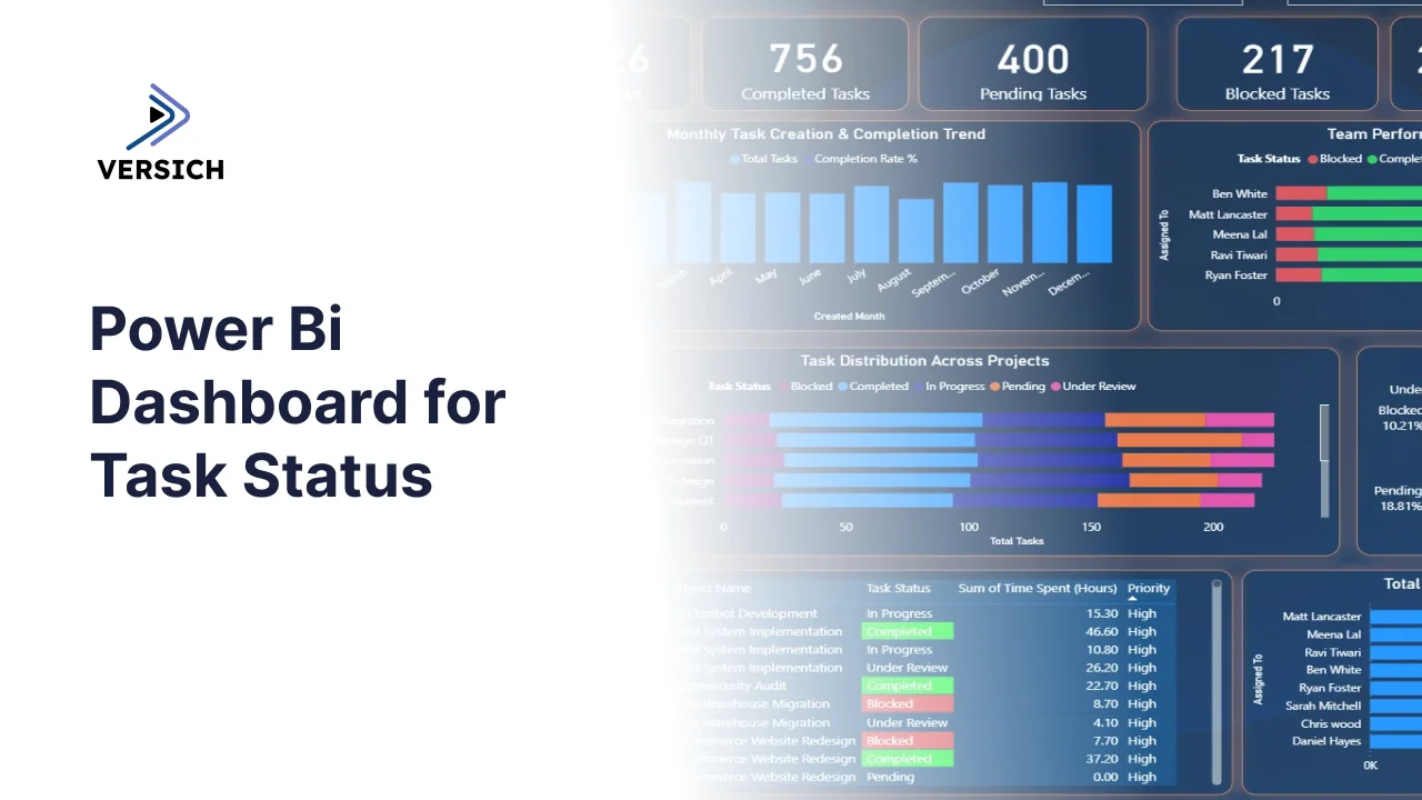
What is a Task Status Dashboard?
Project managers and team leads are dealing with task data scattered across tools every single day. Jira, Asana, Monday.com, spreadsheets, and email threads all holding pieces of the same picture that nobody can see in full. How many tasks are blocked right now? Which team member has the most in-progress work sitting unfinished? Which project is consuming the most hours without moving to completion?
A task status dashboard built in Power BI answers all of those questions in one place. It pulls task data across every project and team member into a single connected view, filterable by task name, created month, and priority so any combination of those questions can be answered in seconds rather than across a series of tool exports.
We built this Task Status Dashboard in Power BI for project managers, operations leads, and team heads who need to see task progress, team performance, and time spent across all projects simultaneously without switching between five different tools to piece the picture together.
Why Project Teams Are Still Missing the Full Picture
Here is what we hear from project managers and ops leads before they have a proper analytics setup. Weekly status updates are compiled by asking each team member individually because there is no single view of who has what in progress. Blocked tasks sit unnoticed until someone mentions them in a standup. Hours logged are tracked in a time tool that nobody looks at consistently. And when a senior leader asks how the ERP Integration project is tracking against the Marketing Campaign, the answer involves opening two different project tools and eyeballing it.
The data exists across those tools. It just needs to be pulled into one model that makes cross-project and cross-team comparisons instant rather than manual.
The Dashboard We Built
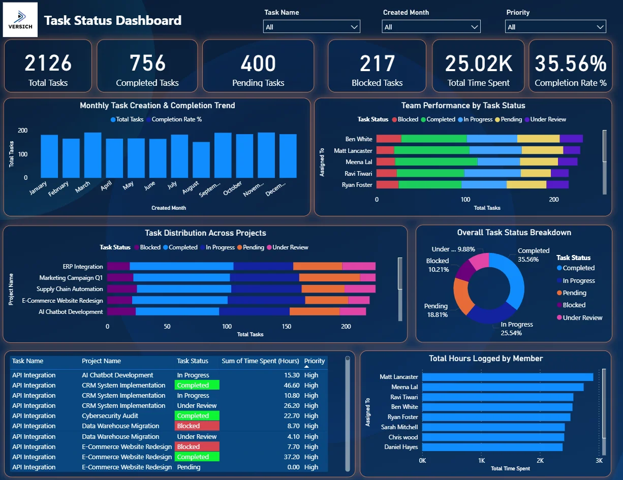
This dashboard was built for project teams managing multiple concurrent workstreams across different team members and priority levels. Three filters sit at the top: Task Name, Created Month, and Priority. Every visual on the page updates simultaneously when any filter changes. A project manager wanting to see only High priority blocked tasks created in March can do that in three clicks.
Here is the interactive version of the Task Status Dashboard : Task Status Dashboard | Real-Time Project Tracking | Versich
What the Dashboard Actually Shows
There are seven main visuals in this dashboard and each one is answering a specific question that project teams deal with every single week.
1. KPI Row Six Numbers That Tell You Where the Work Stands
Total Tasks (2,126), Completed Tasks (756), Pending Tasks (400), Blocked Tasks (217), Total Time Spent (25.02K hours), and Completion Rate % (35.56%) sit across the top. That 35.56% completion rate on 2,126 total tasks means roughly two thirds of the work is still unfinished across all projects. The 217 blocked tasks sitting alongside 400 pending tasks tells you a meaningful portion of the unfinished work is actively stuck rather than simply in the queue. And 25,020 hours logged against a 35.56% completion rate is the kind of ratio that makes a project leader ask whether effort is being directed at the right things.

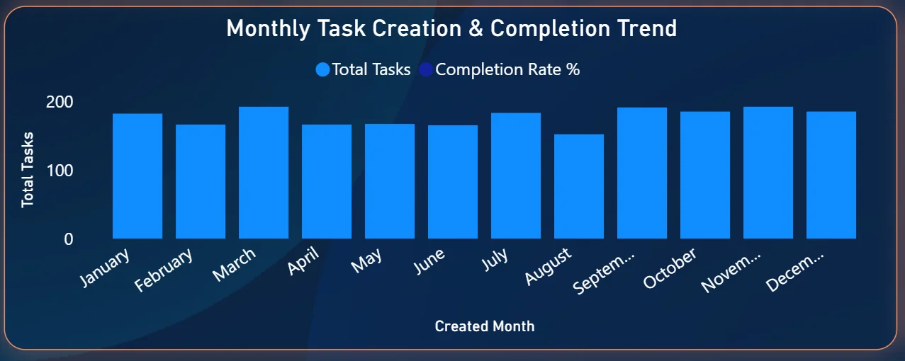
2. Monthly Task Creation and Completion Trend
The combo chart on the top left plots total tasks created per month as bars alongside the completion rate percentage as a line. Task creation stays relatively consistent throughout the year at around 150 to 200 tasks per month. The completion rate line tells the more interesting story, showing which months the team was converting created tasks into completed ones faster and which months the backlog was building. Any month where the bars are high but the completion rate line is dipping is a month where more work was coming in than was getting done, which is exactly the kind of leading indicator project managers need to see before the backlog becomes unmanageable.
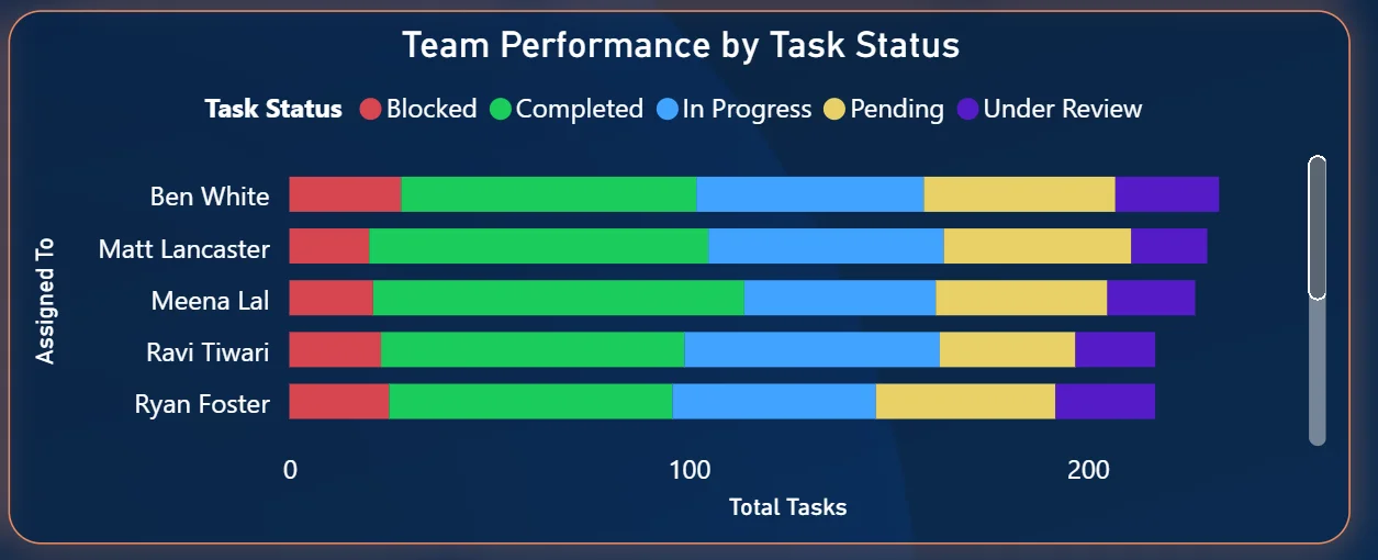
3. Team Performance by Task Status
The stacked bar chart on the top right shows every team member with their tasks broken down by status: Blocked in red, Completed in green, In Progress in blue, Pending in yellow, and Under Review in purple. Chris Wood has the highest total task count. Jack Morrison shows the largest proportion of completed tasks relative to their total. The colour split within each bar immediately shows which team members have a high proportion of blocked or pending work versus those who are converting tasks to completion. For a team lead, this chart makes workload imbalances and stuck contributors visible without having to ask anyone for a status update.
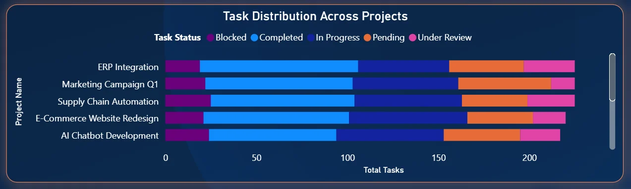
4. Task Distribution Across Projects
The stacked bar chart in the middle left shows the five active projects with their task status breakdown: ERP Integration, Marketing Campaign Q1, Supply Chain Automation, E-Commerce Website Redesign, and AI Chatbot Development. ERP Integration has the highest total task count, followed closely by Marketing Campaign Q1. The colour distribution within each project bar shows which projects are dominated by in-progress work, which have high pending volumes, and which have blocked tasks building up. AI Chatbot Development showing a high proportion of in-progress and pending tasks relative to completed ones is the kind of project-level signal that drives a focused conversation in the next project review.
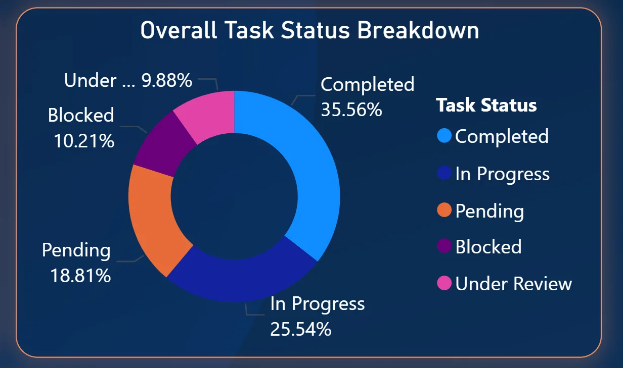
5. Overall Task Status Breakdown Donut
The donut chart on the right shows the organisation-wide task status split: Completed at 35.56%, In Progress at 25.54%, Pending at 18.81%, Blocked at 10.21%, and Under Review at 9.88%. More than a third of tasks sitting in completed is the good news. But 10.21% blocked and 18.81% pending together means nearly 30% of total tasks are either stuck or waiting to start. For leadership reviewing project health, this donut gives the headline picture in one visual before any project-level drilling begins.
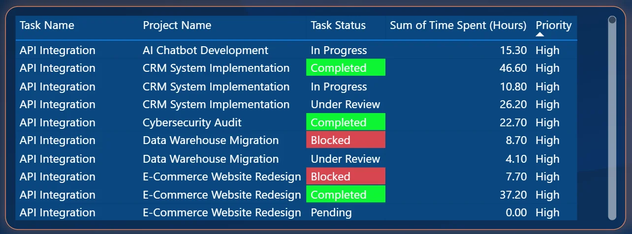
6. Task Detail Table
The table on the bottom left shows individual tasks with their project name, status colour-coding, hours spent, and priority level. Completed tasks are highlighted green, Blocked tasks in red, and other statuses in their respective colours. The table is scrollable and filterable so a project manager can isolate all High priority Blocked tasks across every project in one view. The hours logged per task sit next to the status so you can immediately see whether a task that is blocked has already consumed significant time or whether it got stuck early in the process. That combination of status and hours is more actionable than either piece of information alone.
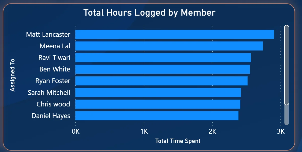
7. Total Hours Logged by Member
The horizontal bar chart on the bottom right ranks team members by total time spent: Matt Lancaster leading, followed by Meena Lal, Ravi Tiwari, Ben White, Ryan Foster, Sarah Mitchell, Chris Wood, and Daniel Hayes. Matt Lancaster logging significantly more hours than Daniel Hayes at the bottom tells you there is meaningful variation in how much time different team members are recording. Cross-referencing this chart with the Team Performance chart tells you whether the members logging the most hours are also converting the most tasks to completed, or whether high hours are going into tasks that remain in progress or blocked.
How It Works Under the Hood
The dashboard connects to task management data from tools like Jira, Asana, Monday.com, or structured exports through a Power BI data model. DAX measures calculate completion rates, blocked task counts, and time aggregations consistently across all projects and team members. The three filters at the top connect to every visual simultaneously so any combination of task name, created month, and priority filters the entire page in one action.
The combination of the Team Performance chart and the Hours Logged chart is deliberately designed to be read together. Hours logged tells you effort. Task status tells you output. A team member with high hours and low completion is a different conversation from a team member with high hours and high completion. Both charts need each other to tell the full story.
Business Benefits
What changes when your team has this dashboard
- Weekly standups start with the blocked task count already on screen rather than discovered mid-meeting when someone mentions it.
- The team performance chart makes workload imbalances visible before they become a delivery risk rather than after.
- Project health comparisons across ERP Integration, Marketing Campaign, and AI Chatbot are one filter click away rather than requiring two tool logins.
- High priority blocked tasks are identifiable in the detail table instantly without scrolling through a full project backlog.
- Hours logged per member can be cross-referenced with completion rates to have evidence-based capacity conversations.
- Monthly task creation vs completion trends are visible so backlog build-up is spotted before it compounds.
Strategic Advantages for Project and Operations Leaders
Beyond the day-to-day standup improvements, having this kind of task analytics dashboard available over weeks and months starts to change how project and operations leaders make longer term decisions.
When you can see that blocked tasks consistently make up 10% of total work across every month, you can investigate whether the blocking pattern is structural, a dependency issue, an approval bottleneck, or a resourcing gap, rather than treating each blocked task as an isolated incident. When the hours logged chart shows the same two team members consistently logging three times the hours of others, you can address capacity distribution before burnout becomes a retention problem. When monthly task creation consistently outpaces completion across specific projects, you can scope or resource those projects differently before they accumulate debt that is impossible to clear.
This is the difference between a dashboard that shows you what is happening today and one that helps you run a more predictable, less reactive operation over time. The Task Status Dashboard is built to do both.
Conclusion
Project teams are not short of task data. They are short of a way to see it all together across every project, every team member, and every status in one place. That is what this dashboard solves.
In one screen you get the full task count with completion rate, monthly creation and completion trends, individual team performance by status, project-level distribution, organisation-wide status breakdown, a filterable task detail table, and hours logged per member. Three filters cover every cross-section of that data. Nothing requires a manual status update request or a cross-tool comparison.
If your team is still discovering blocked tasks in standups or trying to compare project health across two different tools, the data is already sitting in your task management system. A well-built Power BI dashboard just makes it visible where decisions actually get made.