What is an Accounting Dashboard?
Finance teams deal with data that lives across multiple systems and gets reviewed in isolation more often than not. Revenue comes from one source. Expenses from another. Budget figures from a third. And when someone in leadership asks how actual spending compares to budget in the Operations department for the last six months, the answer usually involves pulling three separate reports and reconciling them manually.
An accounting dashboard built in Power BI solves that. It brings revenue, expenses, profit, budget variance, and department-level spend into one connected view, filterable by month, department, sub-category, and region all at once.
We built this Accounting Dashboard in Power BI for finance teams and CFOs who want to move from end-of-month reporting to live financial visibility that supports decisions throughout the month rather than just at the end of it.
Why Finance Teams Are Still Working Harder Than They Should
Here is what we hear from finance managers and controllers before they have a proper analytics setup. Monthly P&L reports are built manually in Excel and take two to three days to compile. Budget vs actual comparisons require pulling figures from the accounting system and the budget spreadsheet separately and combining them. Department heads ask for expense breakdowns and someone has to run a custom report each time. And profit trend analysis means building a chart from scratch every quarter.
The data exists. It is just locked inside systems that were not designed for the kind of cross-dimensional analysis that modern finance teams need to do weekly rather than monthly.
The Dashboard We Built
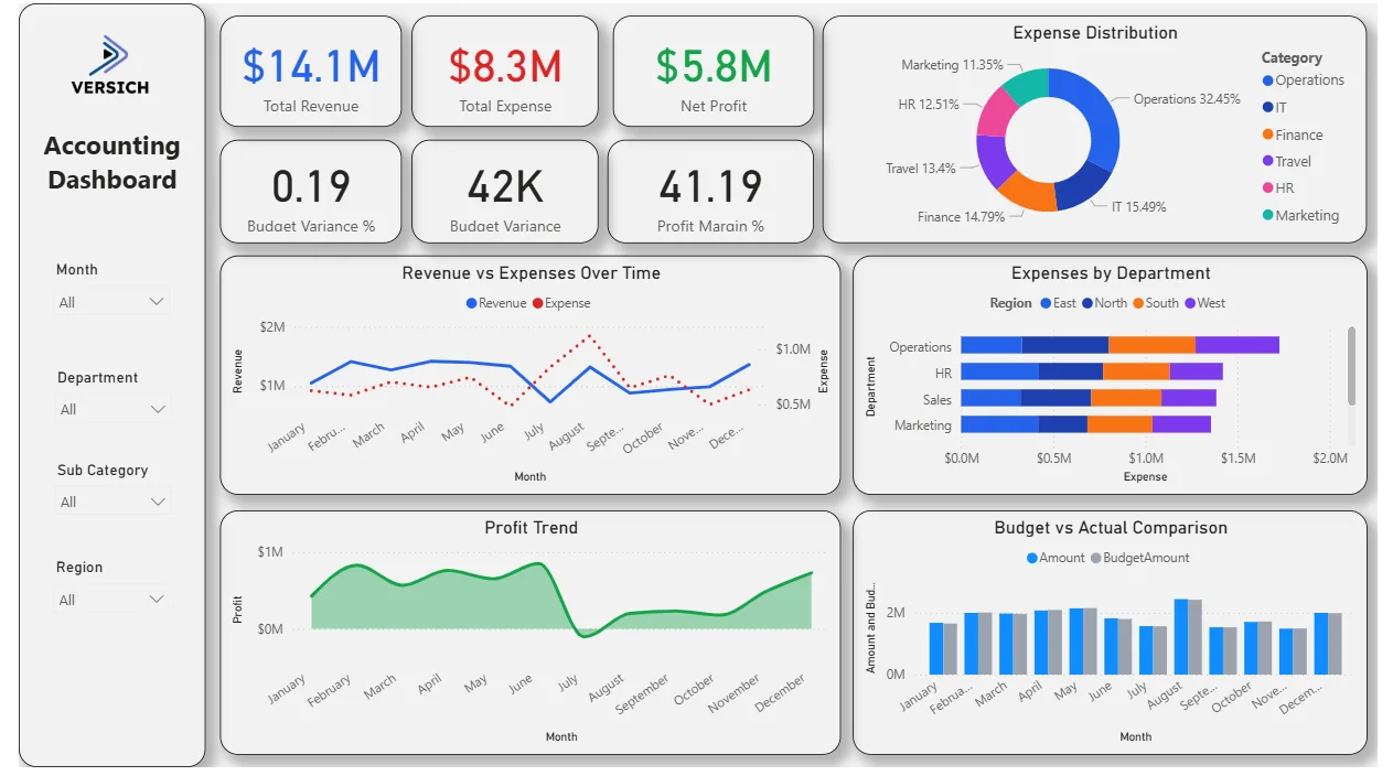
This is a single-page accounting dashboard designed for finance teams who need the full picture without switching between tools. Four filters sit on the left panel: Month, Department, Sub Category, and Region. Every visual on the page updates simultaneously when any filter is applied. A CFO checking Operations department expenses in the East region for Q3 can do that in three clicks.
Here is the interactive version of the Accounting Analytics Dashboard : Accounting Dashboard | Power BI Financial Analytics by Versich
What the Dashboard Actually Shows
There are six main visuals in this dashboard and each one is answering a specific financial question that accounting and finance teams deal with every single week.
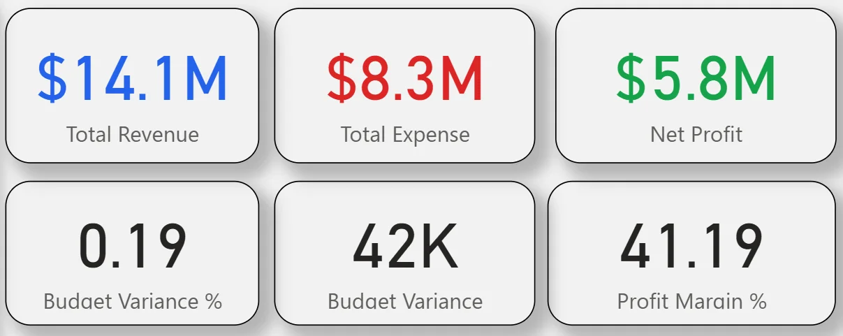
1. KPI Row Six Numbers That Tell You the Financial Position
Total Revenue ($14.1M) in blue, Total Expense ($8.3M) in red, and Net Profit ($5.8M) in green sit across the top row with colour coding that makes the relationship between the three immediately clear. Below them: Budget Variance % (0.19), Budget Variance (42K), and Profit Margin % (41.19%). A profit margin of 41.19% on $14.1M revenue is a strong headline number. The budget variance of just 42K on an $8.3M expense base tells you spending is tracking extremely close to plan. That 0.19% variance is the kind of number that makes a CFO comfortable going into a board meeting.
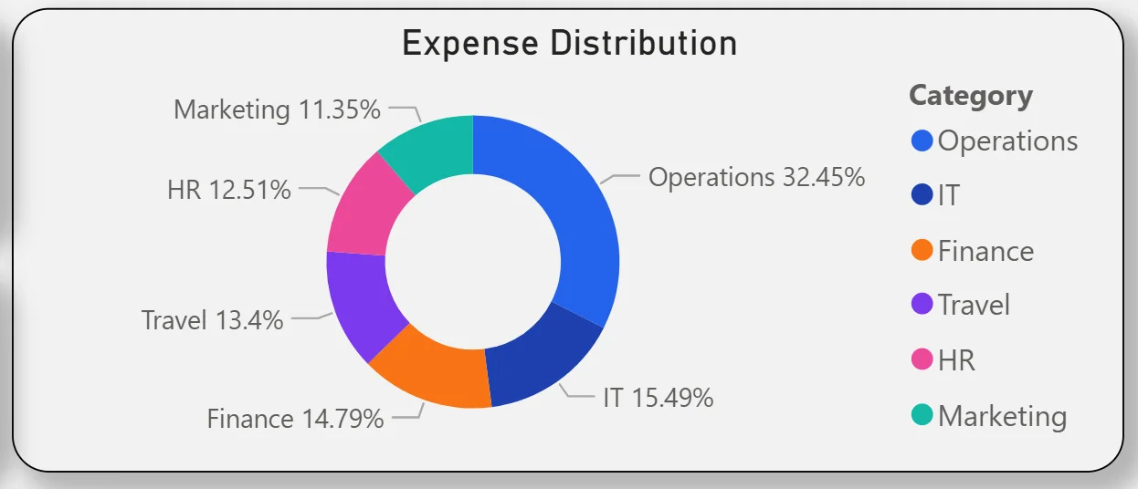
2. Expense Distribution Donut
The donut chart in the top right breaks total expenses across six categories: Operations leads at 32.45%, followed by IT at 15.49%, Finance at 14.79%, Travel at 13.4%, HR at 12.51%, and Marketing at 11.35%. Operations consuming nearly a third of total expenses is the starting point for any cost reduction conversation. The fact that IT and Finance are the next largest categories tells you this is a technology and people-heavy cost structure. Marketing at 11.35% being the smallest category is also worth noting if the business is trying to grow top-line revenue.
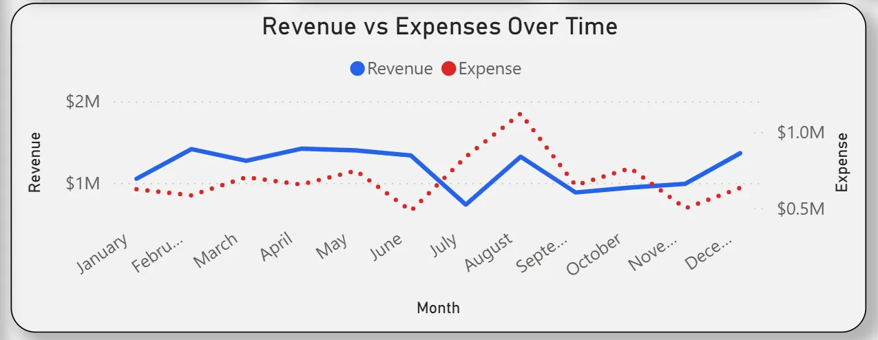
3. Revenue vs Expenses Over Time
The combo chart plots monthly revenue as a blue line and expenses as a dotted red line across all twelve months. Revenue stays relatively consistent around $1M to $1.2M per month through most of the year with a dip visible in August. Expenses track lower than revenue throughout, confirming the business is profitable every month. The gap between the two lines is your monthly profit, and it widens or narrows depending on which months you are looking at. August showing a revenue dip while expenses held steady is the month worth investigating further when filtering by department.
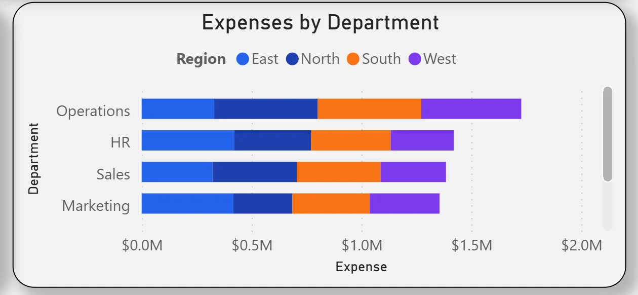
4. Expenses by Department and Region
The stacked bar chart on the right breaks department expenses down by region: East, North, South, and West shown in different colours. Operations has the highest total expense bar, matching the donut chart finding. HR, Sales, and Marketing follow. The regional colour split within each bar tells you which regions are driving costs in each department. If Operations East is significantly larger than Operations West, that is a targeted cost management conversation rather than a blanket operations review.
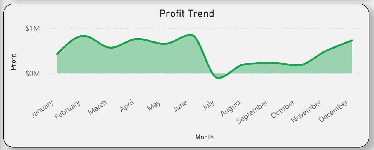
5. Profit Trend
The area chart tracks monthly profit from January through December. Profit is positive throughout the year, starting strong in early months, dipping noticeably around August and September, then recovering strongly through October and into December. That mid-year dip visible in the area chart corresponds to the revenue dip seen in the Revenue vs Expenses chart for the same period. For the finance team, seeing that the recovery is genuine rather than driven by expense cuts is reassuring. Profit climbs because revenue climbs, not because costs were slashed.
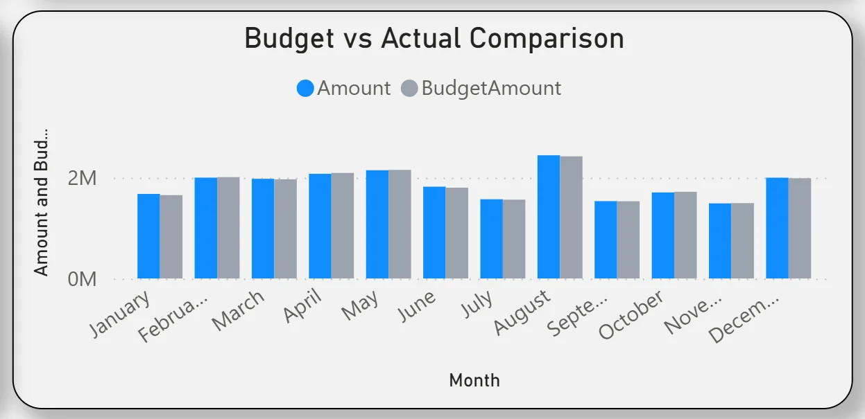
6. Budget vs Actual Comparison
The clustered bar chart at the bottom right compares actual spend against budget for every month of the year. The two bars track very closely across all twelve months, which is what the 0.19% budget variance KPI already hinted at. There are a few months where actual spend is marginally above budget and a few where it is marginally below, but no month shows a dramatic overrun. For finance teams spending hours reconciling budget vs actual in spreadsheets, this chart delivers that comparison instantly for any department, region, or sub-category combination the filters allow.
How It Works Under the Hood
The dashboard connects to the organisation's accounting system, ERP, or structured financial data exports through a Power BI data model. DAX measures calculate revenue, expense totals, profit, margin percentages, and variance figures consistently so every KPI and chart works from the same logic. The four filters on the left panel are connected to every visual on the page, so any selection updates the entire dashboard simultaneously without any manual refresh.
The four filters on the left panel cover Month, Department, Sub Category, and Region. That combination means you can answer questions like "what was Marketing's travel spend in the North region in Q2" in seconds rather than running a custom report. The more specific the question, the more valuable those four filters become.
Business Benefits
What changes when your finance team has this dashboard
- Month-end P&L reviews start with live data already on screen rather than waiting for a report to be compiled.
- Budget vs actual comparisons are available for any department, region, or sub-category in seconds rather than requiring a custom export.
- Department heads can see their own expense breakdown filtered to their team without requesting finance team support.
- The profit trend chart makes mid-year dips visible in real time so corrective action can start before the quarter closes.
- Expense category distribution is visible in the donut chart so cost reduction conversations start with the right departments.
- Regional expense differences are visible in the stacked bar chart so resource allocation decisions are made on evidence.
Strategic Advantages for Finance Leaders
Beyond the monthly reporting cycle, having this kind of accounting dashboard available throughout the year starts to change how finance leaders approach longer term decisions.
When you can see the profit trend dipping in August and September every year in the area chart, you can plan cash flow buffers and expense deferrals proactively rather than reacting to a cash position problem mid-quarter. When the expense distribution donut consistently shows Operations consuming over 30% of total costs, you have the data to challenge whether that allocation is right for the next budget cycle. When budget vs actual tracks within 0.19% variance month after month, you can present that to the board with confidence rather than qualifying it with spreadsheet caveats.
This is the difference between a dashboard that helps you close the books and one that helps you run a tighter, more informed financial operation throughout the year. The Accounting Dashboard is built to do both.
Conclusion
Finance teams are not short of financial data. They are short of a way to see it all together, updated, and filterable across department, region, and time period in one place. That is what this dashboard solves.
In one screen you get a live P&L summary, expense distribution by category, month-by-month revenue and expense trends, department and regional cost breakdowns, a full-year profit trend, and twelve months of budget vs actual comparison. All of it responds to four filters. None of it requires a custom report or a manual export.
If your finance team is still spending significant time building reports that this dashboard would generate automatically, the data is already in your accounting system. A well-built Power BI model just makes it usable every day rather than once a month.