
What is a University Analytics Dashboard?
Universities generate data from every direction simultaneously. Student enrolments, daily attendance records, marketing enquiries, fee payments, scholarship allocations, test scores, and department performance. The problem is that each of these areas is usually managed by a different team, tracked in a different system, and reported on separately if it gets reported on at all.
A university analytics dashboard built in Power BI brings all of it together. Strategy, attendance, marketing, and finance in four dedicated tabs, all connected to the same underlying data, all filterable by department and admission type in seconds.
We built this University Analytics Dashboard in Power BI for education institutions that want to move from reactive reporting to proactive decision-making across every function of the university at once.
Why Universities Are Still Working with Fragmented Data
The academic office tracks attendance in one system. The admissions team tracks enquiries and applications in another. Finance has fee payment records in a third. And when leadership wants to understand how student performance in the IT department connects to attendance rates, or whether scholarship students are paying fees at a different rate to non-scholarship students, someone has to manually pull three different reports and stitch them together.
This dashboard was built to end that process. Every function connects to the same data model so cross-functional questions get answered in one filter click rather than in a three-day reporting exercise.
The Dashboard We Built
Four tabs cover four genuinely different decision-making contexts. Strategy for the academic leadership team. Attendance for department heads and student affairs. Marketing for the admissions and outreach team. Financial for the finance office and senior leadership. The Department and Admission filters sit at the top of every tab so any selection instantly updates every visual across the current tab.
Here is the interactive version of the Data Analytics Dashboard for Schools and Universities : University & School Analytics Dashboard | Power BI Education Insights by Versich
Strategy Dashboard - The Academic Overview
The first tab gives leadership the institution-wide picture before any department-level conversation starts.
1. KPI Row Six Numbers That Define the Institution
Total Students (1,200), Avg Attendance (75.41), Male % (50.33%), Female % (49.67%), Activity % (52.33%), and Avg Test Score (69.62) sit across the top. The gender split being almost perfectly equal at 50.33% and 49.67% tells you enrolment is well balanced. An average test score of 69.62 and an activity participation rate of 52.33% are the two numbers worth watching. Just over half the student body is engaging in activities, and just under half is not. That gap is the conversation starter for student engagement strategy.

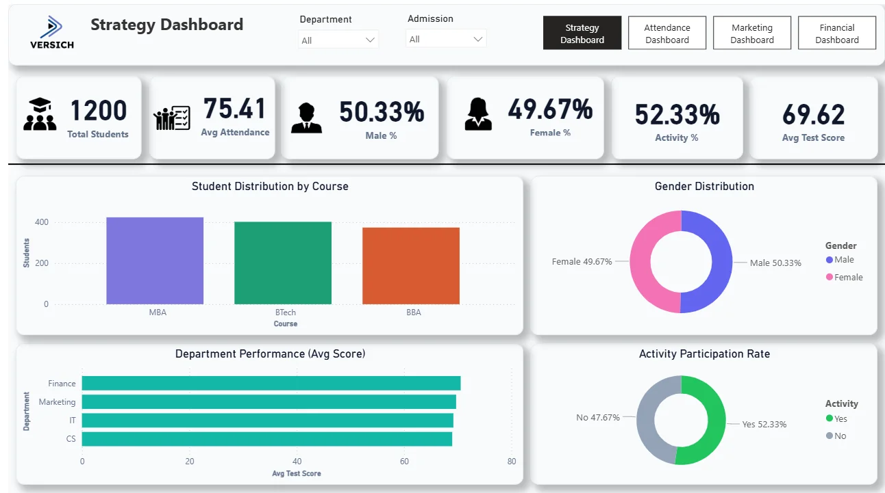
2. Student Distribution by Course
The bar chart shows MBA leading enrolment, followed closely by BTech and BBA. MBA drawing the highest numbers tells you where demand is strongest, which directly informs resourcing decisions across faculty, classroom allocation, and support services for the coming academic year.
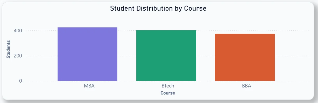
3. Gender Distribution
The donut chart confirms the 50.33% male and 49.67% female split visually. For an institution tracking diversity targets, this chart makes the current state clear at a glance without needing a separate EDI report.
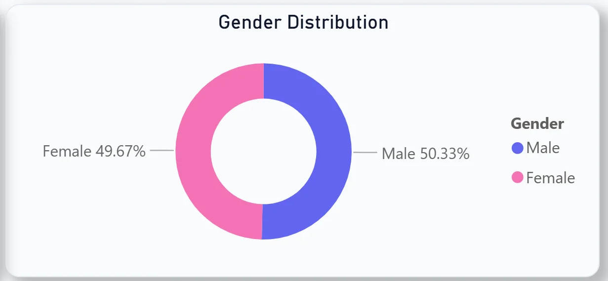
4. Department Performance by Avg Test Score
The horizontal bar chart ranks Finance, Marketing, IT, and CS departments by average test score. All four departments are clustered closely above 60, with Finance leading slightly. The narrow gap between departments tells you academic performance is consistent across the institution rather than one department carrying the average up or down.
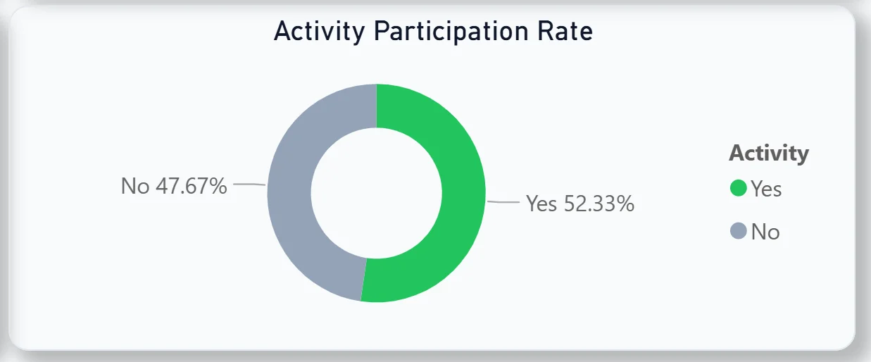
5. Activity Participation Rate
The donut chart shows 52.33% of students participating in activities versus 47.67% who are not. Nearly half the student body not engaging in any activity is a signal worth acting on. For student experience teams, this chart makes the scale of the non-participation group immediately visible.
Attendance Dashboard - Tracking Who Is Showing Up
The second tab is for department heads, course coordinators, and student affairs teams who need to understand attendance patterns at a granular level.

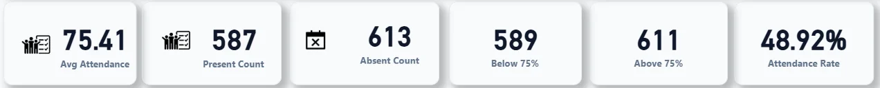
6. KPI Row Six Attendance Numbers in One View
Avg Attendance (75.41), Present Count (587), Absent Count (613), Below 75% (589), Above 75% (611), and Attendance Rate (48.92%). The absent count of 613 being higher than the present count of 587 is the headline finding. And 589 students sitting below the 75% attendance threshold, which is typically the minimum required for exam eligibility, is the most operationally urgent number on this tab. That is nearly half the student body at risk of being barred from exams if nothing changes.
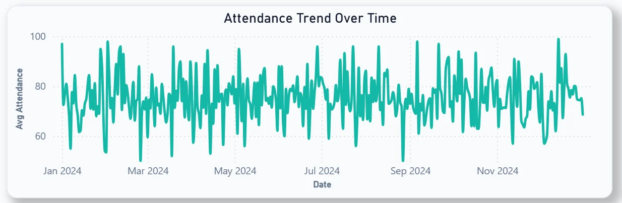
7. Attendance Trend Over Time
The line chart tracks daily average attendance across the full 2024 academic year. The pattern is highly volatile with frequent spikes and dips between 60% and 100% throughout the year. No sustained period of consistently high attendance is visible, which tells you the attendance problem is not seasonal. It is persistent and needs a structural intervention rather than a one-off campaign.
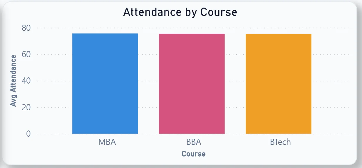
8. Attendance by Course
The bar chart compares MBA, BBA, and BTech by average attendance. All three courses sit at similar levels but BBA and BTech show slightly higher attendance than MBA. For course coordinators, knowing which course has the lowest relative attendance helps prioritise where intervention programmes should be focused first.
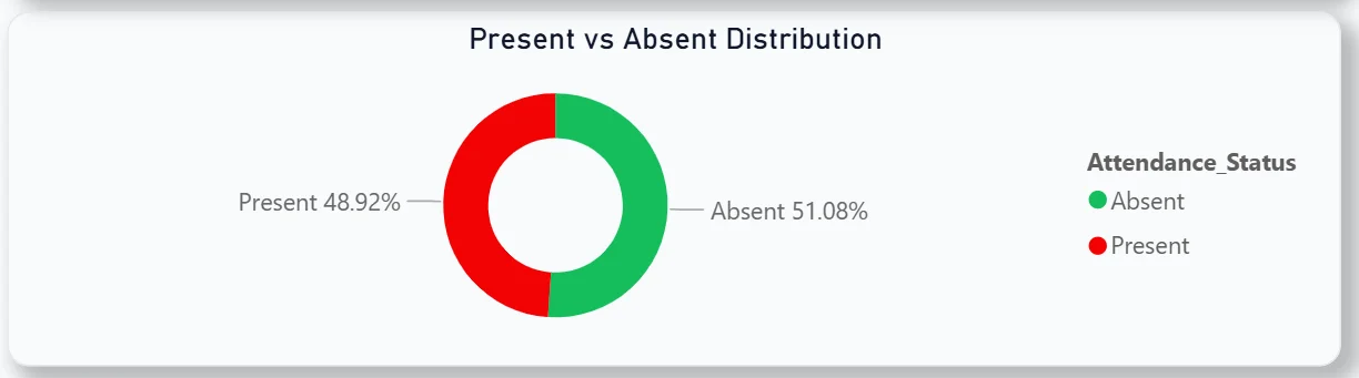
9. Present vs Absent Distribution
The donut chart shows 51.08% absent against 48.92% present. More than half of all recorded attendance entries are absences. For a university leadership team seeing this for the first time, that number typically drives an immediate conversation about attendance policy enforcement and student support.
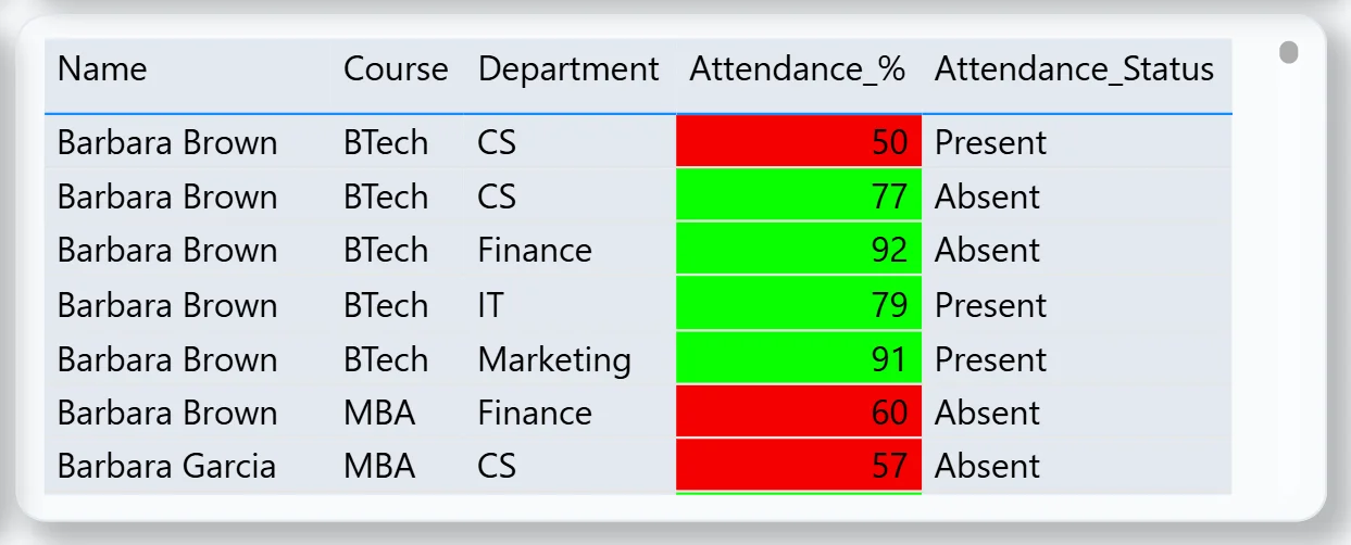
10. Student-Level Attendance Detail Table
The table on the right shows every student with their course, department, attendance percentage, and a colour-coded status. Red for below threshold, green for above. The table is sortable and scrollable so a department head can instantly filter to see only their students who are below 75% and reach out to them directly. This is the most operationally actionable visual in the attendance tab.
Marketing Dashboard - From Visitor to Enrolled Student
The third tab is built for the admissions and marketing team tracking how prospective students move from first website visit through to enrolled admission.
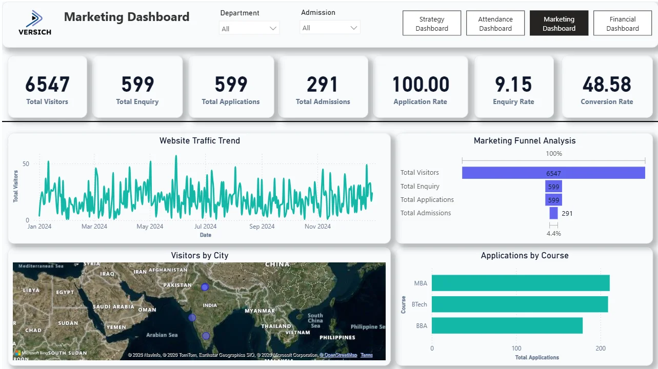
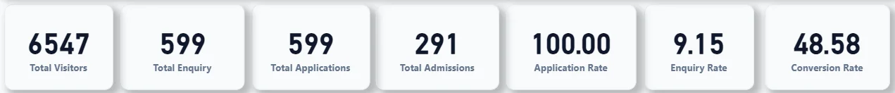
11. KPI Row Seven Funnel Numbers at a Glance
Total Visitors (6,547), Total Enquiry (599), Total Applications (599), Total Admissions (291), Application Rate (100%), Enquiry Rate (9.15%), and Conversion Rate (48.58%). Every visitor who enquired also applied, which the 100% application rate confirms. But only 48.58% of applicants were admitted, meaning roughly half the people who applied did not get in. The 9.15% enquiry rate tells you that for every 100 people who visit the website, only 9 make an enquiry. That is the top-of-funnel conversion the marketing team should be focused on improving.
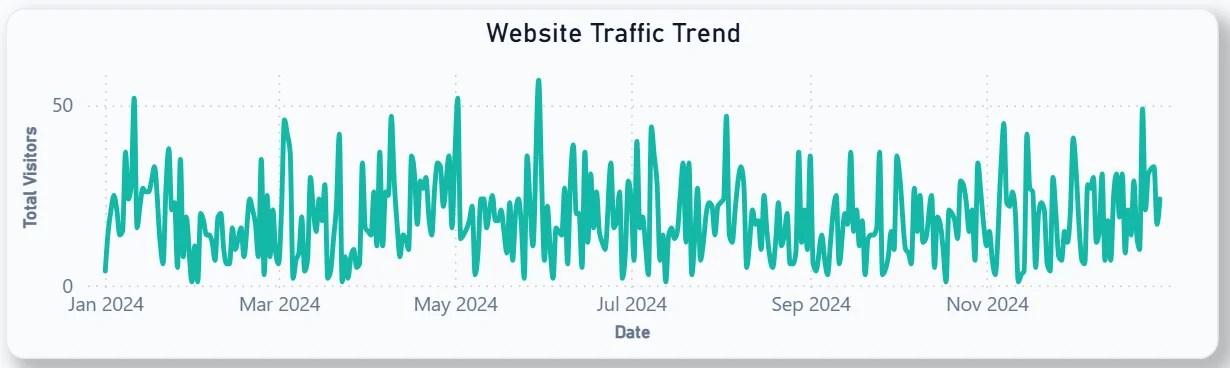
12. Website Traffic Trend
The line chart shows daily visitor volume across the full 2024 year. Traffic is relatively consistent throughout the year with occasional spikes, particularly around July and August which aligns with typical admission season peaks. For the marketing team, identifying which campaigns correspond to those spikes in the traffic trend helps justify budget allocation decisions for the next cycle.
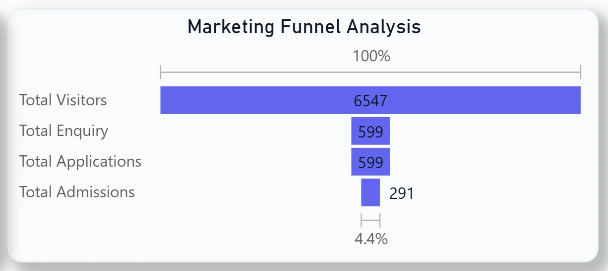
13. Marketing Funnel Analysis
The horizontal bar chart visualises the full funnel: 6,547 visitors narrowing to 599 enquiries, 599 applications, and 291 admissions at the bottom at 4.4% of original visitor volume. The biggest drop happens between visitors and enquiries. Getting more visitors to take the step of making an enquiry is where the highest leverage sits in the whole funnel.
14. Visitors by City Map
The geographic map shows where website visitors are coming from across South Asia and Southeast Asia. Clusters are visible in India and surrounding regions. For a university with international ambitions, this map shows where current awareness is strong and where targeted outreach could open new markets that are not yet generating significant traffic.

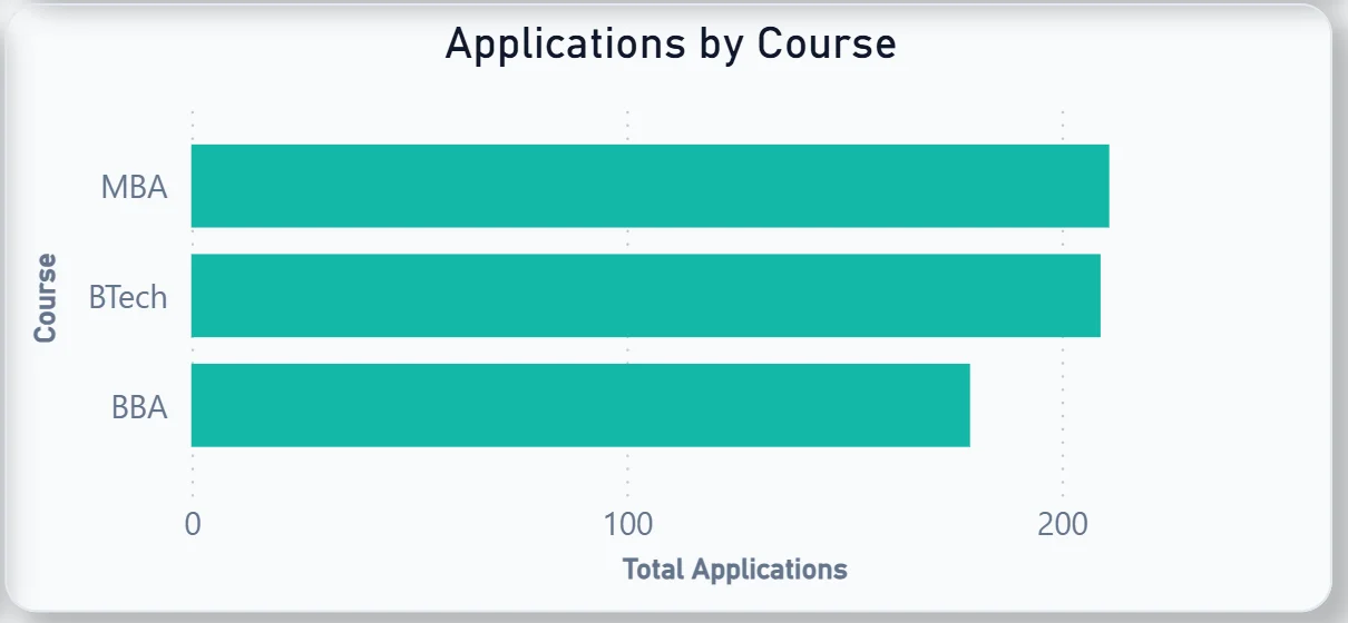
15. Applications by Course
The bar chart shows MBA and BTech receiving roughly equal applications, with BBA slightly behind. MBA leading applications matches the enrolment pattern seen in the Strategy Dashboard, confirming that demand signals are consistent from application stage through to actual enrolment.
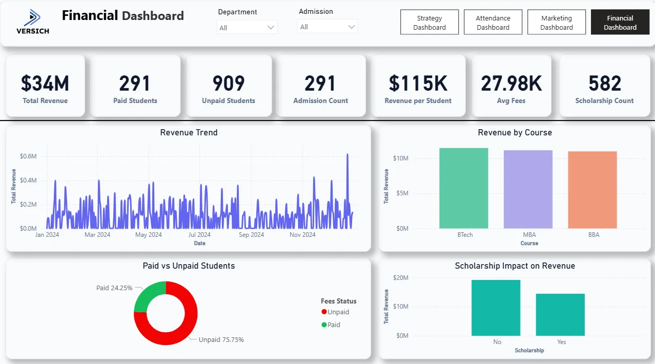
Financial Dashboard - Revenue, Fees, and Scholarships
The fourth tab is for the finance office and senior leadership tracking revenue generation, fee collection status, and the financial impact of the scholarship programme.
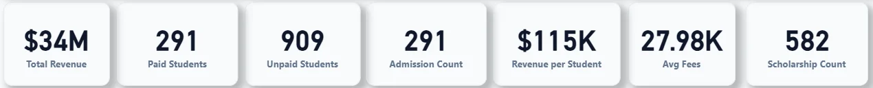
16. KPI Row Seven Financial Numbers That Tell the Full Story
Total Revenue ($34M), Paid Students (291), Unpaid Students (909), Admission Count (291), Revenue per Student ($115K), Avg Fees (27.98K), and Scholarship Count (582). The most urgent number here is Unpaid Students at 909 against only 291 paid. Three quarters of the student body has not paid fees. Whether that reflects payment plan structures, scholarship allocations, or genuine collection issues is the question this tab helps the finance team investigate. The 582 scholarships awarded against 291 admitted students also raises questions about scholarship-to-admission ratios worth examining.
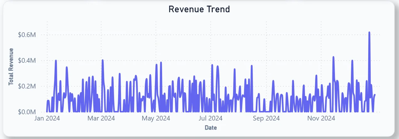
17. Revenue Trend
The daily revenue line chart shows highly volatile revenue across the full 2024 year with a sharp spike visible around July and a noticeable increase toward December. Those spikes correspond to fee payment deadlines and admission cycles. The volatility between peaks tells you revenue is lumpy rather than steady, which has direct implications for cash flow planning across the academic year.
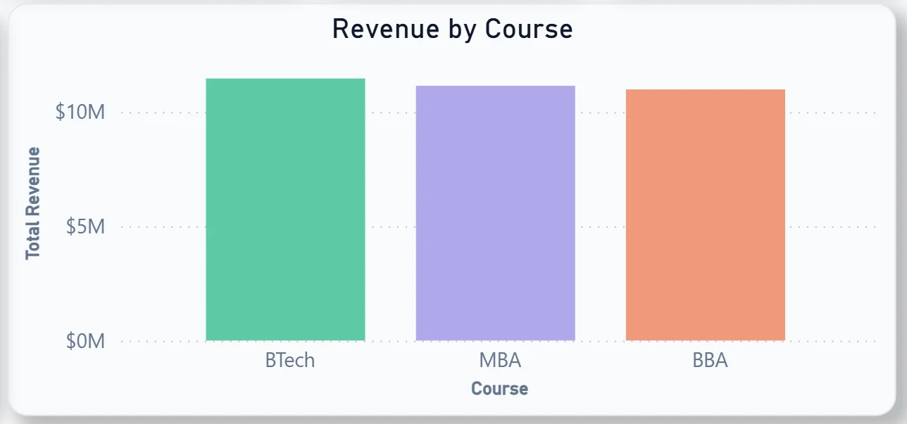
18. Revenue by Course
The bar chart shows BTech generating the highest total revenue, followed closely by MBA, with BBA behind. BTech leading revenue despite MBA leading in enrolment numbers suggests BTech fees are higher per student. That combination of enrolment and revenue data across both the Strategy and Financial tabs gives finance leadership a clearer picture of which courses are most financially valuable to the institution.
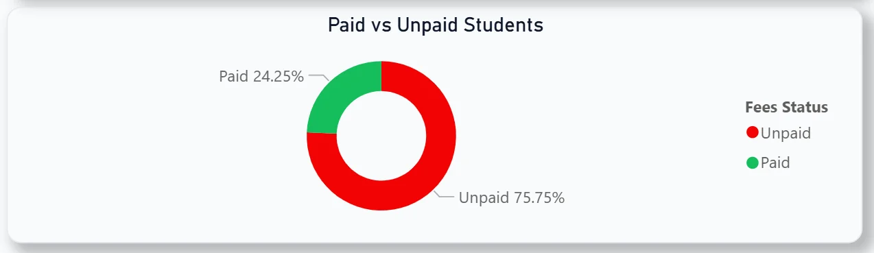
19. Paid vs Unpaid Students
The donut chart shows 75.75% unpaid against 24.25% paid. Three quarters of students are currently recorded as unpaid. For the finance team, this chart makes the collection gap impossible to ignore and provides the starting point for a targeted fee collection campaign filtered by department or course.
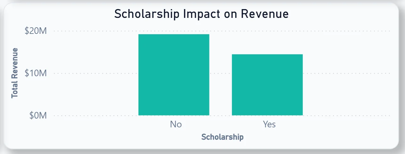
20. Scholarship Impact on Revenue
The bar chart compares total revenue from non-scholarship students against scholarship students. Non-scholarship revenue is notably higher than scholarship revenue, which makes sense given the larger non-scholarship student base. For leadership deciding how to grow the scholarship programme, this chart shows the revenue trade-off in direct financial terms.
How It Works Under the Hood
The dashboard connects to the university's student information system, attendance records, CRM or admissions platform, and fee management system through a unified Power BI data model. DAX measures calculate attendance rates, conversion rates, revenue per student, and department averages consistently so every KPI and chart is working from the same logic regardless of which tab you are on.
The four-tab structure means academic leadership, student affairs, the admissions team, and finance all have a view built for their specific questions. All four tabs share the same Department and Admission filters at the top so cross-functional analysis is always one click away.
Business Benefits
What changes when your institution has this dashboard
- Leadership sees student enrolment, attendance, admissions funnel, and revenue in one place rather than requesting four separate reports.
- Department heads can identify which students are below the 75% attendance threshold before exam season rather than after.
- The admissions team knows exactly where the funnel is leaking and which courses are attracting the most applications.
- Finance can see the paid vs unpaid gap by department and course and run targeted collection follow-ups without a manual data pull.
- The marketing team can see which cities are generating website traffic and where awareness campaigns should be focused.
- Scholarship impact on revenue is visible in a single chart rather than requiring a separate financial model.
Strategic Advantages for University Leadership
Beyond the day-to-day operational improvements, having this kind of analytics dashboard available over semesters and academic years starts to change how university leadership makes longer term decisions.
When you can see attendance trending below 75% for a significant portion of the student body every semester, you can redesign the attendance intervention programme before exam results suffer rather than after. When you can see BTech generating more revenue than MBA despite lower enrolment, you can make fee structure decisions on evidence rather than assumption. When the marketing funnel shows 9% of website visitors converting to enquiries, you can set a specific improvement target and measure progress against it each month.
This is the difference between a dashboard that produces end-of-semester reports and one that drives decisions throughout the academic year. The University Analytics Dashboard is built to do both.
Conclusion
Universities are running complex operations across academic, administrative, marketing, and financial functions simultaneously. Most institutions have the data. Very few have a way to see it all together in a form that is actually usable for weekly decisions.
This dashboard changes that across four tabs. Strategy gives leadership the academic overview. Attendance surfaces at-risk students before it is too late. Marketing shows where the admissions funnel is leaking. Finance makes the fee collection gap and scholarship impact impossible to ignore. All four respond to the same filters and draw from the same data model.
If your institution is still generating reports manually for each of these functions, the data is already sitting in your systems. A well-built Power BI dashboard just makes it usable across every team at once.