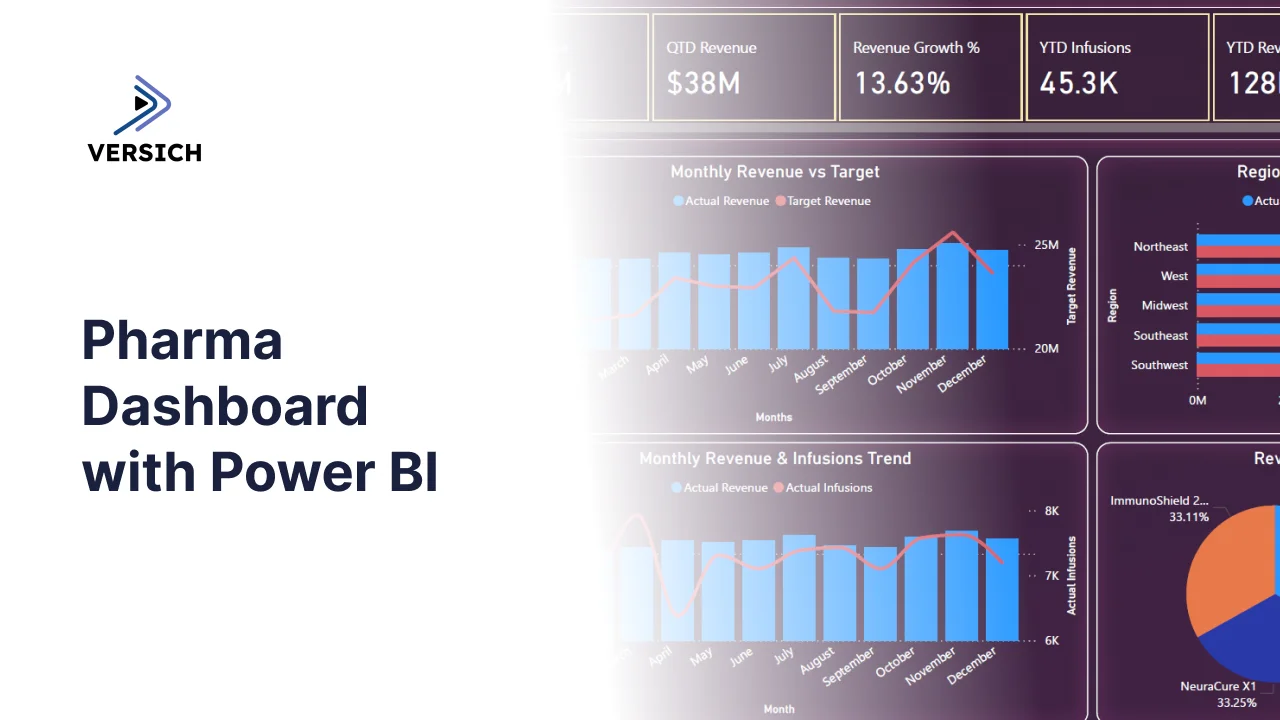
What is a Pharma Dashboard?
Pharmaceutical companies are sitting on enormous amounts of data. Revenue by drug, infusions by region, referrals by hospital, performance by department. The problem is not the data. The problem is that it lives in different systems and nobody sees the full picture until the monthly review, which is usually two weeks after anything useful could have been done about it.
A pharma dashboard built in Power BI changes that. It brings revenue, infusion volume, regional performance, and hospital-level data into one place and presents it in a way that commercial teams, regional managers, and executive leadership can all use, not just the data team.
We built this Pharma Dashboard in Power BI specifically for pharmaceutical commercial teams who need to track how their drugs are performing across regions and hospitals, how revenue compares to target, and where the gaps are before they become problems.
Why Pharma Teams Are Still Working with Incomplete Data
Here is what we hear from commercial leads and regional managers before they have a proper analytics setup. Revenue numbers come from the finance team at the end of the month. Regional performance comparisons require someone to manually pull reports for each territory. Infusion trends are tracked in a spreadsheet that three people maintain. And when leadership asks how a specific drug is performing across hospitals, the answer takes two days to compile.
The data exists. It is just scattered across systems, teams, and time zones. This dashboard was built to pull all of it into one screen and keep it updated so the right people can make the right calls faster.
The Dashboard We Built
This is not a single-page dashboard. We built it with two tabs because pharma commercial teams have two different levels of decision-making happening at the same time. Executives need the big picture. Regional managers and department leads need the details. Trying to put both on one page usually means both audiences get a version that is too cluttered to be useful.
The filters sit on the left panel across both tabs: Drug Name, Region, and Month. Select any combination and every chart, KPI card, and table updates immediately. A regional manager in the Northeast, checking only CardioMax Pro performance in October, can do that in three clicks.
Here is the interactive version of the Pharma Dashboard : Pharma Dashboard | Power BI Pharmaceutical Analytics by Versich
Executive Overview Tab
The first tab is built for leadership. It answers the questions that come up in every exec review: How are we tracking against revenue target? Which regions are performing and which are not? How are infusions trending month over month? And which drug is driving the most revenue?
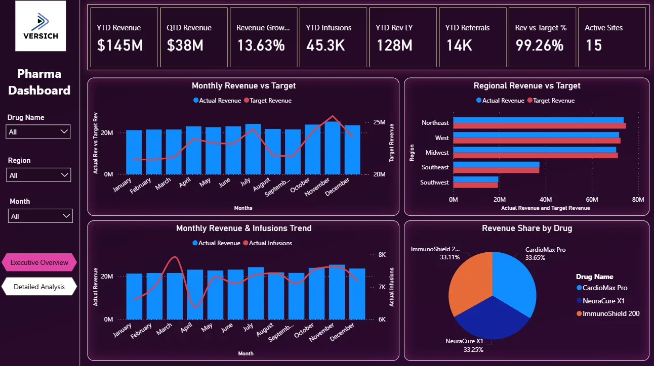
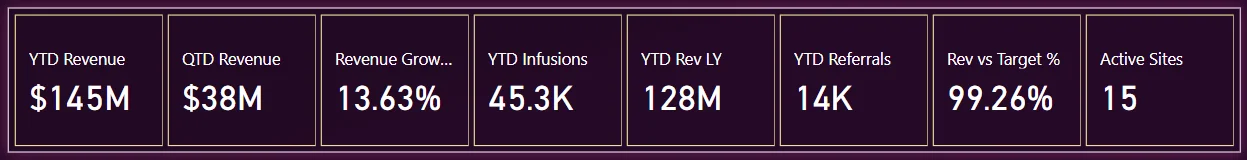
1. KPI Row — Six Numbers That Tell You Where You Stand
The top of the Executive Overview shows six KPI cards: YTD Revenue ($145M), QTD Revenue ($38M), Revenue Growth % (13.63%), YTD Infusions (45.3K), YTD Rev LY ($128M), and YTD Referrals (14K). That 13.63% growth against last year is the headline. It tells you the portfolio is growing. But the QTD figure of $38M sitting next to the YTD of $145M tells you which quarter you are in and how the current quarter is pacing. These six numbers together give leadership the full context before they look at a single chart.
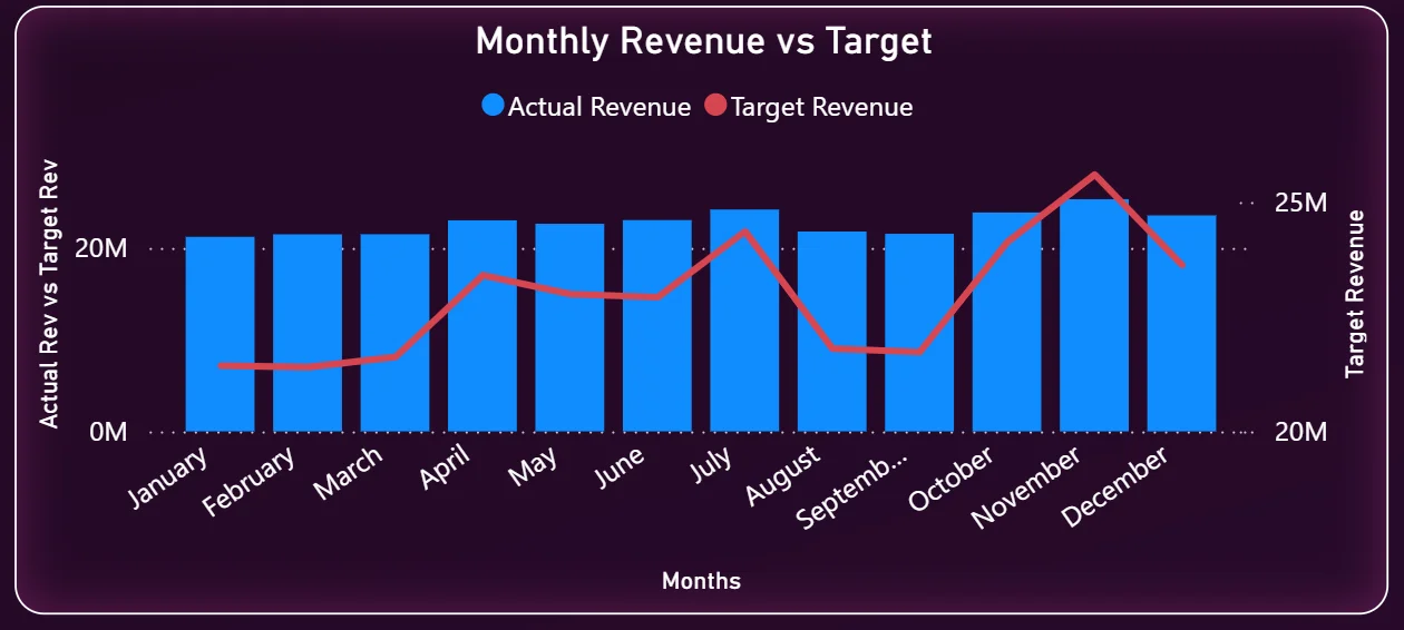
2. Monthly Revenue vs Target
This combo chart on the top left puts actual revenue bars and the target revenue line on the same axis so the gap between them is immediately visible. You can see that the business tracked below target through the first half of the year and started closing that gap from July onwards. By November and December, actual revenue is approaching the target line. A chart like this immediately tells you whether the year-end push is working or whether you need to have a different conversation with the sales team.
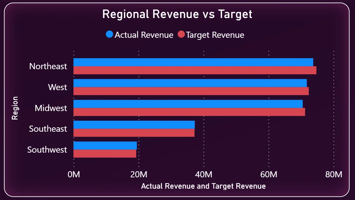
3. Regional Revenue vs Target
The horizontal bar chart on the top right shows every region side by side: Northeast, West, Midwest, Southeast, and Southwest. Each region has two bars, actual revenue in blue and target in red. The Northeast is the top-performing region and is running close to target. Southeast and Southwest are visibly shorter bars, which means they are either underperforming or have smaller market sizes. This chart answers the regional allocation question: where do you put more resources and where do you investigate?
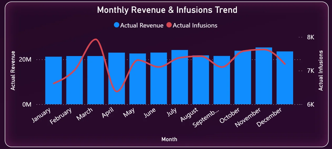
4. Monthly Revenue and Infusions Trend
The bottom left chart overlays actual revenue bars with an infusions trend line across all twelve months. This is one of the most useful charts in the dashboard because it lets you see whether infusion volume and revenue are moving together. If revenue is climbing but infusions are flat, that could mean pricing or product mix changes. If infusions are up but revenue is not following, that is a different problem. Seeing both on the same chart makes that relationship visible without having to run a separate analysis.
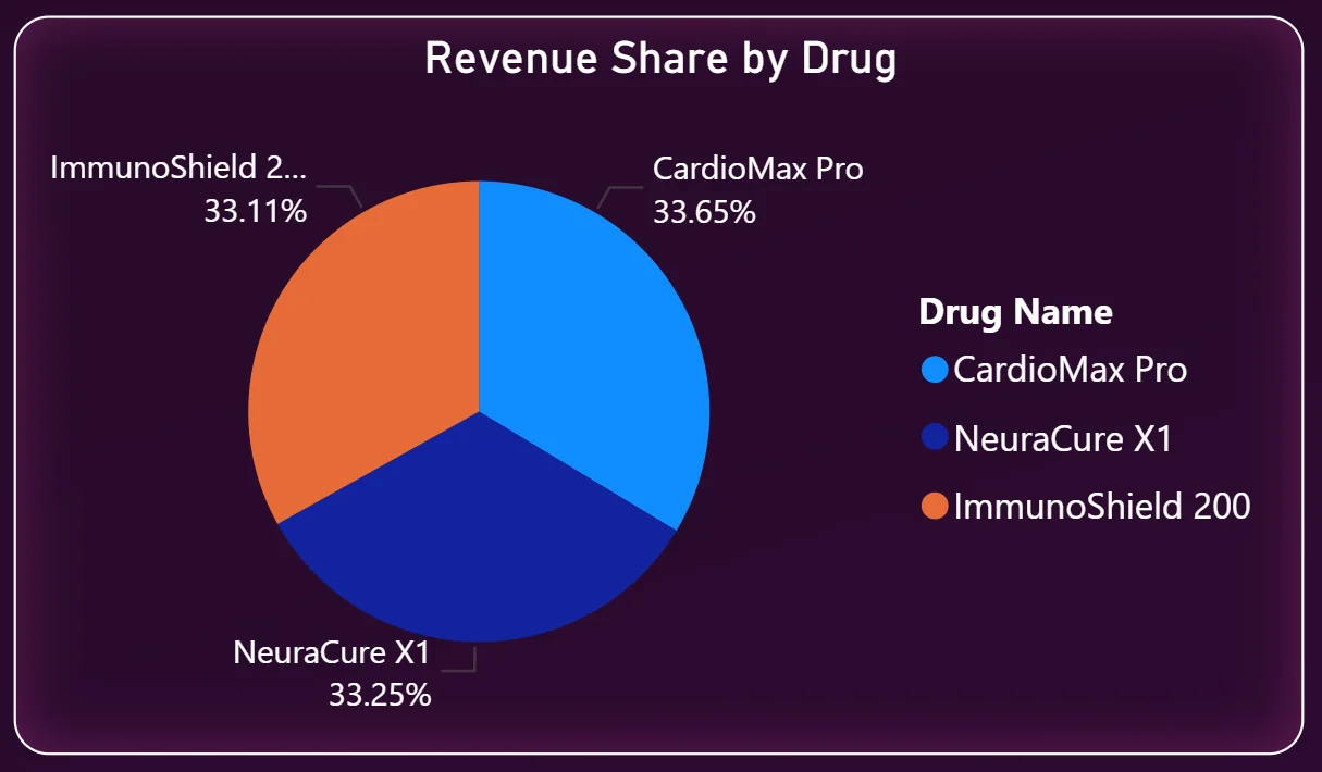
5. Revenue Share by Drug
The pie chart in the bottom right shows how total revenue is split across the three drugs: CardioMax Pro at 33.65%, NeuraCure X1 at 33.25%, and ImmunoShield 200 at 33.11%. The portfolio is remarkably balanced across all three drugs, with no single drug carrying disproportionate risk. That is either a sign of a well-managed portfolio or a signal that no single product has a breakthrough market position yet. Either way, leadership sees it immediately without asking for a separate breakdown.
Detailed Analysis Tab - Where Managers Go Deeper
The second tab is where regional managers, hospital account teams, and department leads live. It starts with a different KPI row that shows total numbers across the whole period: Total Revenue ($273M), Total Target Revenue ($275M), Total Infusions (87K), Total Referrals (26K), Total Patients (38K), and Avg Revenue per Site ($18.20M). That $2M gap between total revenue and total target is the number that drives everything on this page.
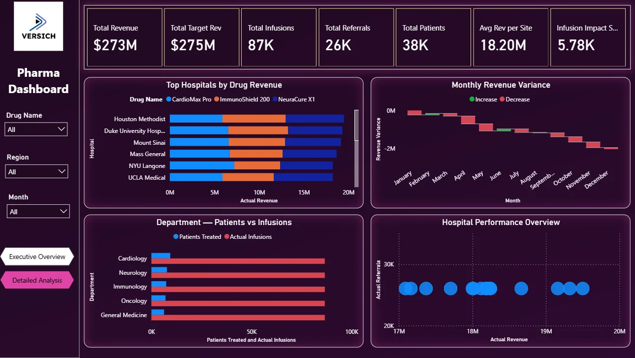
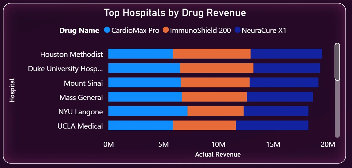
6. Top Hospitals by Drug Revenue
The stacked bar chart on the left shows the six highest-revenue hospitals and breaks down each bar by drug: CardioMax Pro in blue, ImmunoShield 200 in orange, and NeuraCure X1 in dark blue. Houston Methodist leads, followed closely by Duke University Hospital and Mount Sinai. Every hospital in the top six has a similar mix of all three drugs, which tells you distribution is fairly consistent across major accounts. The chart is sorted by total revenue so account teams immediately know which hospitals to prioritise for relationship management and which have headroom for growth.
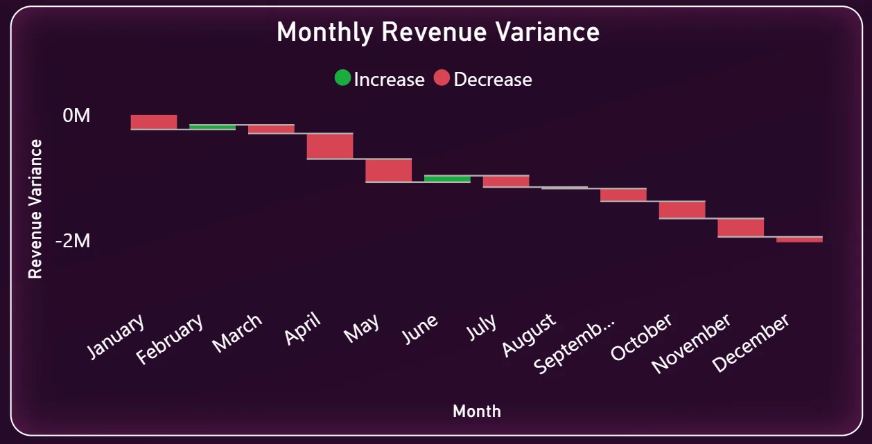
7. Monthly Revenue Variance
The waterfall chart on the top right is one of the more sophisticated visuals in this dashboard. It shows month by month whether revenue went up or down relative to the previous month, with green bars for increases and red bars for decreases. Looking at the chart, variance is largely negative across the year, which means actual revenue is consistently coming in below monthly expectations. The waterfall makes it easy to spot which specific months had the sharpest drops and work backwards to understand why. That is a much faster diagnostic than looking at a simple revenue line chart.
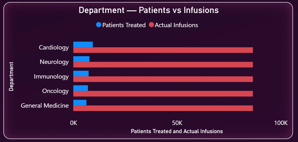
8. Department Patients vs Infusions
This horizontal bar chart on the bottom left compares patients treated against actual infusions across five departments: Cardiology, Neurology, Immunology, Oncology, and General Medicine. The infusion bars are dramatically longer than the patient bars across every department. Cardiology and Neurology show the highest infusion volumes. This chart is particularly useful for clinical operations teams because it shows the ratio of infusions per patient by department, which drives resource planning, scheduling, and supply chain decisions at the site level.
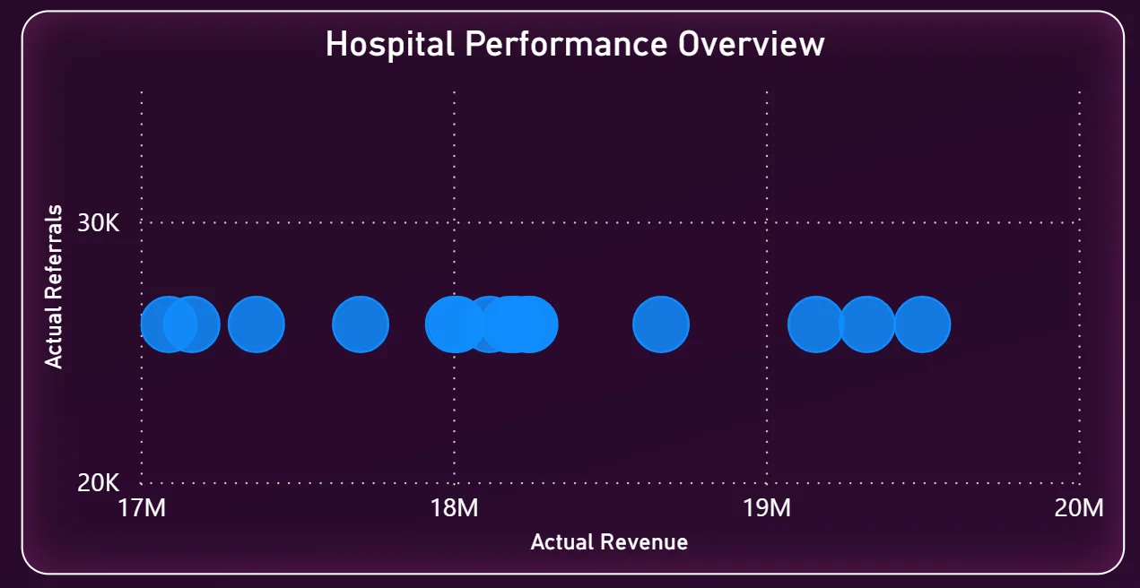
9. Hospital Performance Overview
The scatter chart on the bottom right plots hospitals by actual revenue on the X axis and actual referrals on the Y axis. Each bubble represents a hospital site. The cluster of dots sitting between $17M and $19M in revenue with referrals around 25K to 30K tells you that most hospitals are performing in a similar band. Any hospital that sits significantly outside that cluster in either direction is worth investigating. High revenue but low referrals could mean a large existing patient base with limited new patient growth. High referrals but lower revenue could indicate pricing or conversion issues at that site.
How It Works Under the Hood
The dashboard pulls from a centralised data model that connects sales transaction data, infusion records, referral logs, and hospital account data. Power BI DAX measures sit on top of that model to calculate YTD, QTD, prior year comparisons, and variance figures. Because the model is structured correctly from the start, adding a new drug, a new region, or a new time period does not require rebuilding any visuals. The source data updates and the dashboard handles the rest.
The two-tab structure means executives get a clean summary view without scrolling past hospital-level detail they do not need, while regional managers get the granular breakdown they do use. Both audiences are working from the same underlying data model, so there is no version mismatch between what leadership sees and what the teams report.
Business Benefits
Moving from manual reporting to a live Power BI pharma dashboard changes how commercial teams operate week to week. Here is what that looks like in practice.
What changes when your team has this dashboard
- Weekly reviews start with everyone looking at the same revenue vs target numbers instead of different versions of the same spreadsheet.
- Regional underperformance is visible in the bar chart before it becomes a quarter-end surprise.
- Hospital account teams know which sites are tracking ahead and which need attention without waiting for a monthly report.
- Infusion trends are tracked automatically rather than maintained manually in a shared file.
- Leadership can filter by drug or region in seconds instead of requesting a custom report.
- The revenue variance waterfall surfaces monthly drops immediately so the commercial team can investigate before the quarter closes.