
What is a Social Media Dashboard?
Social media teams are dealing with data coming in from six different platforms, each with its own reporting interface, its own metrics, and its own definition of what a good result looks like. Trying to compare TikTok performance against LinkedIn in the native apps is not just inconvenient. It is basically impossible to do consistently at scale.
A social media dashboard built in Power BI changes that. It pulls data from every platform into one model, applies consistent metric definitions across all of them, and lets you see impressions, engagement, paid performance, and audience demographics side by side in a single screen with filters that work across everything simultaneously.
We built this Social Media Dashboard in Power BI for marketing teams who need to understand how their content and paid campaigns are performing across TikTok, Instagram, YouTube, Facebook, LinkedIn, and Twitter without switching between six different tools to piece the picture together.
Why Social Teams Are Still Working with Fragmented Data
Here is what we hear from social media managers and paid media leads before they have a proper analytics setup. Monthly reports are compiled by exporting from each platform separately and combining them in a spreadsheet that takes hours to build. Engagement rate comparisons across platforms are unreliable because each platform calculates them differently. ROAS by campaign is tracked in the ad manager but never connected to organic reach data. And when leadership asks which platform is actually driving results, the answer is always "it depends" because nobody can see everything in one place.
The data exists across all those platforms. It just needs to be structured, unified, and presented in a way that is actually usable for weekly decisions and monthly reviews.
The Dashboard We Built
This dashboard has three tabs because social media genuinely has three different audiences. An overview for the whole team, a paid performance view for the media buyers, and an audience analysis tab for the strategists thinking about targeting and demographics. Trying to put all three on one page would mean all three audiences get a cluttered version that serves none of them properly.
Three filters sit across the top of all tabs: Year, Is Paid, and Platform. Every chart, KPI card, and visual updates simultaneously when any filter changes. A paid media manager filtering for TikTok paid campaigns only can do that in seconds and every visual on screen reflects that selection instantly.
Here is the interactive version of the Social Media Dashboard : Social Media Dashboard | Power BI Analytics by Versich
Overview Tab
The first tab is the one everyone opens first. It gives the marketing team the complete cross-platform summary before any meeting starts.
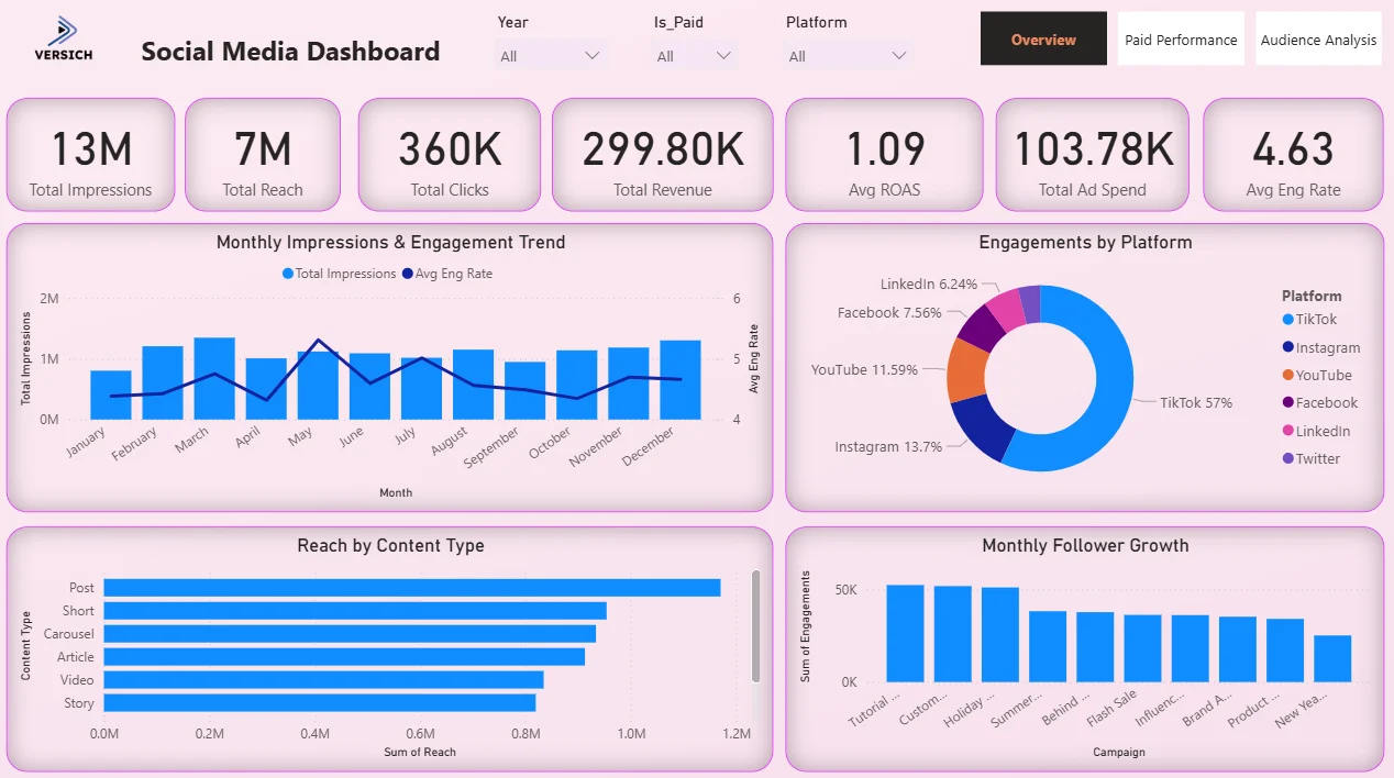
1. KPI Row — Seven Numbers That Tell You Where You Stand
The top of the Overview tab shows seven KPI cards: Total Impressions (13M), Total Reach (7M), Total Clicks (360K), Total Revenue (299.80K), Avg ROAS (1.09), Total Ad Spend (103.78K), and Avg Eng Rate (4.63). That combination of organic and paid metrics sitting side by side in one row is the entire point. Before any chart, you know how big the audience is, how much was spent, what came back, and how engaged people are. An Avg ROAS of 1.09 across all platforms and campaigns tells you paid is generating just above break-even on average, which means the platform and campaign mix matters a lot. That is the conversation the dashboard enables.

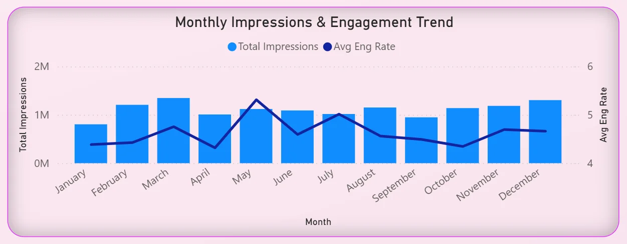
2. Monthly Impressions and Engagement Trend
The combo chart on the left overlays total impressions bars with an average engagement rate line across all twelve months. Impressions are relatively consistent throughout the year, hovering around 1M per month, but the engagement rate line tells a more interesting story. It peaks around May and dips in the second half of the year. High impressions with falling engagement in the same period means content is reaching people but getting less of a response. For a content team, that is a signal about creative fatigue or posting cadence that would never surface from a simple impressions report.
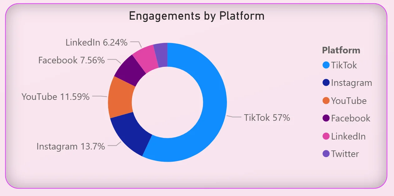
3. Engagements by Platform
The donut chart on the right breaks total engagement across six platforms: TikTok at 57%, Instagram at 13.7%, YouTube at 11.59%, Facebook at 7.56%, LinkedIn at 6.24%, and Twitter making up the remainder. TikTok is not just ahead. It is more than all other platforms combined. For any team debating where to invest content effort, this chart ends that conversation with a single visual. It also raises the question of whether the 57% TikTok engagement is matched by 57% of the content budget, and if not, why not.
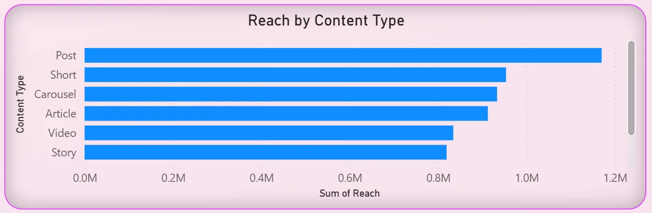
4. Reach by Content Type
The horizontal bar chart on the bottom left ranks content types by total reach: Posts at the top, followed by Shorts, Carousels, Articles, Videos, and Stories. Posts generating the highest reach might seem obvious until you consider the channel mix. Posts performing better than Shorts and Videos across a dataset that includes TikTok and YouTube tells you something about where the audience is actually paying attention versus where the team might assume they are. For a content calendar review, this chart is a direct input.
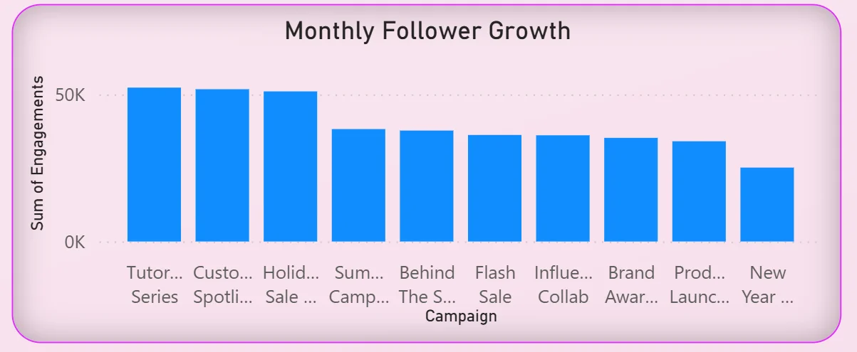
5. Monthly Follower Growth by Campaign
The bar chart on the bottom right shows follower growth grouped by campaign name: Tutorial, Customer, Holiday, Summer, Behind the Scenes, Flash Sale, Influencer, Brand Awareness, Product, and New Year campaigns. Tutorial and Customer campaigns lead follower growth. Flash Sale and Influencer campaigns, which typically require more spend, are trailing behind organic content campaigns. That is exactly the kind of finding that changes how a team allocates budget between paid and organic next quarter.
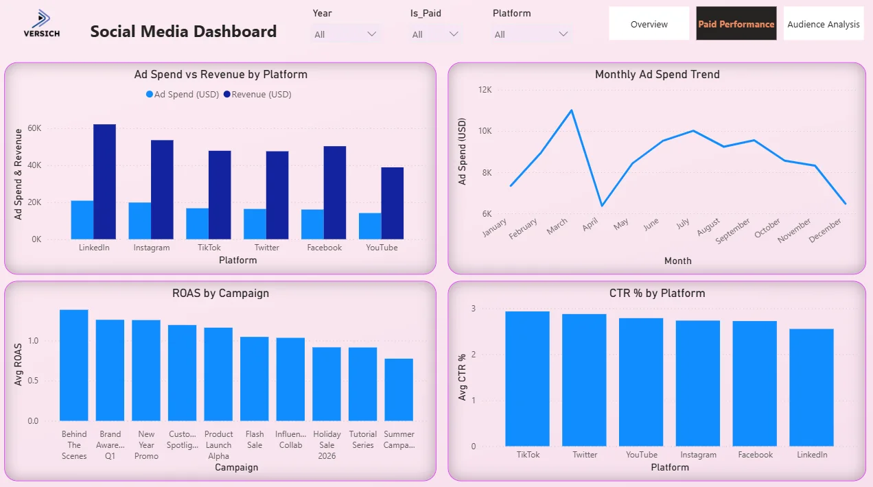
Paid Performance Tab - Where the Media Buyers Live
The second tab is built for the paid media team. It answers the specific questions that come up when you are managing ad spend across multiple platforms simultaneously and need to know what is working and what is not before you make the next budget decision.
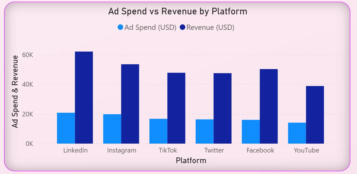
6. Ad Spend vs Revenue by Platform
The clustered bar chart on the top left puts ad spend and revenue side by side for every platform: LinkedIn, Instagram, TikTok, Twitter, Facebook, and YouTube. LinkedIn has the highest revenue generated but also one of the higher spend levels. YouTube is generating meaningful revenue from a relatively lower spend. TikTok is in the middle of the pack despite being the dominant engagement platform from the Overview tab. The gap between the spend bar and the revenue bar for each platform immediately shows which platforms are converting spend into revenue efficiently and which have work to do.
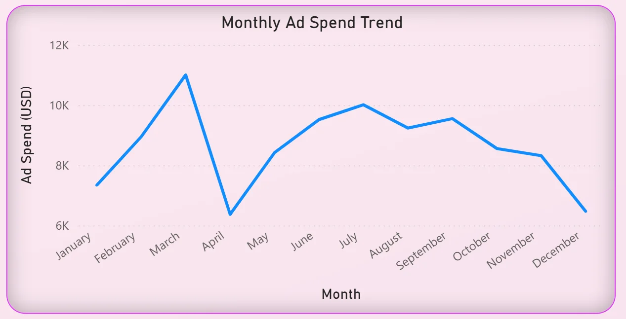
7. Monthly Ad Spend Trend
The line chart on the top right tracks total ad spend month by month across the year. Spend climbs from around $7.5K in January to a peak of just over $11K in April, drops sharply in May, recovers through the summer, then falls again from October through December. That April peak is worth investigating. Was it a planned campaign push? Did it correspond to the engagement rate peak visible in the Overview tab? The dashboard does not answer that question automatically but it makes the pattern visible so the team can ask it.
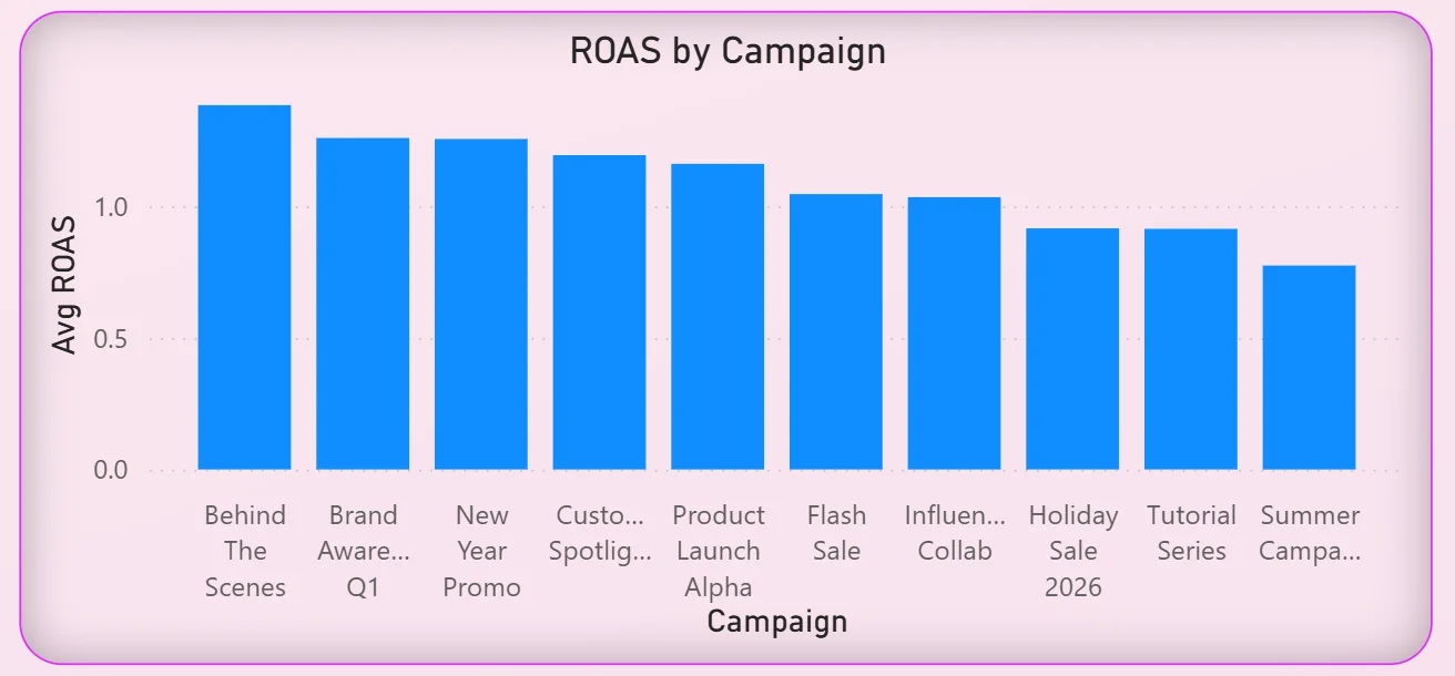
8. ROAS by Campaign
The bar chart on the bottom left ranks every campaign by average ROAS from highest to lowest: Behind The Scenes, Brand Awareness Q1, New Year Promo, Customer Spotlight, Product Launch Alpha, Flash Sale, Influencer Collab, Holiday Sale 2026, Tutorial Series, and Summer Campaign at the bottom. Behind The Scenes generating the highest ROAS is a finding that will surprise most paid media teams who would not typically think of that content type as a performance driver. Flash Sale and Influencer Collab sitting in the lower half of the ROAS ranking despite being high-spend campaign types is the kind of data that changes budget allocation decisions.
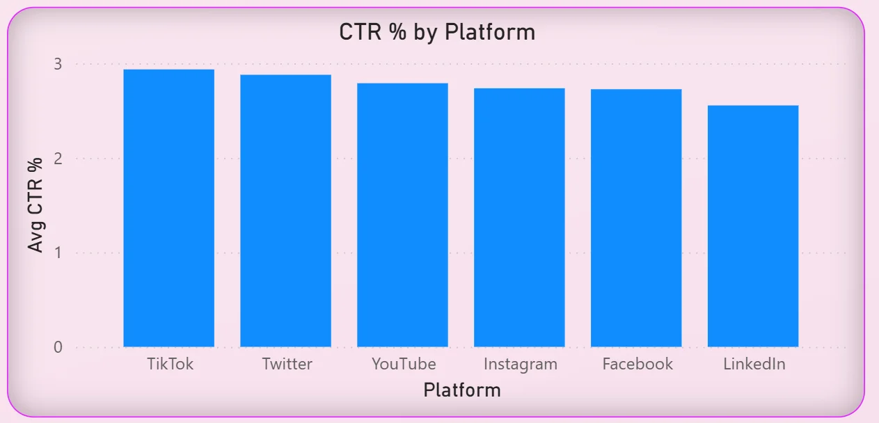
9. CTR by Platform
The bar chart on the bottom right shows average click-through rate across all six platforms. The rates are relatively close together, ranging from around 2.5% to just under 3%, with TikTok and Twitter leading slightly. Given TikTok's dominant engagement share from the Overview tab, its CTR being at the top as well suggests the platform is delivering quality attention, not just volume. LinkedIn sitting at the bottom of CTR despite having the highest revenue per spend from the ad spend chart tells you LinkedIn conversions are happening through a different path than a direct click.
Audience Analysis Tab - Understanding Who Is Actually Watching
The third tab is where strategists and brand managers go when they need to understand the audience rather than just the performance numbers. Reach and impressions tell you how many people saw the content. This tab tells you who they were and where they were.
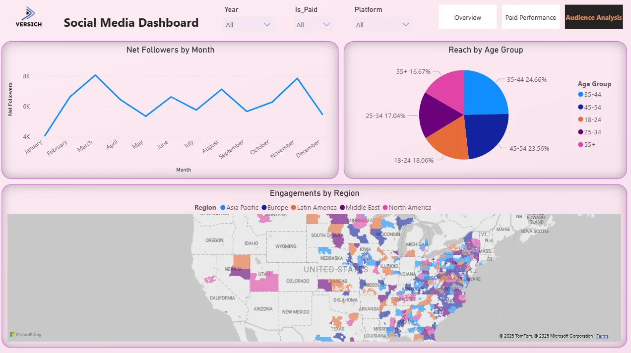
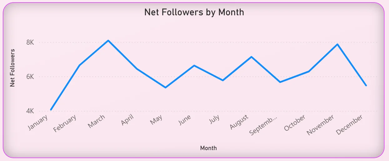
10. Net Followers by Month
The line chart tracks net follower growth month by month across the year. The pattern is not a steady climb. It peaks in March at around 8K, drops through April and May, recovers in summer, dips again in August, and then climbs back toward the end of the year. Follower growth rarely moves in a straight line but the shape of this curve tells you when content was resonating and when it was not. Matching those peaks and troughs against the campaign calendar from the Overview tab gives the strategy team a direct read on which campaign types are actually growing the audience versus just generating impressions.
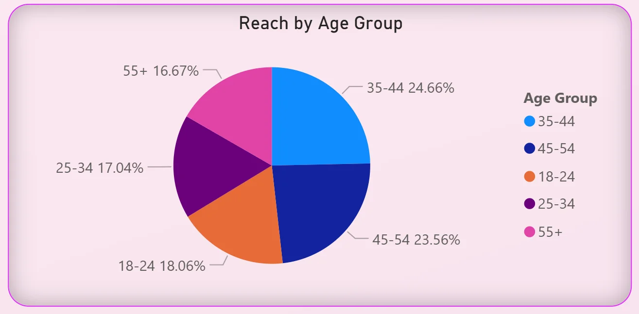
11. Reach by Age Group
The pie chart breaks total reach across five age groups: 35 to 44 leading at 24.66%, followed by 45 to 54 at 23.56%, 18 to 24 at 18.06%, 25 to 34 at 17.04%, and 55 and above at 16.67%. The audience is remarkably evenly distributed across age groups. No single group is dominant and the older demographics (35 to 54) are actually reaching more people than the 18 to 34 group combined. For a brand that assumes its social media audience skews young, this data is a direct challenge to that assumption and a reason to reconsider both creative direction and targeting parameters.
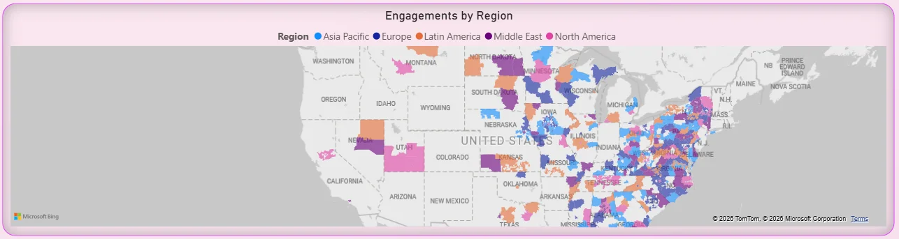
12. Engagements by Region Map
The geographic map plots engagement data across five regions: Asia Pacific, Europe, Latin America, Middle East, and North America, with different colors for each. The concentration of dots along the US East Coast and in the midwest tells you where the North American audience is densest. Seeing engagement spread across multiple global regions tells you this is not a purely domestic audience, which has direct implications for posting time, content localisation, and which platforms get prioritised for different markets. A map visual makes geographic distribution impossible to miss in a way that a table of regional percentages never would.
How It Works Under the Hood
The dashboard connects to a unified social media data model that pulls platform data from TikTok, Instagram, YouTube, Facebook, LinkedIn, and Twitter through API connections or scheduled exports. DAX measures calculate cross-platform engagement rates, ROAS, CTR, and net follower growth consistently so the same metric definition applies to every platform rather than using each platform's own calculation method.
The three-tab structure means the overview team, the paid media buyers, and the audience strategists all have a view built for their specific questions without scrolling past charts that are not relevant to their role. All three tabs run on the same data model and respond to the same three filters at the top, so selecting a specific platform or year updates every tab simultaneously.
Business Benefits
Moving from platform-by-platform reporting to a unified Power BI social media dashboard changes how marketing teams operate every single week. Here is what that looks like in practice.
What changes when your team has this dashboard
- Weekly social reviews start with everyone looking at the same cross-platform numbers instead of different exports pulled from different tools.
- Platform budget decisions are informed by actual ROAS and CTR data rather than assumptions about where the audience is.
- Content type performance is visible in the reach chart so the calendar is built on what is working, not on habit.
- Paid campaign ROAS rankings make budget reallocation conversations straightforward instead of subjective.
- Audience age and regional data is available without a separate analytics report request.
- Follower growth trends are tracked monthly so dips are spotted and investigated rather than noticed at the end of the quarter.
Strategic Advantages for Marketing Leaders
Beyond the week-to-week operational improvements, having this kind of social media dashboard available over months and quarters starts to change how marketing leaders make longer term decisions too.
When you can see TikTok consistently driving 57% of engagement month after month, you can make a confident case for reallocating budget toward short-form video content rather than defending a channel split based on last year's strategy. When you can see Behind The Scenes campaigns generating the highest ROAS across the board, you can build a content calendar around that finding rather than treating it as a one-off result. When follower growth consistently peaks in March and dips in summer, you can plan campaign timing around that pattern rather than discovering it after the fact.
This is the difference between a dashboard that helps you report on what happened and one that helps you make better decisions about what to do next. The Social Media Dashboard is designed to do both.
Conclusion
Most social media teams are not short of data. They are short of a way to see data from six different platforms together, updated, and comparable in the same view. That is what this dashboard solves.
In three tabs you get a complete cross-platform overview with seven headline KPIs, a dedicated paid performance view that ranks every campaign by ROAS and every platform by CTR, and an audience analysis layer that shows you who is actually engaging and where in the world they are. Everything responds to the same three filters. Nothing requires a separate export or a cross-platform spreadsheet.
If your social media reporting still involves stitching together exports from multiple platform dashboards into a weekly deck, this is the dashboard that replaces that entire process. The data is already sitting in your ad accounts and analytics tools. A well-built Power BI model just makes it usable.