What is a Zoom Analytics Dashboard?
Most organisations using Zoom are sitting on three separate pools of data that never talk to each other. Phone call records in Zoom Phone. Meeting logs in Zoom Meetings. Webinar registration and attendance data in Zoom Webinars. Each one lives in its own reporting section inside Zoom, each one requires a separate export if you want to do anything with it, and none of them give you a cross functional view of how your organisation is actually communicating.
A Zoom analytics dashboard built in Power BI changes that. It pulls all three data streams into one model, structures them into dedicated tabs for each use case, and gives operations leaders, IT managers, and communications teams a single place to understand call volumes, meeting patterns, and webinar performance without switching between tools or stitching together exports.
We built this Zoom Analytics Dashboard in Power BI for organisations that use Zoom across their phone, meeting, and webinar functions and want to see all three working together rather than separately.
Why Teams Are Still Missing the Full Picture on Zoom
Here is what we hear from operations and IT teams before they have a proper analytics setup. Call centre managers know their total call volume but cannot easily see which hours consistently generate the most missed calls without pulling a custom export. Department heads want to know how many meeting hours their teams are consuming each month but have no visibility without requesting a Zoom admin report. Marketing teams running webinars can see registration numbers inside Zoom but cannot connect that data to which campaigns are actually driving sign ups.
None of this is a failure of Zoom as a platform. It is what happens when communication data grows faster than the reporting tools built to handle it at scale. This dashboard was built to close that gap across all three Zoom product areas simultaneously.
The Dashboard We Built
This dashboard has three tabs because Zoom's three product areas serve three genuinely different audiences. Phone analytics is for call centre managers and operations leads. Meeting analytics is for department heads and IT administrators tracking collaboration patterns. Webinar analytics is for marketing and events teams tracking audience reach and campaign effectiveness. Combining all three into one page would produce a dashboard that serves none of those audiences well.
Filters sit at the top of each tab tailored to that tab's use case. Department and Webinar Name for phone analytics. Webinar Name and Host Name for meeting analytics. Webinar Name and Country for webinar analytics. Every visual on each tab responds instantly to the relevant filter selection.
Here is the interactive version of the Zoom Analytics Dashboard : Zoom Analytics Dashboard | Power BI Collaboration Insights by Versich
Phone Analytics Tab - Understanding Your Call Centre
The first tab is built for operations managers and call centre leads who need to understand call volume, answer rates, missed call patterns, and agent level performance without running a custom report every time someone asks a question.
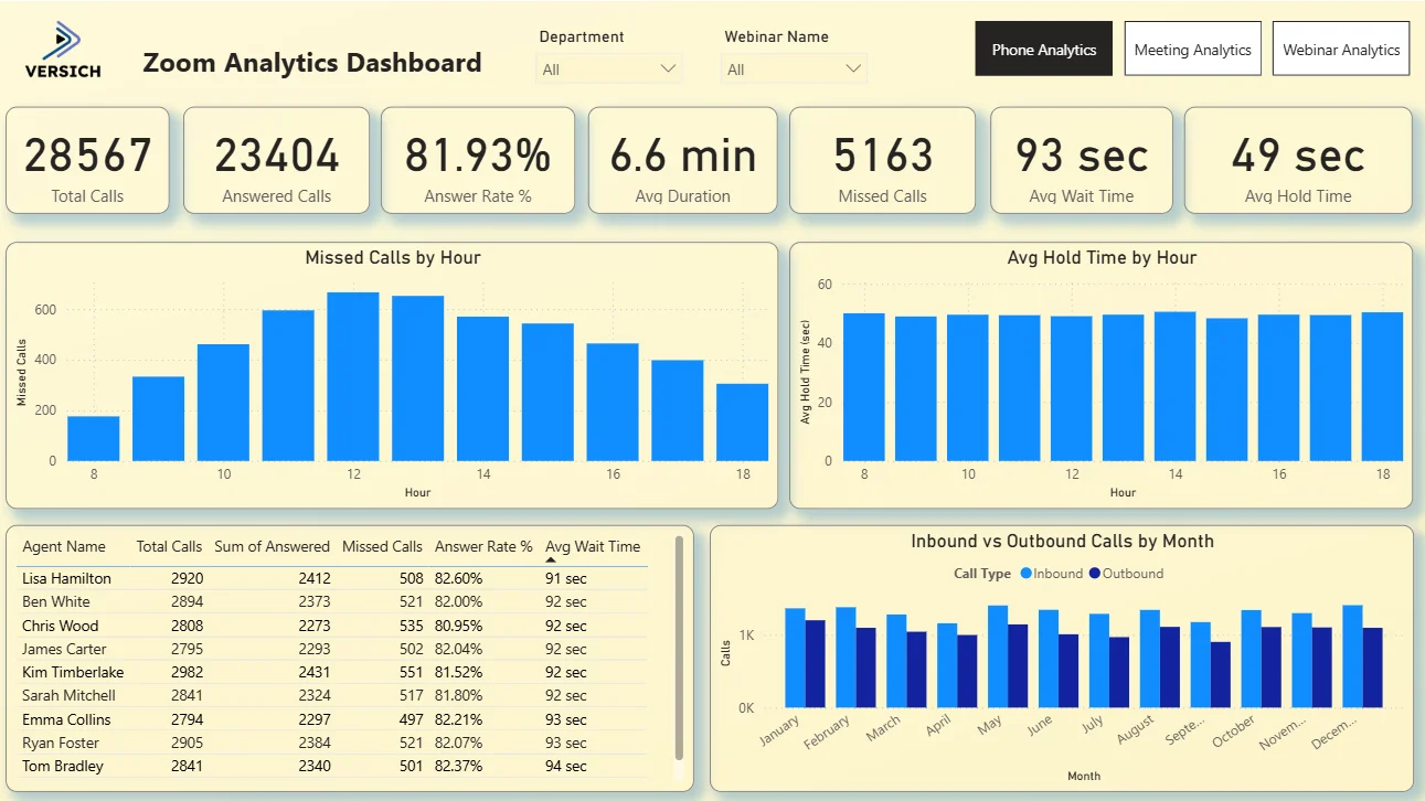
1. KPI Row Seven Call Centre Numbers in One View
The top row shows Total Calls (28,567), Answered Calls (23,404), Answer Rate (81.93%), Avg Duration (6.6 min), Missed Calls (5,163), Avg Wait Time (93 sec), and Avg Hold Time (49 sec). That 81.93% answer rate means roughly 1 in 5 calls is going unanswered, which is represented directly by the 5,163 missed calls figure sitting next to it. An average wait time of 93 seconds alongside an average hold time of 49 seconds tells you customers are spending more time waiting to be connected than they are being put on hold once connected. These seven numbers together give any operations manager the full call centre health picture before they look at a single chart.

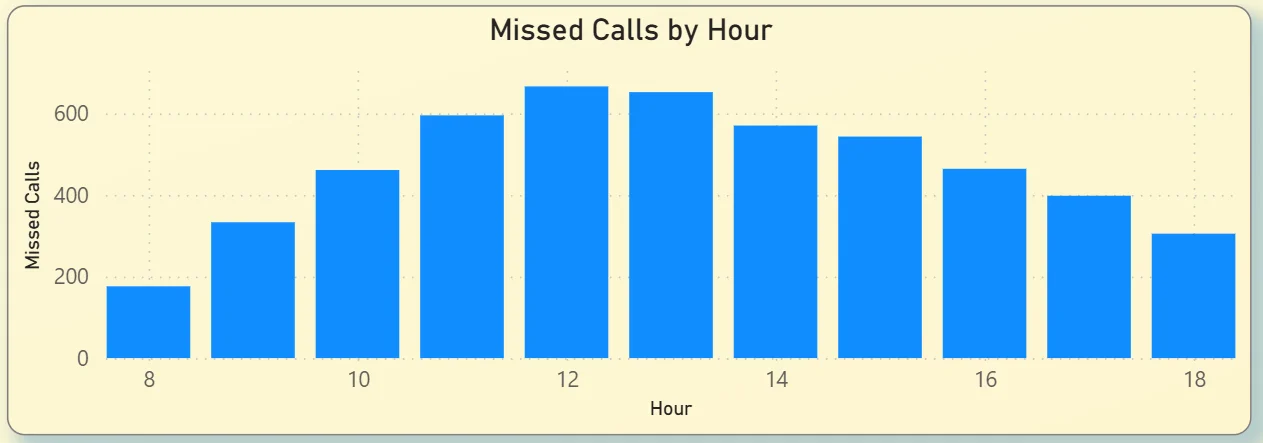
2. Missed Calls by Hour
The bar chart on the top left plots missed calls across every hour of the working day from 8am through to 6pm. Missed calls climb steadily from around 175 at 8am, peak between 11am and 1pm at over 600 per hour, then taper off through the afternoon. That midday peak is consistent with lunch period staffing gaps and the highest inbound demand happening simultaneously. For a call centre manager, this chart tells you exactly where to add capacity. If you are under staffed between 11am and 1pm, you do not need a workforce study to prove it. The missed call pattern shows it directly.
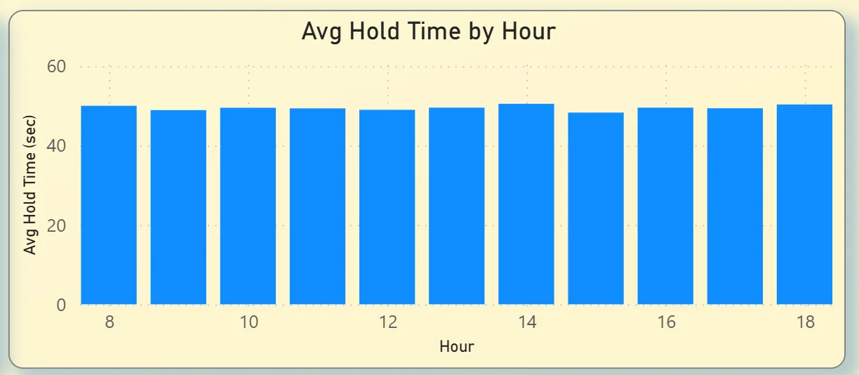
3. Avg Hold Time by Hour
The bar chart on the top right shows average hold time is remarkably consistent across the entire working day, hovering around 45 to 50 seconds from 8am through to 6pm. There are no hours where hold time spikes significantly. That consistency tells you hold time is not the bottleneck driving missed calls. The problem is getting calls answered in the first place, which points back to staffing levels and call routing during peak hours rather than agent handling time once a call is connected.
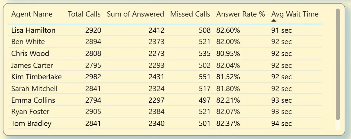
4. Agent Performance Table
The table on the bottom left shows every agent with their Total Calls, Answered Calls, Missed Calls, Answer Rate, and Avg Wait Time side by side. Lisa Hamilton leads on total calls at 2,920 with an 82.6% answer rate. Answer rates across all agents are clustered tightly between 80.95% and 82.6%, which tells you performance is consistent across the team and the missed call issue is structural rather than agent specific. If one agent had an 60% answer rate, the table would surface that immediately. The fact that it does not tells you something important about where to focus improvement efforts.
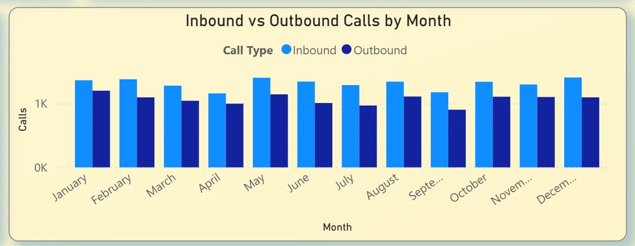
5. Inbound vs Outbound Calls by Month
The clustered bar chart on the bottom right tracks inbound and outbound call volumes month by month across the full year. Both stay consistently around 1K calls per month each with no dramatic seasonal spikes. Inbound and outbound volumes are running at roughly equal levels throughout the year, which is useful context for capacity planning. A call centre where inbound calls suddenly doubled in September would show that clearly in this chart. The fact that volumes are stable here means any staffing changes need to be driven by the hourly pattern data rather than seasonal demand.
Meeting Analytics Tab - How Your Organisation Spends Its Time
The second tab is built for department heads, IT administrators, and operations leaders who want to understand how meeting time is distributed across the organisation, which hosts are running the most meetings, and which departments and hours of the day are generating the most collaboration activity.
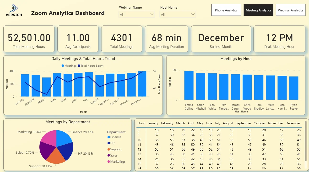
6. KPI Row Six Meeting Numbers That Tell the Story
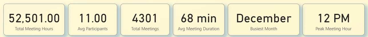
The top row shows Total Meeting Hours (52,501), Avg Participants (11), Total Meetings (4,301), Avg Meeting Duration (68 min), Busiest Month (December), and Peak Meeting Hour (12 PM). Over 52,000 hours of meeting time across 4,301 meetings is a significant number for any organisation to see clearly for the first time. At an average of 68 minutes and 11 participants per meeting, the cost of that time in human hours is substantial. December being the busiest month and 12 PM being the peak hour are the kinds of operational facts that look obvious in hindsight but are rarely visible without a dashboard like this one.
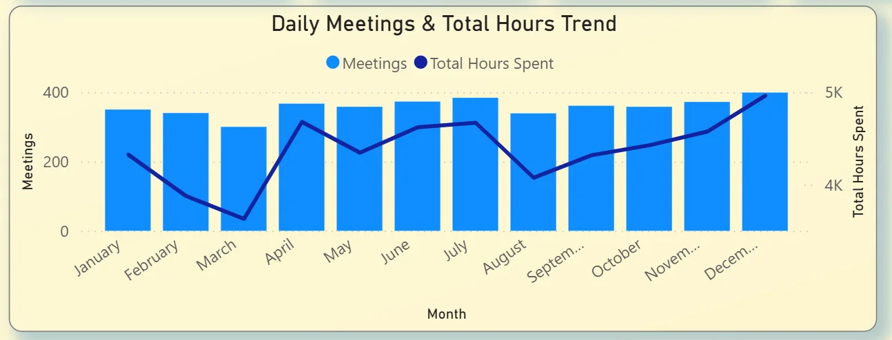
7. Daily Meetings and Total Hours Trend
The combo chart on the top left plots total meetings per month as bars alongside a total hours spent line. Meetings stay relatively consistent throughout the year between 200 and 350 per month, but the total hours line climbs steadily from around 4,100 in January to over 5,000 in December. That divergence tells you that while meeting frequency is staying relatively stable, meeting duration is increasing over the course of the year. More hours per meeting rather than more meetings. For an IT administrator or operations lead tracking productivity, that trend is worth investigating before it compounds further into the next year.
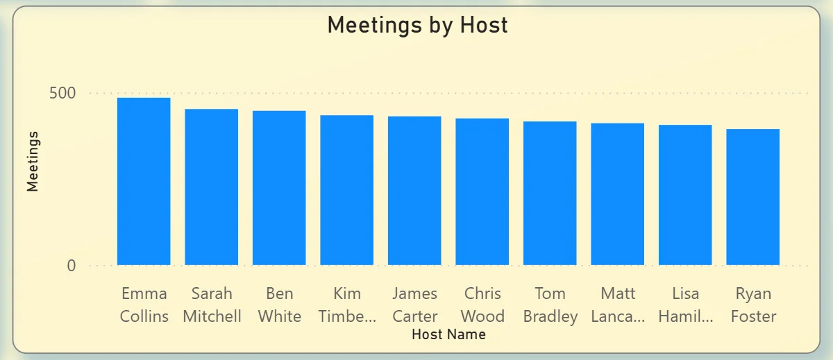
8. Meetings by Host
The bar chart on the top right ranks all ten hosts by total meetings hosted: Emma Collins leads, followed closely by Sarah Mitchell, Ben White, Kim Timberlake, James Carter, Chris Wood, Tom Bradley, Matt Lancaster, Lisa Hamilton, and Ryan Foster. The distribution is relatively even across all hosts with no single person running dramatically more meetings than others. That balance is actually worth noting in an org where one or two people often end up as the default meeting organiser for everything. Even distribution suggests meeting culture is healthy across the host group rather than concentrated.
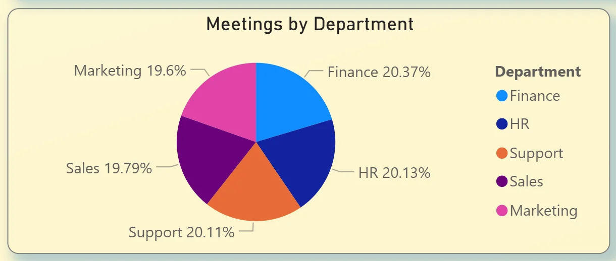
9. Meetings by Department
The pie chart on the bottom left breaks meeting volume across five departments: Finance at 20.37%, HR at 20.13%, Support at 20.11%, Sales at 19.79%, and Marketing at 19.6%. The distribution is almost perfectly even across all five departments with less than one percentage point separating the highest from the lowest. For a department head questioning whether their team is in too many meetings compared to others, this chart answers that directly. Everyone is at roughly the same level.
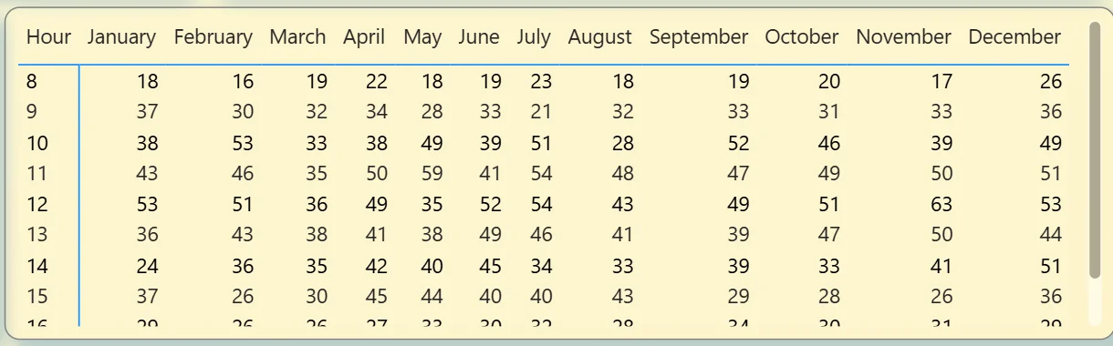
10. Hour by Month
The table on the bottom right shows meeting count by hour of day across every month of the year. The 12 PM row consistently has the highest numbers across almost every month, confirming the Peak Meeting Hour KPI. The 8am row is consistently the lowest. April and December show the highest meeting counts across most hours of the day, matching the December busiest month finding from the KPI row. This heatmap is the most granular view in the meeting tab and the most useful for scheduling decisions. If you want to protect certain hours from meeting overload or understand when collaboration demand is highest, this table gives you the data to act on.
Webinar Analytics Tab - Measuring Your Audience Reach
The third tab is built for marketing and events teams running webinars through Zoom. It covers attendance rates, registration sources, which webinars performed best, and where in the world the audience is coming from.
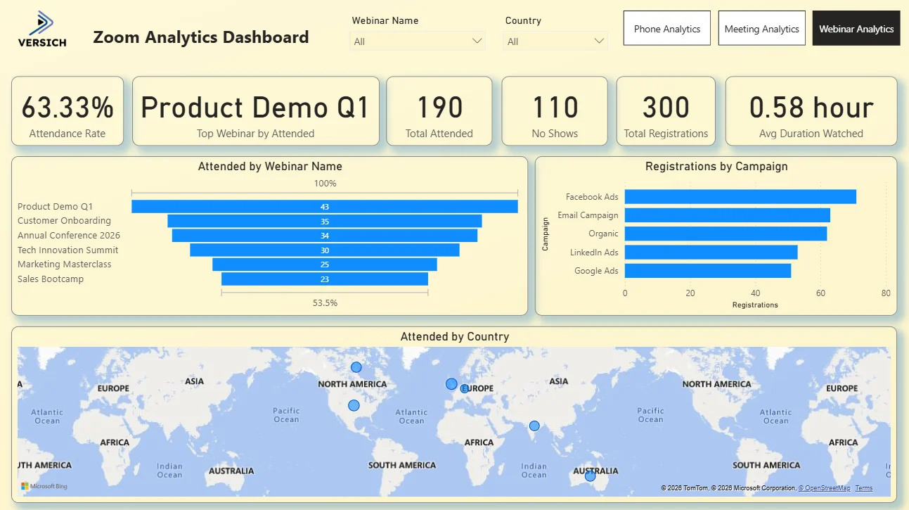
11. KPI Row Six Webinar Numbers at a Glance
The top row shows Attendance Rate (63.33%), Top Webinar by Attended (Product Demo Q1), Total Attended (190), No Shows (110), Total Registrations (300), and Avg Duration Watched (0.58 hour). A 63.33% attendance rate from 300 registrations means 110 people who signed up did not show. That no show rate of roughly 37% is the headline number for any webinar team because it tells you how much registration volume is being converted into actual attendance. Product Demo Q1 being the top performing webinar tells you product focused content is drawing the most engaged audience, which is a direct input for planning the next webinar calendar.

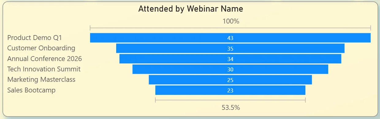
12. Attended by Webinar Name
The funnel chart on the left ranks all six webinars by attendance: Product Demo Q1 at 43, Customer Onboarding at 35, Annual Conference 2026 at 34, Tech Innovation Summit at 30, Marketing Masterclass at 25, and Sales Bootcamp at 23. Product Demo Q1 outperforming every other webinar by a meaningful margin tells you that prospects and customers are most interested in seeing the product directly. Sales Bootcamp sitting at the bottom despite being an internal training webinar suggests either lower promotion or a more targeted invite list. Seeing all six side by side in one chart makes the performance gaps immediately visible without needing a separate attendance report for each webinar.
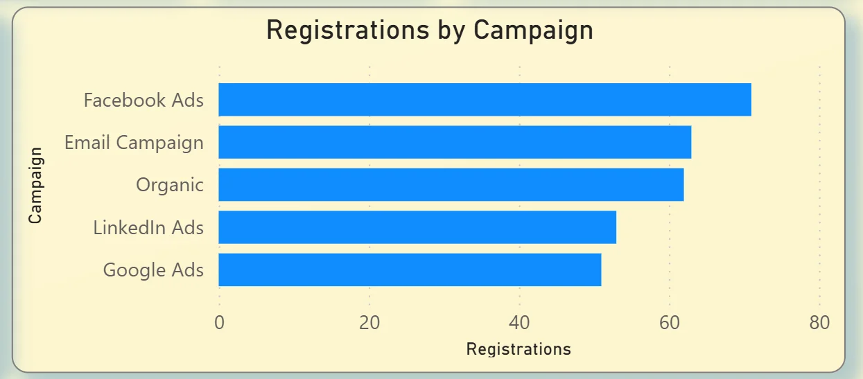
13. Registrations by Campaign
The bar chart on the right shows which marketing channels are driving webinar registrations: Facebook Ads leading, followed by Email Campaign, Organic, LinkedIn Ads, and Google Ads. Facebook Ads generating the most registrations tells you paid social is the strongest top of funnel channel for webinar sign ups. Email Campaign coming in second suggests the existing audience list is highly responsive. Organic registrations in third place means there is meaningful inbound interest without any paid spend behind it. Google Ads sitting at the bottom means search intent is not a strong driver for webinar sign ups, which should directly inform where the next campaign budget goes.
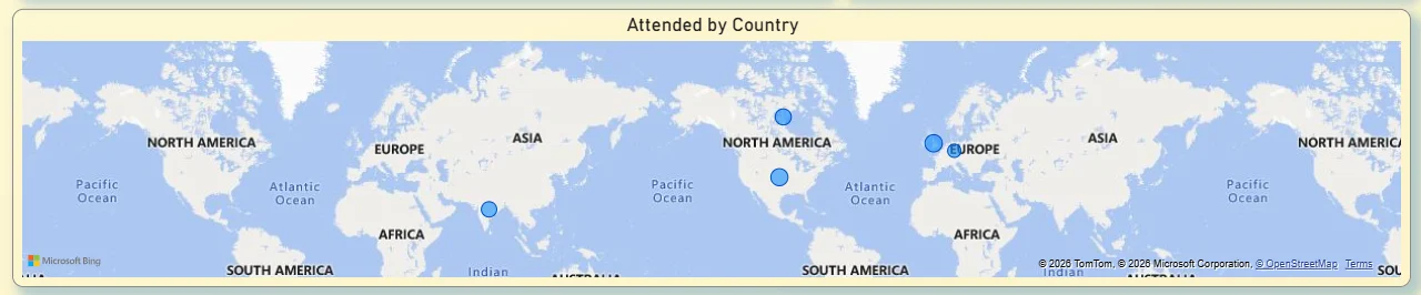
14. Attended by Country Map
The world map at the bottom plots attendance by country with bubble markers showing where attendees are located. Bubbles appear across North America, Europe, and Australia, confirming the webinar audience is genuinely global rather than concentrated in a single market. For a marketing team deciding whether to run regional webinar sessions in different time zones, this map makes the case visually. If significant audience clusters exist in Europe and Australia alongside North America, a single time zone webinar slot is always going to disadvantage part of the audience. The geographic distribution data makes that conversation concrete rather than speculative.
How It Works Under the Hood
The dashboard connects to Zoom's data through the Zoom API or structured exports from the Zoom admin portal. Three separate data models handle phone call records, meeting logs, and webinar data respectively, then surface in their dedicated tabs in Power BI. DAX measures calculate answer rates, attendance rates, average durations, and hourly distributions consistently so every KPI card and chart is working from the same underlying logic.
The three tab structure means the call centre team, the department heads tracking meeting time, and the marketing team running webinars all have a view built specifically for their questions. All three tabs connect to the same Zoom data source and respond to their own relevant filters. No one has to scroll past data that is not relevant to their role to get to the numbers they actually need.
Business Benefits
Moving from Zoom's native reporting to a Power BI analytics dashboard changes how operations, IT, and marketing teams make decisions across the organisation. Here is what that looks like in practice.
What changes when your team has this dashboard
- Call centre managers can identify peak missed call hours without pulling a custom export and make staffing decisions the same day.
- Agent performance comparisons are visible in one table rather than requiring individual call logs to be reviewed separately.
- Department heads can see how many meeting hours their teams are consuming each month without requesting an IT admin report.
- The hour by month heatmap makes scheduling decisions data-driven rather than based on individual preference.
- Webinar teams know exactly which campaigns are driving registrations so budget allocation decisions are made on evidence rather than assumption.
- Global webinar attendance data is visible on a map so time zone and regional session planning is grounded in actual audience geography.
Strategic Advantages for Operations and Communications Leaders
Beyond the day-to-day improvements, having this kind of Zoom analytics dashboard available over months and quarters starts to change how operations and communications leaders make longer term decisions too.
When you can see meeting hours climbing steadily from January to December while meeting frequency stays flat, you can address meeting duration norms before they become an organisational productivity problem. When you can see that Facebook Ads consistently drives more webinar registrations than Google Ads across every quarter, you can make a confident budget reallocation rather than running another test. When missed calls consistently peak at 12pm every day regardless of the month, you can restructure lunch break rotations rather than adding headcount to solve a scheduling problem.
This is the difference between a dashboard that tells you what happened last month and one that helps you run a better operation over the next year. The Zoom Analytics Dashboard is designed to do both.
Conclusion
Most organisations using Zoom at scale are generating more communication data than they are able to use. Call records, meeting logs, and webinar analytics all exist but they live in separate places, require separate exports, and get reviewed separately if they get reviewed at all.
This dashboard brings all three together. Phone analytics tells you where your call centre has gaps. Meeting analytics tells you how your organisation is spending its collaboration time. Webinar analytics tells you which content and campaigns are building your audience and where in the world that audience actually is. All three tabs respond to their own filters instantly and all three draw from the same underlying Zoom data.
If your team is still pulling Zoom reports manually or making staffing, scheduling, and webinar investment decisions without this kind of visibility, the data is already sitting in your Zoom account. A well built Power BI dashboard just makes it usable.