What is an Inventory Management Dashboard?
If you run a warehouse or manage logistics operations, you already know the problem. Data is everywhere but actionable insight is nowhere. You have got your WMS generating pallet logs, your ERP tracking orders, your team sending shift summaries over email, and somehow you are still making decisions based on yesterday's numbers.
An inventory management dashboard changes that. It pulls all of that data into one place and turns it into live, visual intelligence that warehouse managers can actually use during their shift, not after it.
At Versich, we built our Inventory Management Dashboard using Power BI to give logistics and supply chain teams a real time view of everything happening across their warehouse operations, from storage occupancy and pallet movement to order status and forklift activity, all in a single screen.
Why Most Warehouse Teams Are Still Flying Blind?
Here is what we hear from warehouse managers before they start using a proper Power BI warehouse dashboard. Occupancy numbers are updated at the end of the shift, not live. Put away backlogs only get noticed when pallets start piling up at the dock. Late orders are tracked across email threads. Checking forklift status means walking the floor. And comparing two warehouses requires pulling two separate reports.
None of this is unusual. It is just the reality of how most warehouses operate today. The data exists, it is just not connected and it is not visual. That is exactly the gap this dashboard was built to close.
The Dashboard We Built
We built this dashboard specifically for warehouse and logistics operations teams who need a single screen that tells them exactly what is happening across their sites at any given moment. The layout is clean and intentional. KPIs sit at the top so managers get the summary first, and the five visuals below each answer a specific operational question.
The left panel has three filter slicers: Month Name, Quarter, and Warehouse. Selecting any combination updates every chart, table, and KPI card on the page at the same time. A regional manager checking just Warehouse B for Q3 can do that in two clicks.
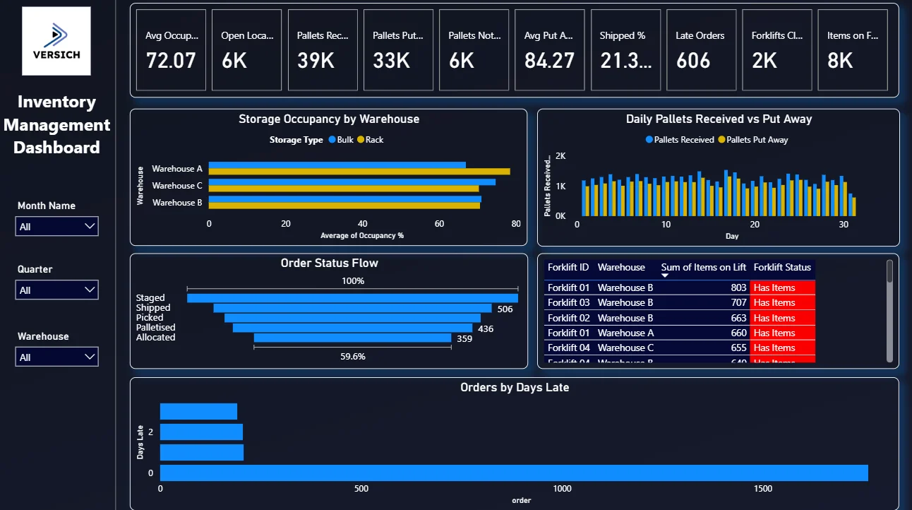
Looking at the dashboard, the top KPI row immediately shows the numbers that matter most: 72.07 average occupancy, 39K pallets received against 33K put away, 6K still sitting in the backlog, and a put away rate of 84.27%. That gap between received and put away is the first thing a warehouse manager should notice every morning, and this dashboard makes it impossible to miss.
Here is the interactive version of the Inventory Management Dashboard : Inventory Management Dashboard | Power BI Solutions by Versich
What the Dashboard Actually Shows
There are five main visuals in this dashboard and each one is answering a specific question that warehouse teams deal with every single day. Here is a breakdown of what you are looking at and why each one was built the way it was.
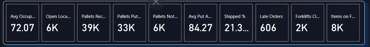
1. KPI Row The First Thing You See Every Morning
The very top of the dashboard is a row of six KPI cards: Avg Occupancy % (72.07), Open Locations (6K), Pallets Received (39K), Pallets Put Away (33K), Pallets Not Put Away (6K), and Avg Put Away % (84.27). Before anything else, a manager opening this dashboard knows that out of 39,000 pallets received, 6,000 are still not put away. That is 15% of inbound stock sitting somewhere it should not be. That single number tells you where your morning starts.
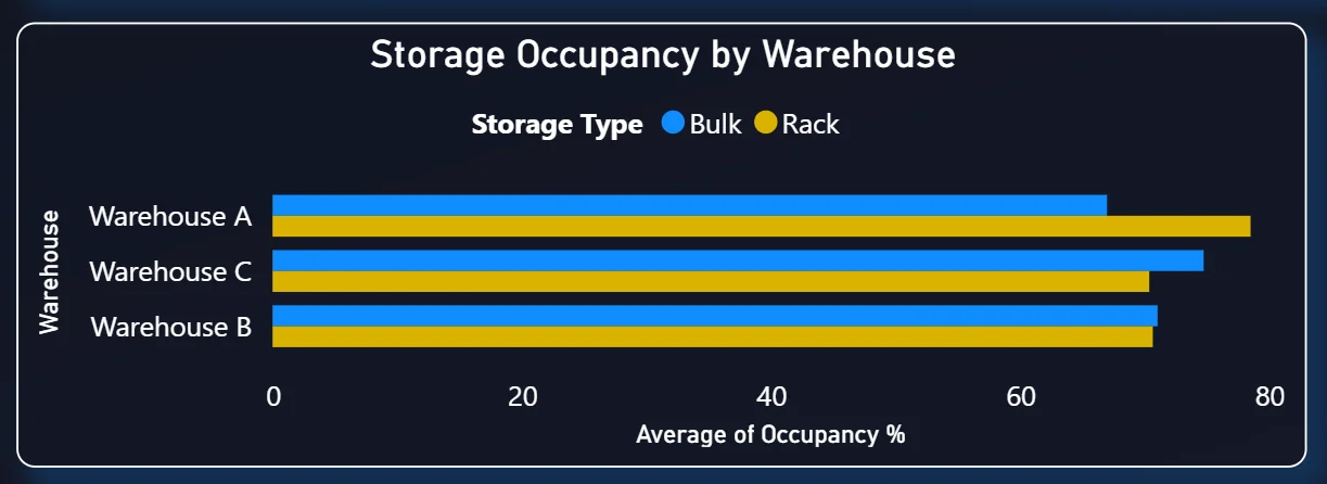
2. Storage Occupancy by Warehouse
The top left chart is a horizontal grouped bar chart comparing average occupancy across Warehouse A, Warehouse C, and Warehouse B. Each warehouse shows two bars side by side, one for Bulk storage (blue) and one for Rack storage (yellow). Looking at the chart, Warehouse A is the most heavily utilised, with both its bulk and rack storage running significantly higher than Warehouse B. This is the kind of comparison that used to require pulling three separate reports. Here it is one chart, updated automatically, and filterable by month or quarter.
The practical use case is simple: if Warehouse A is consistently running above 75% occupancy while Warehouse B has headroom, operations teams can start redistributing inbound stock before A hits capacity and creates a bottleneck.
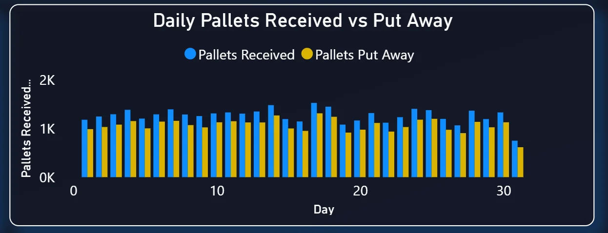
3. Daily Pallets Received vs Put Away
This clustered bar chart on the top right tracks every single day of the month. The blue bars show pallets received each day and the yellow bars show how many were actually put away. On most days the bars are close to each other, which means the put away team is keeping up. But you can see specific days where received volume spikes and the put away bars do not follow. That gap is a backlog forming in real time.
What makes this chart valuable is timing. If you catch that divergence on day 4, you can add a shift or reprioritise tasks and fix it before the dock fills up. If you only find out on day 14 because someone sent a report, you are already dealing with a congestion problem instead of preventing one.
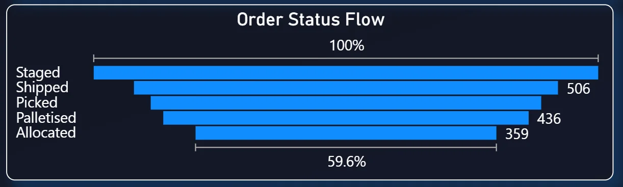
4. Order Status Flow
The middle left chart is a horizontal bar chart that shows all active orders broken down by their current fulfillment status: Staged, Shipped, Picked, Palletised, and Allocated. The percentage at the top (100%) is the baseline and each bar represents how far through the process those orders are. In the current view, 506 orders are at the Shipped stage, 436 are at Picked, and 359 are Allocated but not yet moving.
Fulfillment supervisors use this to immediately see where work is stacking up. If Allocated orders are sitting at 359 and barely moving while Shipped is only at 506, that tells you the bottleneck is between allocation and picking, not between picking and shipping. That kind of diagnosis without a dashboard usually takes a meeting. Here it takes a glance.
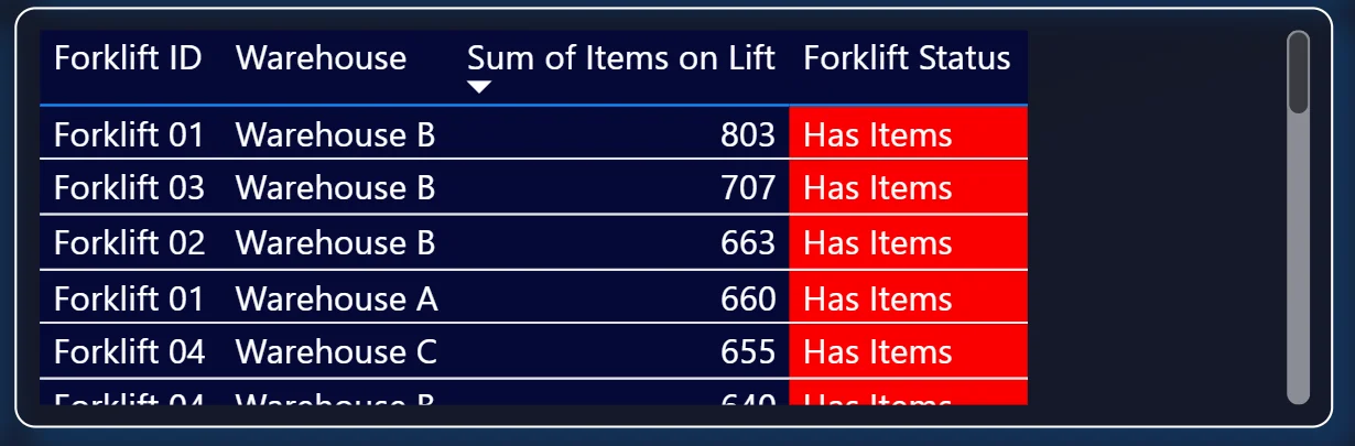
5. Forklift Activity Table
The table on the middle right is a live scrollable view of every forklift across all three warehouses. Each row shows the Forklift ID, which warehouse it is in, how many items it is currently carrying, and its status. Every forklift in the current view is flagged red with "Has Items", meaning all active forklifts are loaded and moving.
Looking at the numbers: Forklift 01 in Warehouse B is carrying 803 items, Forklift 03 has 707, Forklift 02 has 663, Forklift 01 in Warehouse A has 660, and Forklift 04 in Warehouse C has 655. The table continues scrolling below. Floor supervisors can check this from anywhere without a radio call or a physical walkthrough. If a forklift shows zero items and a green status when it should be active, that flags a problem immediately.
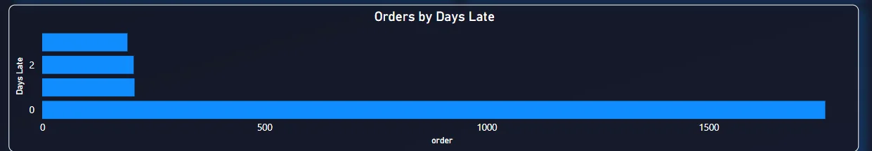
6. Orders by Days Late
The bottom chart is the escalation tool. It plots late orders on the Y axis by how many days overdue they are (0, 1, 2, 3 days late) and shows the order count on the X axis. The very long bar at day 0 shows a large volume of orders that just crossed into late territory today. These are your best intervention opportunity because a call or a priority reassignment right now can still save the shipment. The bars at day 2 and day 3 are smaller but those orders need immediate escalation because they are already behind.
Without this chart, late orders would surface in a system report or a customer complaint. With it, the issue is visible the same day it happens.
How It Works Under the Hood
The dashboard connects to a SQL Server database that aggregates data from the warehouse management system. Power BI runs a set of DAX measures on top of that data to calculate the KPIs and feed the visuals. Because the data model is built correctly from the start, adding a new warehouse or a new time period does not require rebuilding anything. You just update the data source and the dashboard handles the rest.
Operational Benefits
The shift from manual reporting to a live Power BI inventory dashboard changes how warehouse teams actually work day to day. Here is what that looks like in practice.
What changes when your team has this dashboard
- Morning stand ups start with everyone looking at the same live numbers instead of someone's spreadsheet from last night.
- Put away backlogs are spotted in the daily chart before they create dock congestion.
- Late orders are visible in one sorted chart instead of scattered across emails and tickets.
- Forklift status is checked on screen instead of over radio or a floor walk.
- Comparing Warehouse A and Warehouse B occupancy takes one filter change instead of two separate reports.
- Leadership gets consistent numbers because everyone is pulling from the same source.
Strategic Advantages for Operations Leaders
Beyond the day-to-day operational improvements, having this kind of warehouse analytics dashboard available over months and quarters starts to change how operations leaders make longer term decisions too.
When you can see occupancy trending upward across Warehouse A over six months, you can plan a capacity expansion before you hit 95% utilization rather than after. When you can see that put away backlogs consistently spike in the second week of every quarter, you can adjust staffing proactively. When late orders cluster around specific order types or warehouses, you can trace the root cause rather than just firefighting each one.
This is the difference between a dashboard that helps you manage today and one that helps you run a better operation over time. The Versich Inventory Management Dashboard is designed to do both.