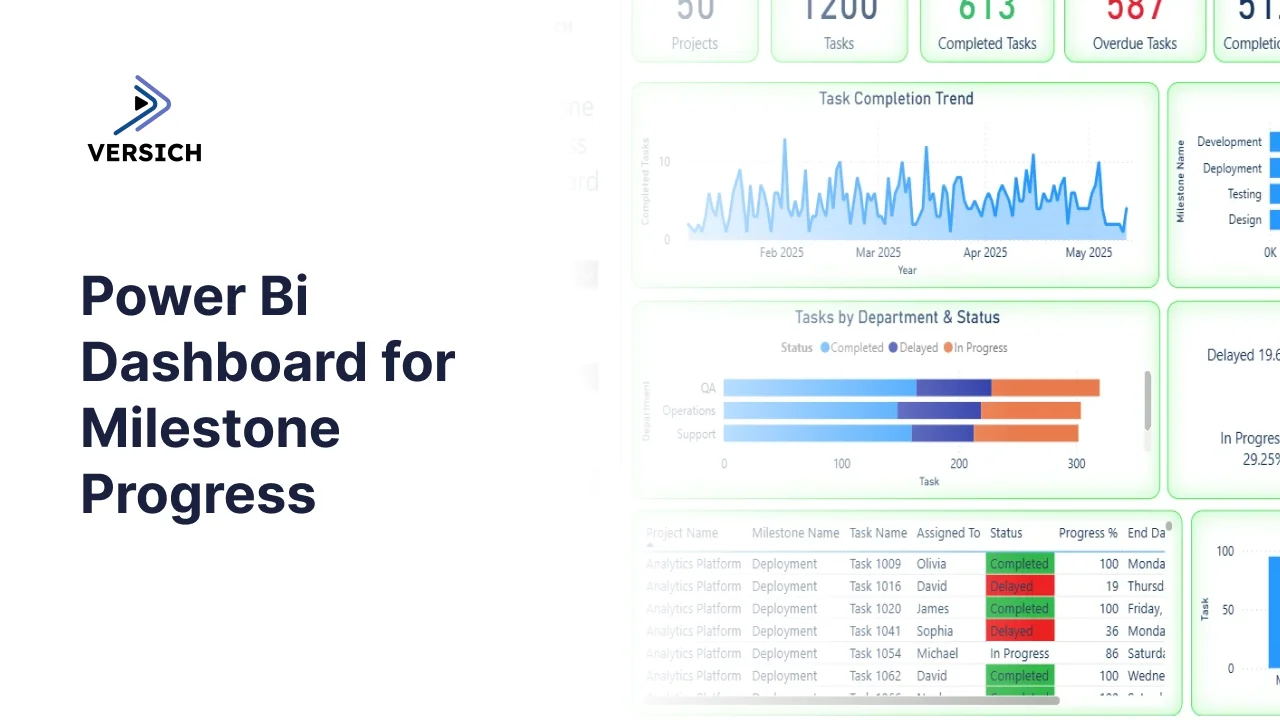
What is a Milestone Progress Dashboard?
Managing 50 projects simultaneously means milestone deadlines are slipping through the cracks somewhere every single week. Tasks get delayed, overdue counts build up quietly, and by the time leadership asks for a status update, someone is scrambling to pull data from three different tools to piece together an answer.
A milestone progress dashboard built in Power BI changes that. It tracks task completion, overdue counts, milestone progress by phase, department-level status, and top employee performance across all 50 projects in one connected view, filterable by priority, assigned person, and department so any project health question gets answered in seconds.
We built this Milestone Progress Dashboard in Power BI for project management offices, delivery leads, and operations heads who need to see where every milestone stands across every project without opening a single project management tool.
Why Milestone Tracking Falls Apart at Scale
Here is what we hear from project managers and PMO leads before they have a proper dashboard. Status updates are collected manually in weekly meetings because there is no single view of what is on track and what is delayed. Overdue tasks are discovered reactively when someone misses a deadline rather than proactively when the risk first appears. Milestone phase progress across Development, Deployment, Testing, and Design exists in project tools but is never visible in aggregate across the whole portfolio. And employee workload comparisons require pulling data from multiple sources and combining them manually.
With 50 projects and 1,200 tasks, that manual approach stops scaling almost immediately. This dashboard was built to replace it.
The Dashboard We Built
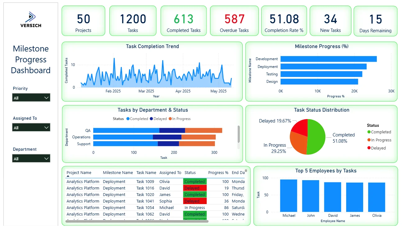
This is a single-page milestone dashboard designed for portfolio-level visibility. Three filters sit on the left panel: Priority, Assigned To, and Department. Every visual on the page updates simultaneously when any filter is applied. A PMO lead checking all High priority overdue tasks assigned to a specific department can do that in three clicks.
Here is the interactive version of the Milestone Progress Dashboard : Milestone Progress Dashboard | Project Timeline View | Versich
What the Dashboard Actually Shows
There are seven main visuals in this dashboard and each one is answering a specific question that project and delivery teams deal with every single week.
1. KPI Row Seven Numbers That Define Portfolio Health
Projects (50), Tasks (1,200), Completed Tasks (613) in green, Overdue Tasks (587) in red, Completion Rate % (51.08), New Tasks (34), and Days Remaining (15) sit across the top with colour coding that makes the urgency immediately clear. The 587 overdue tasks sitting almost level with the 613 completed tasks is the headline finding. Nearly as many tasks are overdue as have been completed, which tells you the portfolio is under significant delivery pressure. With only 15 days remaining in the current cycle and 34 new tasks still coming in, the dashboard gives leadership everything they need to decide where to intervene before the window closes.

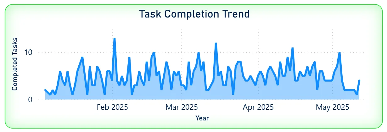
2. Task Completion Trend
The area chart tracks daily completed tasks from February 2025 through May 2025. The pattern is highly volatile with frequent spikes reaching 10 to 12 completions per day and dips close to zero. There is no sustained period of consistent high output. For a project lead, that volatility tells you completion is happening in bursts rather than at a steady pace, which is a workflow and prioritisation signal rather than a capacity issue. Understanding what triggers the spike days, specific sprint ends, deadline pressure, or team composition, helps replicate them more consistently.
3. Milestone Progress by Phase
The horizontal bar chart shows progress percentage across four milestone phases: Development leading at the highest progress value, followed by Deployment, Testing, and Design. Development being furthest along is expected in a delivery portfolio where coding typically precedes deployment and testing. Design sitting at the lowest progress level tells you either design work is being done last, which is a process concern, or design milestones have been added more recently and have had less time to progress. Seeing all four phases ranked in one bar chart makes the phase sequencing and bottlenecks visible without opening individual project records.

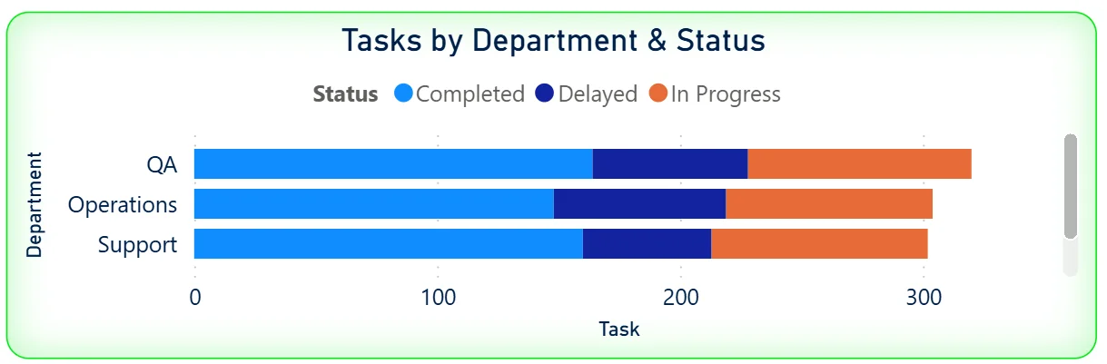
4. Tasks by Department and Status
The stacked bar chart shows three departments: QA, Operations, and Support with their tasks split by status: Completed in blue, Delayed in dark blue, and In Progress in orange. QA has the highest total task count, followed by Operations and Support. The colour distribution within each department bar shows the health of each team's workload. A department bar heavily weighted toward Delayed is the one that needs immediate attention. Cross-referencing this chart with the Priority filter tells you whether the delayed tasks in that department are High priority or can wait.
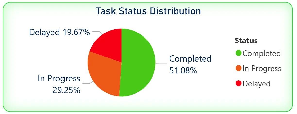
5. Task Status Distribution
The pie chart breaks the full 1,200 task portfolio into three status categories: Completed at 51.08%, In Progress at 29.25%, and Delayed at 19.67%. Just under 20% of all tasks being delayed across 50 projects is a meaningful number. For leadership, the pie chart confirms the overdue KPI at a glance. The 29.25% in-progress segment tells you nearly a third of all tasks are actively being worked on, which means the delayed 19.67% is genuinely stuck rather than simply not started.
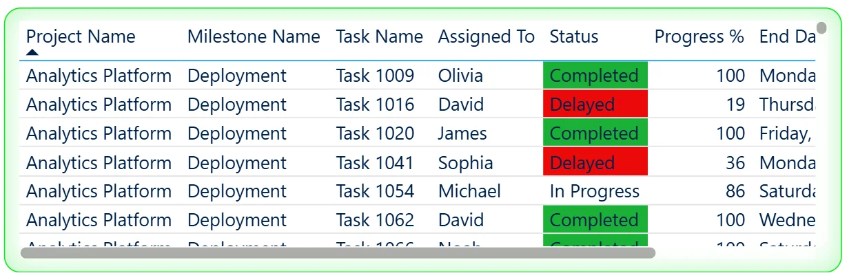
6. Task Detail Table
The table at the bottom left shows individual tasks with their project name, milestone name, task name, assigned person, status with colour coding, progress percentage, and end date. Completed tasks are highlighted green, Delayed tasks in red, and In Progress tasks shown without highlighting. The table is scrollable and filterable so a project manager can isolate all Delayed tasks in the Analytics Platform project assigned to a specific person with the end date visible to understand how far past deadline each one has slipped. The progress percentage column adds further context by showing whether a delayed task is at 19% or 86% complete.
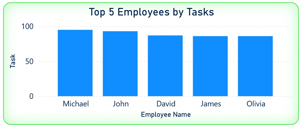
7. Top 5 Employees by Tasks
The bar chart on the bottom right ranks the five highest-task employees: Michael, John, David, James, and Olivia. Michael leads with the highest task count, followed closely by John and David. The bars are relatively similar in height across all five, meaning the top employee workload is reasonably balanced. Cross-referencing this chart with the Assigned To filter and the task detail table shows whether the employees with the highest task counts also have the highest proportion of overdue or delayed work.
How It Works Under the Hood
The dashboard connects to project management and task tracking data through a Power BI data model. DAX measures calculate completion rates, overdue counts, milestone progress percentages, and daily completion trends consistently across all 50 projects. The three filters on the left panel connect to every visual simultaneously so any priority, assignee, or department selection updates the entire dashboard in one action.
The combination of the overdue KPI, the task detail table, and the department status chart is designed to work together. The KPI tells you the scale of the problem. The department chart tells you which team it is concentrated in. The detail table tells you exactly which tasks, assigned to whom, with what end date. All three are needed to move from awareness to action.
Business Benefits
What changes when your team has this dashboard
- PMO leads see portfolio health across 50 projects in one screen rather than receiving status updates from 50 project managers separately.
- The 587 overdue tasks are visible by department, priority, and assignee so escalation decisions are targeted rather than blanket.
- Milestone phase progress across Development, Deployment, Testing, and Design is trackable at the portfolio level without opening individual project records.
- The task detail table with colour-coded status lets any team lead filter to their overdue tasks and see end dates in one scrollable view.
- The top 5 employees chart surfaces workload concentration so resource rebalancing decisions are made on data rather than perception.
- With 15 days remaining visible in the KPI, every team knows the window and can prioritise accordingly without a separate deadline communication.
Strategic Advantages for PMO and Delivery Leaders
Beyond the weekly standup improvements, having this kind of milestone dashboard available over sprints and quarters starts to change how PMO and delivery leaders make longer term decisions.
When you can see that the Delayed segment in the task status pie chart sits consistently around 19% to 20% across every reporting cycle, you know the delay rate is structural rather than project-specific and the root cause investigation needs to happen at the process level rather than the individual project level. When the milestone progress chart consistently shows Design trailing all other phases, you can address design resourcing or process sequencing before it becomes the bottleneck that delays every subsequent phase. When the task completion trend shows consistent spikes at the end of every sprint period and near-zero completions mid-sprint, you can restructure work distribution to smooth output rather than creating pressure-driven delivery cycles.
This is the difference between a dashboard that shows you the current snapshot and one that helps you build a more predictable delivery operation over time. The Milestone Progress Dashboard is built to do both.
Conclusion
Managing a 50-project portfolio with 1,200 tasks is not a visibility problem if you have the right dashboard. It becomes a visibility problem when that data lives across multiple project tools, status updates come in through weekly meetings, and overdue counts are discovered after deadlines have already passed.
This dashboard puts the full picture in one screen. Seven KPIs give you the portfolio headline. The completion trend shows daily output patterns. Milestone phase progress shows where each delivery stage stands. Department status shows which teams need attention. The task detail table shows exactly which tasks are delayed, who owns them, and how far past deadline they are. The top 5 employees chart surfaces workload concentration. All of it responds to three filters and updates in one click.
If your PMO is still running weekly status collection meetings or discovering overdue milestones after the fact, the data is already in your project management system. A well-built Power BI dashboard just makes it visible before decisions need to be made.