What is a Resource Allocation Dashboard?
Resource management teams and project leads are constantly trying to answer the same set of questions without a reliable way to see the answers. Are we tracking close to our estimates? Which team members are logging the most hours? How much of our total time is actually billable? Which projects are consuming hours beyond what was planned?
A resource allocation dashboard built in Power BI answers all of those questions in one place. It brings actual hours, estimated hours, variance analysis, billable ratios, and department utilisation into a connected view filterable by month and department so any resourcing question can be answered in seconds rather than through a manual timesheet export.
We built this Resource Allocation Dashboard in Power BI for operations leaders, project managers, and finance teams who need to understand where their team's time is going, how it compares to what was planned, and how much of it is generating revenue.
Why Resource Teams Are Still Flying Blind
Here is what we hear from operations and project leads before they have a proper analytics setup. Actual vs estimated hour comparisons require someone to pull timesheet exports and match them against project estimates in a spreadsheet. Billable percentage is calculated manually at month end. Which resources are over or under their estimates is unknown until a project is already over budget. And department utilisation is tracked loosely if at all.
All of that data exists in time tracking and project management tools. It just needs a dashboard that surfaces it automatically, consistently, and in a form that drives decisions rather than just records history.
The Dashboard We Built
This dashboard has two tabs because resource management has two genuinely different lenses. The Hours Analysis tab is for understanding how actual time compares to estimates across resources and projects. The Billable Analysis tab is for understanding how much of that time is revenue-generating versus overhead. Both tabs share Month and Department filters at the top so any selection updates every visual on the current tab simultaneously.
Here is the interactive version of the Resource Allocation Dashboard : Resource Allocation Dashboard | Optimize Team Output | Versich
Hours Analysis Tab - Actual vs Estimated Across Every Dimension
The first tab is built for project managers and operations leads who need to understand how actual time is tracking against estimates at the resource, project, and task type level.
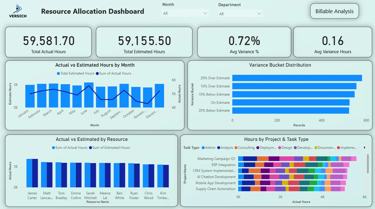
1. KPI Row Four Numbers That Define Resource Accuracy
Total Actual Hours (59,581.70), Total Estimated Hours (59,155.50), Avg Variance % (0.72%), and Avg Variance Hours (0.16) sit across the top. The gap between actual and estimated hours across the entire portfolio is less than 0.72%. That is an exceptionally tight variance at this scale of hours. For a team logging nearly 60,000 hours, being 426 hours off from the original estimate means resourcing and estimation processes are working well. The Avg Variance Hours of 0.16 tells you that at the individual record level, most tasks are coming in almost exactly on estimate.

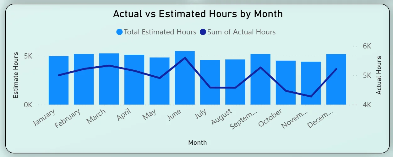
2. Actual vs Estimated Hours by Month
The combo chart plots estimated hours as bars and actual hours as a line across all twelve months. Estimated hours stay consistently around 5K per month throughout the year. The actual hours line follows closely but dips noticeably in August, September, and October before recovering in November and December. That mid-year dip in actual hours against a steady estimate baseline tells you the team was underdelivering on planned capacity during those months. For a project manager, that is the window to investigate whether it was leave, resourcing gaps, or project delays driving the shortfall.
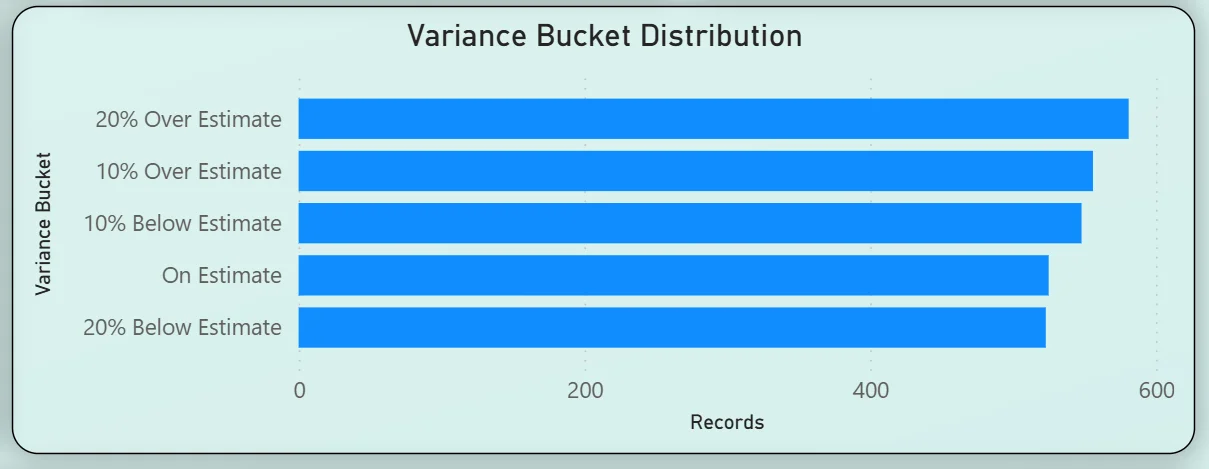
3. Variance Bucket Distribution
The horizontal bar chart categorises all records into five variance buckets: 20% Over Estimate leading with the highest record count, followed by 10% Over Estimate, 10% Below Estimate, On Estimate, and 20% Below Estimate. The fact that the 20% Over Estimate bucket has the most records means a significant portion of tasks are coming in above their original estimates even though the overall average variance is only 0.72%. That tells you the over and under estimates are largely cancelling each other out at the portfolio level but individual task estimation accuracy has room to improve. This is exactly the kind of nuance that a simple average variance KPI hides.
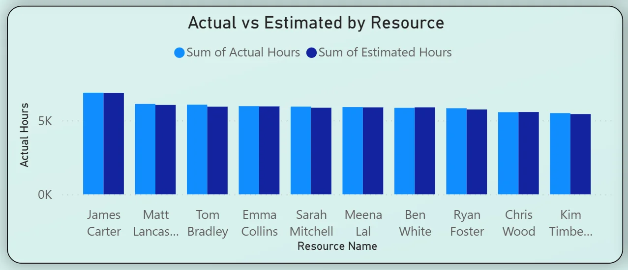
4. Actual vs Estimated by Resource
The clustered bar chart compares actual and estimated hours side by side for every team member: James Carter, Matt Lancaster, Tom Bradley, Emma Collins, Sarah Mitchell, Meena Lal, Ben White, Ryan Foster, Chris Wood, and Kim Timberlake. James Carter leads on both actual and estimated hours. Most team members show their actual hours closely matching their estimates. Any resource where the two bars are noticeably different is worth examining further using the month and department filters to understand whether the variance is concentrated in a specific period or project type.
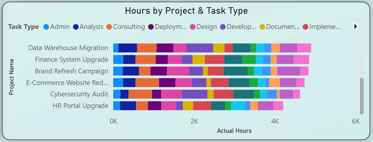
5. Hours by Project and Task Type
The stacked bar chart on the right breaks hours by project with each bar coloured by task type: Admin, Analysis, Consulting, Deployment, Design, Development, Documentation, and Implementation. Marketing Campaign Q1 leads total hours, followed by ERP Integration, CRM System Implementation, AI Chatbot Development, Mobile App Development, and Supply Chain Automation. The colour distribution within each project bar shows which task types are consuming most of the hours in each project. A project bar dominated by Admin and Documentation rather than Development and Implementation is a resourcing conversation worth having before the project reaches its delivery deadline.
Billable Analysis Tab - Understanding Revenue-Generating Time
The second tab is built for finance teams, account managers, and operations leaders who need to understand what proportion of total time is actually billable and how that splits across team members and departments.
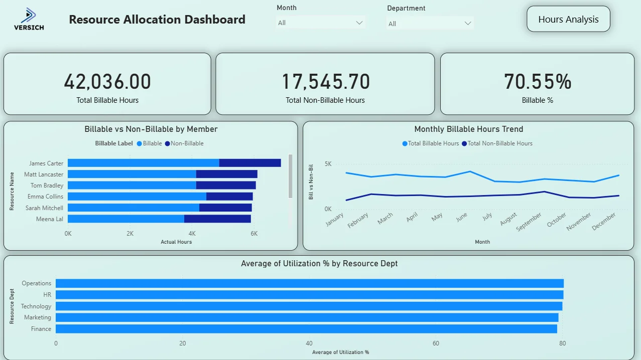
6. KPI Row Three Billability Numbers That Tell the Revenue Story
Total Billable Hours (42,036), Total Non-Billable Hours (17,545.70), and Billable % (70.55%) across the top. Of the 59,581 total hours logged, 70.55% are billable. That means roughly 3 in every 10 hours worked across the entire team is non-revenue-generating overhead. Whether 70.55% is a strong or weak billable ratio depends on the organisation's target, but having the number visible and filterable by department and month is the starting point for any conversation about improving it.

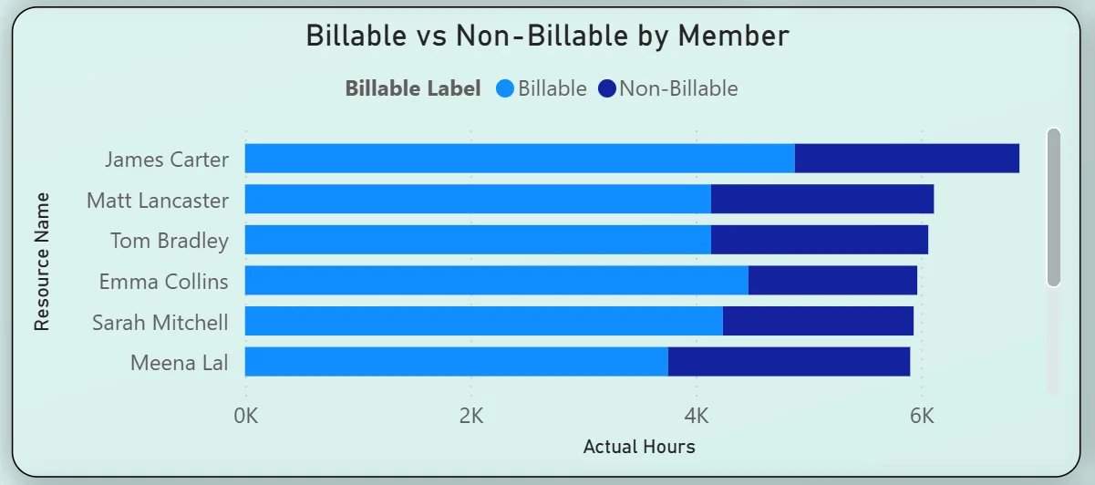
7. Billable vs Non-Billable by Member
The horizontal bar chart shows every team member with their hours split into billable (light blue) and non-billable (dark blue). James Carter has the highest total hours and a significant non-billable portion alongside his billable work. Meena Lal shows one of the more balanced splits. For a finance or operations lead, this chart immediately shows which team members are spending a high proportion of their time on non-billable activities and opens the conversation about whether that overhead is necessary or addressable. Filtering by department narrows the view to a specific team in one click.
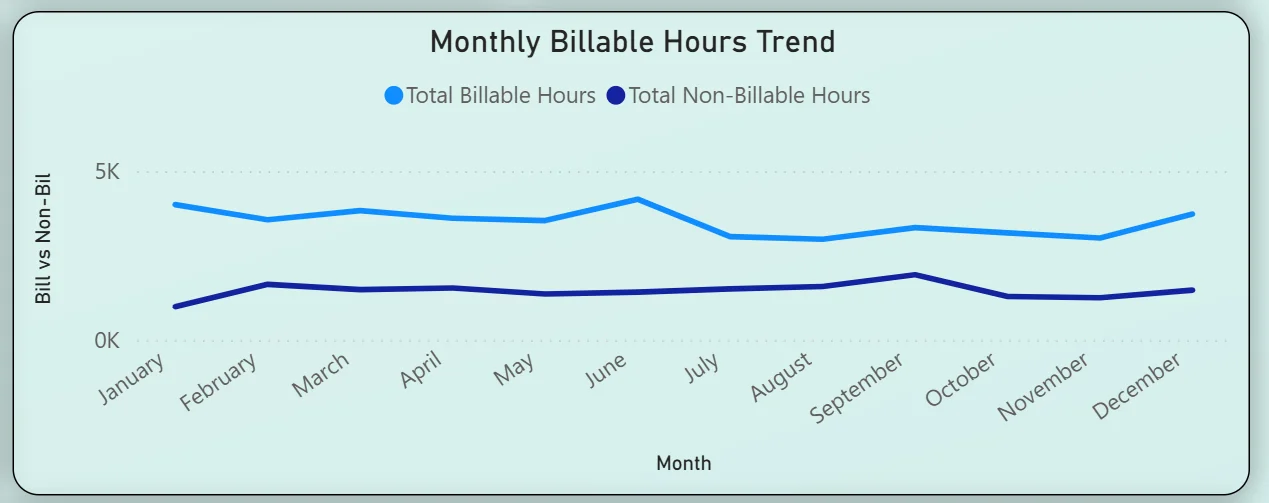
8. Monthly Billable Hours Trend
The line chart tracks total billable and total non-billable hours month by month across the full year. The billable line runs consistently around 3.5K to 4.5K per month with a noticeable peak in June and July. Non-billable hours stay relatively flat between 1K and 1.5K throughout the year. The gap between the two lines represents the billable margin for each month. June and July showing the widest gap means those months were the strongest for revenue-generating time. For planning purposes, understanding what drove those peaks helps replicate them in the following year.
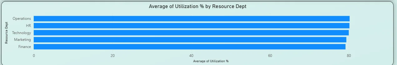
9. Average Utilisation by Resource Department
The horizontal bar chart at the bottom ranks five departments by average utilisation percentage: Operations leading at just above 80%, followed closely by HR, Technology, Marketing, and Finance. All five departments are clustered tightly between 78% and 82% utilisation. That consistency across departments tells you the organisation is running at high utilisation across the board with no single department significantly over or underloaded. For capacity planning, a uniform 80% utilisation means there is limited headroom before the team is operating at full capacity, which should inform hiring decisions before a new project intake overwhelms current resourcing.
How It Works Under the Hood
The dashboard connects to timesheet and project management data through a unified Power BI data model. DAX measures calculate variance percentages, billable ratios, and utilisation figures consistently across all resources and projects. The Month and Department filters at the top of each tab connect to every visual simultaneously so any selection updates the entire tab in one action without manual refresh.
The two tabs are designed to be read in sequence. Hours Analysis tells you where the time went and how it compared to the plan. Billable Analysis tells you how much of that time generated revenue and which departments and individuals are contributing most to billable output. Neither tab alone gives the complete picture. Both together give you the full resource story.
Business Benefits
What changes when your team has this dashboard
- Actual vs estimated variance is visible at the portfolio, project, and individual resource level without any manual timesheet reconciliation.
- The variance bucket chart shows estimation accuracy distribution so improvement targets can be set at the task type level.
- Billable percentage is tracked monthly so dips are spotted and investigated before they affect revenue targets.
- Department utilisation is visible across all five teams simultaneously so capacity planning is proactive rather than reactive.
- Individual billable vs non-billable splits surface overhead patterns that would otherwise stay hidden in aggregated time totals.
- Project-level task type breakdowns show where hours are going within each project so resourcing conversations are specific rather than general.
Strategic Advantages for Operations and Finance Leaders
Beyond the month-to-month reporting improvements, having this kind of resource analytics dashboard available over quarters and years starts to change how operations and finance leaders make longer term decisions.
When you can see that all five departments are consistently running at 80% utilisation across every month in the utilisation chart, you know that taking on a new major project without additional headcount is a risk rather than a capacity question. When the variance bucket chart consistently shows more records in the 20% Over Estimate bucket than On Estimate, you know your estimation process needs recalibration rather than your delivery team needing to work faster. When billable percentage dips in the same two months every year, you can plan non-billable investment activities for those periods rather than treating the dip as a problem to solve.
This is the difference between a dashboard that closes out timesheets and one that drives resourcing strategy. The Resource Allocation Dashboard is built to do both.
Conclusion
Resource management teams are not short of timesheet data. They are short of a way to see actual vs estimated hours, variance patterns, billable ratios, and utilisation rates all in one connected view that updates when they need it rather than at month end.
This dashboard provides that across two tabs. Hours Analysis gives you the full picture of where time went versus where it was planned to go, down to the resource, project, and task type level. Billable Analysis shows you how much of that time is generating revenue and which departments have room to improve their billable ratio. Both respond to the same Month and Department filters and draw from the same underlying data model.
If your team is still reconciling timesheets manually or discovering over-budget projects after the fact, the data is already in your time tracking system. A well-built Power BI dashboard just makes it usable before decisions need to be made rather than after.