
What is a Gantt Chart Dashboard?
A Gantt chart is one of the oldest tools in project management for a reason. Seeing tasks laid out on a timeline, knowing who owns what, and understanding which tasks are running late versus on schedule is information that no status report can communicate as quickly as a visual timeline.
A Gantt Chart Dashboard built in Power BI takes that concept further. It combines the visual timeline with KPI cards, status distribution charts, project and category breakdowns, assignee workload comparisons, and a detailed task table all in one connected dashboard. Every filter you apply updates every visual simultaneously so you can drill from the portfolio overview to a single assignee's overdue tasks in seconds.
We built this Gantt Chart Dashboard in Power BI for project managers, delivery leads, and PMO offices who need to see task timelines, workload distribution, and completion rates across 2,050 tasks without opening a separate project management tool for each project.
Why Project Teams Still Struggle with Timeline Visibility
Here is what we hear from project managers before they have a proper timeline dashboard. Task deadlines are tracked in spreadsheets that only one person maintains. Overdue tasks are discovered in standups rather than before they slip. Assignee workload comparisons require pulling individual task lists for each team member. And when a stakeholder asks how the Delta project is tracking against Gamma, someone has to open two separate project tools to find out.
With 2,050 tasks across five projects and four categories, that manual approach means the team is always reacting rather than planning. This dashboard was built to change that.
The Dashboard We Built
This single-page dashboard was designed for project teams who need timeline visibility, status tracking, and workload distribution all in one view. Four filters sit on the left panel: Project Name, Category, Status, and Assignee. The Clear All Slicers button resets everything instantly. Every visual on the page updates simultaneously when any filter is applied so drilling from portfolio level to a specific assignee's overdue tasks takes three clicks.
Here is the interactive version of the Gantt Chart Dashboard : Gantt Chart Dashboard | Visual Project Timelines | Versich
What the Dashboard Actually Shows
There are seven main visuals in this dashboard and each one is answering a specific question that project teams deal with every single week.
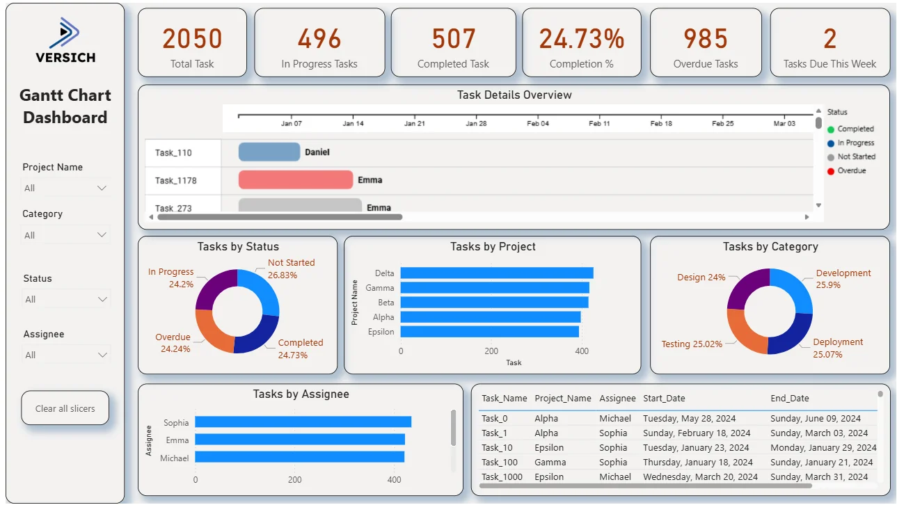
1. KPI Row Six Numbers That Tell You Where the Portfolio Stands
Total Task (2,050), In Progress Tasks (496), Completed Task (507), Completion % (24.73%), Overdue Tasks (985), and Tasks Due This Week (2) sit across the top in orange. The most urgent number here is 985 overdue tasks. That is nearly half the entire portfolio sitting past its deadline. Alongside a completion rate of only 24.73%, the dashboard is telling you this portfolio has a significant delivery challenge that needs immediate attention. Tasks Due This Week being only 2 tells you the immediate horizon is manageable even if the overall overdue count is high.
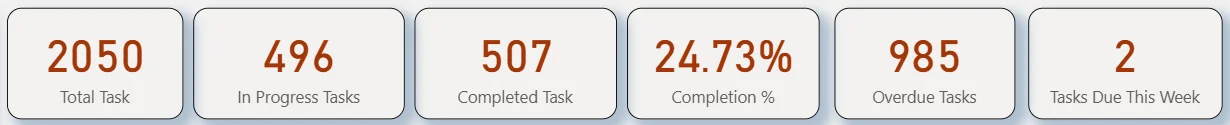
2. Gantt Chart Task Details Overview
The Gantt chart is the centrepiece of this dashboard. Each row represents a task, each bar represents its timeline from start date to end date, and the colour tells you the status: blue for In Progress, red for Overdue, grey for Not Started, and green for Completed. Task_110 assigned to Daniel shows a blue In Progress bar spanning from early January to mid-January. Task_1178 assigned to Emma shows a red Overdue bar, meaning it has passed its end date without being completed. Task_273 assigned to Emma shows a grey Not Started bar. The timeline scrolls horizontally across weeks so you can see which tasks are clustered together and which ones are causing scheduling conflicts. No other visual in the dashboard communicates deadline pressure as immediately as this chart.
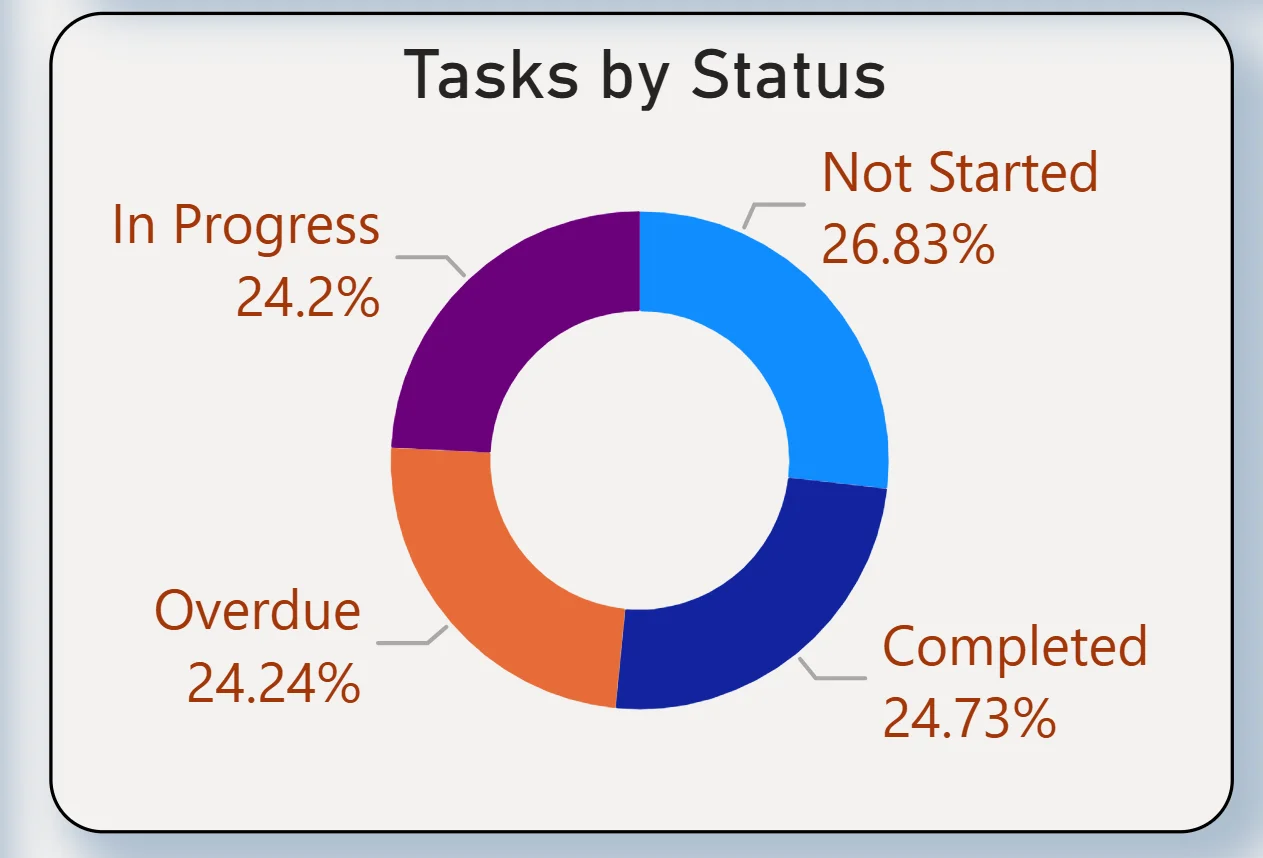
3. Tasks by Status Donut
The donut chart breaks the full 2,050 tasks into four status categories: Not Started at 26.83%, Overdue at 24.24%, In Progress at 24.2%, and Completed at 24.73%. The four segments are almost perfectly equal, which tells you tasks are spread across every status at nearly the same proportion. One quarter of all tasks being overdue matches the 985 KPI figure. One quarter not yet started means a significant volume of work has not been picked up. For a project leader, this chart raises the question of whether Not Started tasks are scheduled for future periods or whether they represent scope that has been delayed without formal acknowledgement.
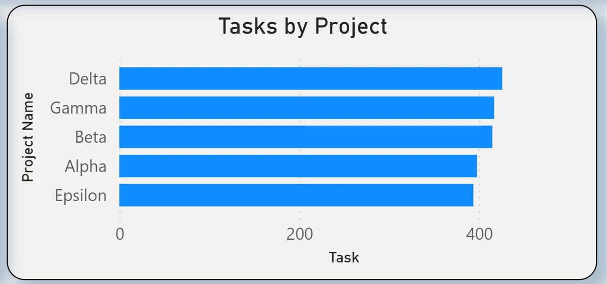
4. Tasks by Project
The horizontal bar chart ranks five projects by total task count: Delta leading, followed by Gamma, Beta, Alpha, and Epsilon with the smallest task count. Delta carrying the most tasks makes it the largest project in the portfolio and the one with the most delivery exposure if the overdue rate applies proportionally. Filtering by Status to show only Overdue and then reading this chart tells you whether the overdue problem is concentrated in Delta or distributed evenly across all five projects.
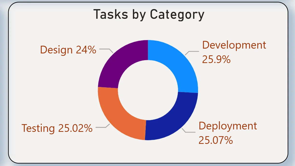
5. Tasks by Category
The donut chart breaks tasks across four categories: Development at 25.9%, Deployment at 25.07%, Testing at 25.02%, and Design at 24%. The distribution is almost perfectly even across all four categories with less than two percentage points separating the highest from the lowest. For a delivery lead, this even spread means no single delivery phase is disproportionately loaded relative to others. Cross-referencing with the Status filter shows whether overdue tasks are concentrated in one category or spread proportionally.
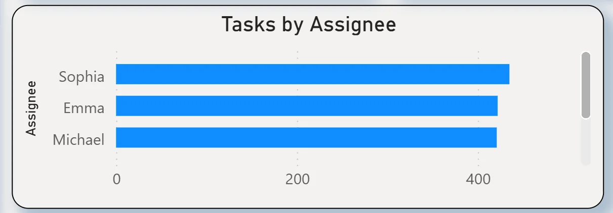
6. Tasks by Assignee
The horizontal bar chart ranks three assignees by total task count: Sophia leading, followed by Emma and Michael with similar counts. All three are close in total volume, meaning the workload is relatively balanced at the top level. However, total task count alone does not tell you whether one assignee has a higher proportion of overdue tasks than others. Selecting Overdue in the Status filter and reading this chart immediately shows which assignee is carrying the most overdue work rather than just the most total work.
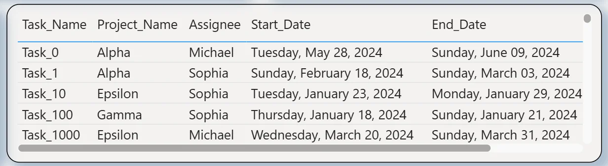
7. Task Detail Table
The table at the bottom right shows every task with its task name, project name, assignee, start date, and end date. Task_0 assigned to Michael on the Alpha project ran from 28 May 2024 to 9 June 2024. Task_1 assigned to Sophia on Alpha ran from 18 February 2024 to 3 March 2024. The start and end date columns make the timeline information from the Gantt chart searchable and filterable. A project manager wanting to find all tasks that ended before a specific date and are still showing as In Progress can do that by combining the Status filter with the date information in this table.
How It Works Under the Hood
The dashboard connects to project task data from project management tools or structured exports through a Power BI data model. The Gantt chart visual renders task bars based on start date and end date fields with status-based colour coding applied through DAX conditional formatting. The four filters on the left panel connect to every visual simultaneously including the Gantt timeline, so filtering to a specific assignee or project updates the timeline bars as well as all supporting charts in one action.
The Gantt chart and the task detail table are designed to work together. The Gantt gives you the visual timeline pattern and immediately surfaces scheduling conflicts and overdue bars. The table gives you the exact dates and assignee information for any task you want to investigate further. Both together replace the need to open individual project records in a separate tool.
Business Benefits
What changes when your team has this dashboard
- Weekly project reviews start with the Gantt timeline already showing which tasks are overdue and who owns them rather than being compiled from individual status updates.
- The 985 overdue tasks are filterable by project, category, and assignee so escalation conversations are targeted rather than general.
- The Gantt chart makes scheduling conflicts visible across assignees so resource clashes are spotted before they cause delays rather than after.
- Tasks Due This Week being visible in the KPI means the immediate horizon is always clear without anyone having to check individual project tools.
- The assignee workload chart shows which team members are carrying the most tasks so rebalancing decisions are made on data rather than perception.
- The four category donuts confirm whether overdue tasks are concentrated in Development, Deployment, Testing, or Design so the right team leads are brought into the resolution conversation.
Strategic Advantages for Project and Delivery Leaders
Beyond the weekly standup improvements, having a Gantt Chart Dashboard available over sprints and quarters changes how delivery leaders make longer term planning decisions.
When the Tasks by Status donut consistently shows Not Started sitting at 26% across every reporting period, you know scope is being added faster than capacity can absorb it and the project intake process needs adjustment rather than the delivery team needing to work faster. When the Gantt timeline consistently shows the same assignee carrying overdue bars across multiple sprints, you know that is a capacity or dependency issue for that specific person rather than a general team performance problem. When the Tasks by Category donut shows Testing overdue at a higher rate than Development sprint after sprint, you know test environment availability or QA resourcing is the bottleneck rather than development velocity.
This is the difference between a dashboard that shows you what is overdue today and one that helps you build a more predictable delivery cadence over time. The Gantt Chart Dashboard is designed to do both.
Conclusion
A Gantt chart in a spreadsheet tells you what was planned. A Gantt Chart Dashboard in Power BI tells you what is actually happening, who is behind, which projects are under pressure, and where the workload is concentrated, all in one filterable screen.
With 2,050 tasks, 985 overdue, and a 24.73% completion rate, this dashboard gives project leads the full picture in seconds. The Gantt timeline shows the schedule visually. The status donut confirms the proportion breakdown. The project and category charts show where the problems are concentrated. The assignee chart shows who is carrying the most load. The task detail table gives you the exact dates for any task you need to investigate.
If your team is still discovering overdue tasks in standups or trying to track 2,000 tasks across five projects in a spreadsheet, the data is already in your project management system. A well-built Power BI Gantt dashboard just makes it visible and actionable.