
Power BI healthcare dashboards are essential tools for visualising data in the medical field. These dashboards consolidate clinical, operational, financial, and marketing data into a structured view. Each team typically has dedicated dashboards that transform complex healthcare data into actionable insights. At Versich, we are committed to building powerful healthcare dashboards for various entities, including pharmaceutical companies, hospitals, care homes, and medical device manufacturers. Our dashboards support needs like executive reporting, operational control, referral tracking, reimbursement protection, service profitability analysis, and patient-level monitoring.
In this article, we present 12 real examples of healthcare dashboards created using Power BI, Looker Studio, and custom-coded solutions. Each dashboard showcases how structured analytics enhances financial visibility, improves operational processes, and fosters better patient outcomes across the healthcare landscape.
Benefits of Healthcare Dashboards
Healthcare dashboards offer far more than mere reporting capabilities. When crafted effectively, they serve as decision-support systems that integrate finance, operations, clinical care, and marketing into one cohesive view. Here are the key benefits consistently observed across pharmaceutical companies, hospitals, care homes, and medical device manufacturers:
Improved Executive Visibility - Healthcare dashboards consolidate revenue, costs, referrals, utilization, and patient metrics into one structured view. Executives can quickly pinpoint underperformance, revenue shortfalls, or cost overruns without sifting through multiple disconnected reports.
Stronger Financial Control - OpEx, service profitability, and LUPA monitoring dashboards empower finance teams to track margins and reimbursement risks in real time. Leadership can take prompt action to protect profitability.
Better Operational Coordination - Dashboards help care homes, hospitals, and home health agencies to track visits, overtime, referrals, and staffing levels, reducing manual reconciliation and enhancing everyday planning across departments.
Faster Clinical Decision-Making - Patient-level dashboards provide clinicians structured insights into device usage, compliance, and health metrics. This enables early detection of irregularities for timely adjustments to treatment plans.
Reduced Manual Reporting - Many dashboards have replaced Excel-based or manual consolidation tasks. Automated data refresh capabilities minimize administrative overhead and decrease the likelihood of reporting errors.
Stronger Referral and Growth Management - Referral dashboards aid hospitals and healthcare providers in monitoring patient origins and bolstering ties with high-performing doctors or branches, enabling sustainable patient growth.
Enhanced Cost and Overtime Control - Overtime and operational expense dashboards allow HR and operations teams to spot seasonal spikes and budget deviations, facilitating better workforce planning without compromising patient care.
Data-Driven Marketing Optimization - Healthcare marketing dashboards provide clinics with insights into which channels drive the most inquiries and highest-quality leads, enabling smarter budget allocation and campaign optimization.
Enhanced Device and Patient Compliance Monitoring - Medical device dashboards track compliant vs. non-compliant patients and their recent activity. This aids manufacturers and care teams in managing engagement risks proactively.
Scalable and Flexible Reporting Options - Built in Power BI, Looker Studio, or custom-coded, healthcare dashboards can be adjusted to fit internal reporting, external stakeholder sharing, or interactive clinical use cases.
Power BI Healthcare Dashboard Examples
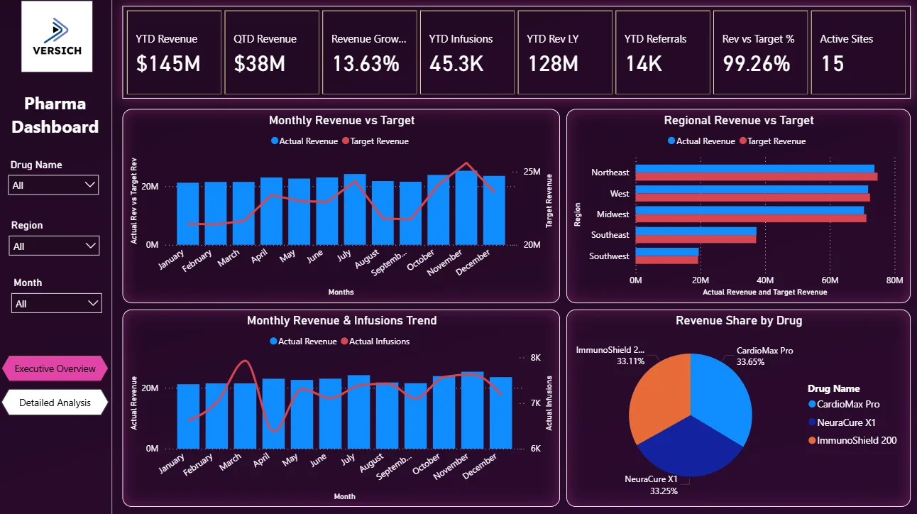
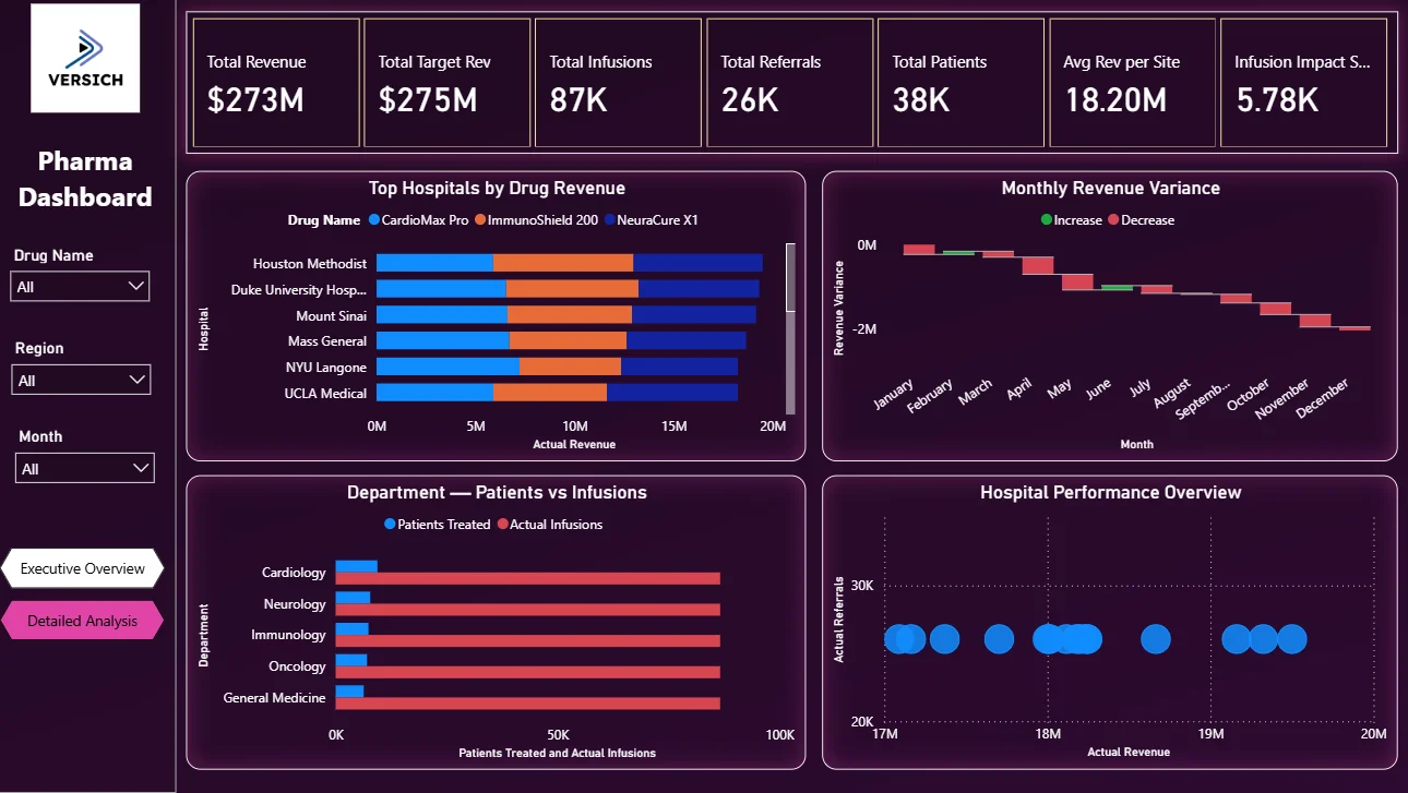
Here is the interactive version of the Pharma Dashboard : Pharma Dashboard | Power BI Pharmaceutical Analytics by Versich
Most healthcare dashboards are created by our employ Power BI due to its suitability for internal data analysis and the need for sharing insights with finance teams, operations managers, and executives. The platform is designed with secure reporting capabilities for organizations.
Additionally, we have developed mobile-optimized Power BI dashboards, allowing doctors to access patient insights on-the-go. This functionality makes it easy to check key metrics without needing to be at a desktop. Power BI's automated data refresh ensures stakeholders always have the latest information. With costs starting at $14 per user per month, it's an affordable choice for healthcare organizations of all sizes. However, it is crucial to note that Power BI serves purely as a visualisation tool; it does not allow clinicians to input or modify patient data directly within the dashboard.
Power BI Pharma Sales Dashboard
Our Power BI pharma sales dashboard offers executives a comprehensive view of commercial performance. It is tailored for CEOs, Supply Chain Managers, and Financial Leaders who need rapid insights into revenue patterns, infusion activities, and target achievement. Instead of combing through multiple reports, leadership can view overall performance metrics on a single screen.
Our consultants developed this executive overview dashboard for a healthcare client that required consolidation of sales and infusion data. Key performance indicators such as YTD Revenue, QTD Revenue, YTD Infusions, and Total Infusions are prominently displayed for quick assessment. The dashboard features line charts that illustrate infusion and referral trends over time, along with visuals comparing actual vs. target figures.
This dashboard streamlines structured executive processes including monthly sales assessments and quarterly goal tracking. Previously reliant on static Excel reports, leadership teams found it difficult to detect underperformance proactively. Now, they can identify revenue shortfalls or declining infusion trends swiftly and take corrective measures before the reporting cycle closes.
Power BI Pharma OpEx Dashboard
The Power BI Pharma OpEx Dashboard is designed for pharmaceutical and biotechnology organizations to manage operational expenses associated with drug production. It primarily serves CFOs, Finance Directors, and Operations Managers who need insight into costs related to laboratory operations and outsourced processes-essential for maintaining profit margins.
We crafted this OpEx dashboard for a biotechnology firm involved in drug manufacturing. It monitors operational expenses across multiple time frames, including prior month-to-date and year-to-date, segmented by laboratory, project, and expense category. Monthly reviews become straightforward and efficient, allowing finance teams to quickly ascertain which labs are exceeding budgets and whether cost increases are temporary or indicative of a trend.
Before implementing this dashboard, expense analysis involved tedious manual data gathering from various systems. Now, leadership can identify budget deviations earlier to make more informed production and expenditure choices, ultimately shielding profit margins via precise cost control.
Power BI Pocket Dashboard for Hospitals & Care Homes
Our Power BI Pocket Dashboard gives doctors and facility management teams a streamlined, mobile-friendly view of patient care metrics. Ideal for medical staff needing rapid access during rounds or planning meetings, this dashboard ensures essential appointments are not overlooked and care standards remain high.
Our BI consultants tailored this dashboard for a care home to monitor key patient engagement indicators. It tracks attendance for crucial medical visits and displays monthly trends, allowing users to filter data by ward, unit, or duration.
With this transformation, doctors can quickly identify which residents missed appointments and follow up during clinical discussions. Facility managers gain insights into scheduling patterns, enabling them to spot and remedy communication gaps effectively. Previously reliant on manual record checks, now teams have immediate visibility that fosters compliance, enhances coordination, and preserves patient quality care.
Power BI Hospital Referrals Dashboard
The Power BI Hospital Referrals Dashboard enables hospitals to track incoming patient sources and fortify referral relationships. Business development teams and physician leads utilize this dashboard to analyze referral patterns to streamline patient growth.
We designed this dashboard for a U.S.-based hospital to provide a transparent overview of referral activity. The top section showcases total referrals by branch using bar charts, facilitating performance comparisons. Below, the dashboard details internal referrals by doctor and external referrals by physician, including metrics on referral sources (like hospital transfers) and insurance types.
By using this data-rich tool, branch managers can identify which physicians generate the most referrals, ensuring stronger cooperation. Business development teams are empowered to address underperforming branches proactively, enhancing external outreach for patient growth. Earlier methods that relied on manual reporting are now upgraded to real-time monitoring, thereby fostering sustainable patient inflow.
Power BI Hospital LUPA Dashboard
Our Power BI Hospitals LUPA Dashboard allows home health agencies to track Low Utilization Payment Adjustments (LUPA) under the PDGM model. This dashboard caters to operations managers and finance teams searching for insight into visit thresholds during each payment cycle, as LUPA impacts reimbursement directly.
Our consultants created this dashboard for a healthcare provider in the U.S. to monitor LUPA occurrences organization-wide. Users can filter data monthly to assess performance and identify branches with higher LUPA rates, detecting trends efficiently.
This dashboard underpins three key functions: from a financial angle, leadership gains visibility into lost bundled payments; from a compliance standpoint, early detection of recurring LUPA patterns minimizes audit risk; and clinically, managers can explore potential impacts on patient outcomes from missed visits. Previously, LUPA tracking depended on manual reconciliations of visit logs and billing records. Now, the organization can preemptively manage visit planning to safeguard reimbursement and maintain standards.
Power BI Healthcare Service Profitability Dashboard
The Power BI Healthcare Service Profitability Dashboard offers healthcare providers insights into revenue performance across clinical services. Aimed at finance teams, this tool provides a clear view of the relationship between billed and received payments over time.
Our BI developers designed this dashboard to analyze labor revenue, breaking down billed and paid amounts by month and week. This allows leadership to monitor trends and swiftly identify discrepancies between invoiced amounts and actual payments. The dashboard provides a normalized monthly revenue trend to ensure reliable comparisons across varying month lengths.
By using this structured insight, managers can understand which services yield the highest revenue and how payments correspond. Prior to this solution, labor revenue analysis required laborious manual reconciliations. Teams can now effectively track service performance and unearth trends influencing profitability.
Power BI Hospital Service Profitability Dashboard
Our Power BI Hospital Service Profitability Dashboard presents a clear overview of profitability at both the patient and service levels. It assists finance managers and facility administrators in understanding labor costs related to margins effectively.
We developed this dashboard to summarize total patients, billed amounts, overall profit margin, and total profit succinctly. It features a detailed table that breaks down hours worked, billed rates, payment rates, and margins by patient and worker.
Facilitating instant insights, this dashboard enables users to filter data by patient, discipline, procedure, and facility, thereby helping managers identify charge expectations and confirm billing details. Previously, profitability evaluations required time-consuming manual data integration; now, users can quickly access comprehensive data to make educated staffing and pricing decisions, ensuring overall profitability.
Power BI Doctor Overtime Dashboard
The Power BI Doctor Overtime Dashboard helps facilities manage overtime costs while ensuring adequate patient coverage. Specifically designed for HR and finance leaders, it provides insights into how overtime influences labor budgets, which is crucial in the healthcare setting.
Our data visualisation consultants constructed this dashboard to visually represent overtime spending through detailed bar charts. This enables leadership to recognize seasonal patterns and identify months with elevated overtime costs, categorized into patient-paid and hospital-paid overtime for clarity on financial responsibility.
With additional insights, including overtime tracked by patient, managers can evaluate which assignments incur extra hours. Filtering options enable users to scrutinize trends across departments or specific roles. Prior to this solution, overtime analysis involved tedious payroll reconciliations. Now, management can monitor overtime drivers in real-time, improving work distribution and preserving budgetary constraints while delivering quality patient care.
Looker Studio Healthcare Dashboards
We had also developed numerous healthcare dashboards in Looker Studio, primarily for app usage analytics. In our experience, Looker Studio excels when tracking mobile app data sourced from Firebase. We pull this data into BigQuery and visualize it via Looker Studio, establishing an efficient reporting pipeline. The seamless integration among these Google products supports stable and effective data management.
Moreover, we have crafted Looker Studio dashboards that serve marketing agencies tasked with reporting results to healthcare clients. The advantage of Looker Studio is that sharing reports does not necessitate paid viewer licenses, facilitating external distribution of insights easily to clients, partners, or investors. This added versatility makes Looker Studio an excellent choice for outward-facing healthcare reporting.
Patient Health Distribution Dashboard
The Patient Health Distribution Dashboard is engineered to provide healthcare professionals a real-time view of their patient demographics. Suitable for teams collecting clinical data via mobile apps, this dashboard helps physicians efficiently understand patient distribution and health status.
Ourcustom-built this solution, utilizing data captured through mobile applications tracked via Firebase and visualized in Looker Studio. The dashboard presents patient breakdowns through pie charts focused on key medical indicators, like hemoglobin levels and various oncology-related metrics.
By offering an interactive view of patient data, the dashboard supports rapid clinical assessments and better workload management. Healthcare professionals can prioritize based on current health indicators, leading to improved decision-making and more consistent patient care.
Healthcare Marketing Dashboard
The Healthcare Marketing Dashboard helps clinics and healthcare providers decipher how digital marketing translates into patient inquiries. Relevant for practices relying heavily on online campaigns, this dashboard enables marketing managers to monitor call volumes, lead quality, and overall channel performance.
Our Looker Studio consultants crafted this dashboard specifically for dental clinics by integrating data from CallRail. The top section analyses daily trends across total calls, answered calls, and average call durations, while below, individual call statuses are categorized by answered, missed, voicemail, and first-time calls.
The lower segment evaluates marketing channel effectiveness, comparing total inquiries and call performance across sources. This insight empowers the marketing team to identify which channels yield the highest number of engaged leads, making budget allocations and campaign optimizations more data-driven.
Custom Healthcare Dashboards
For specific needs, we had developed fully custom dashboards using ReactJS, CSS, and Bootstrap. This approach entails substantial front-end and back-end development, offering unmatched flexibility in functionality and user experience, albeit at a higher cost compared to standard BI solutions.
Custom-built dashboards are ideal when current BI tools don't meet design, interactivity, or workflow requirements. For example, if direct data entry or strict branding adherence is necessary within the application, a fully coded solution will suffice.
This method allows for total control over layout, navigation, user permissions, and data handling. Though development may take longer, it offers healthcare organizations a platform tailored precisely to their unique operational, commercial, and clinical needs.
Patient Summary Dashboard
The Patient Summary Dashboard offers healthcare professionals a concise overview of patient engagement and device utilization. This tool is intended for operational and clinical teams needing to monitor whether devices actively transmit data and patient compliance rates over time.
Our consultants designed this dashboard for a medical device manufacturer whose sensors gather health data from patients. It tracks the number of compliant versus non-compliant patients, counting a patient as non-compliant if no data is received for seven consecutive days post-registration. Trends on total and compliant patients are calculated monthly to monitor usage effectively.
This detailed view helps healthcare organizations identify early signs of engagement risks, enabling timely follow-ups. By continually tracking compliance and activity, teams can quickly detect inactive devices and address various issues impacting patient care.
Patient Health Indicator Dashboard
The Patient Health Indicator Dashboard is crafted to assist clinicians in monitoring detailed health metrics for patients using connected devices. It is designed for care teams seeking session-level visibility to evaluate both patient conditions and device performance.
Our team developed this dashboard for the same medical device manufacturer, allowing clinicians to select individual patients and review all logged device sessions. Key metrics like session duration and leak rates are tracked, along with vital health indicators, such as respiration rates and Apnea-Hypopnea Index values.
By grouping metrics into an interactive platform, this dashboard fosters precise evaluations and follow-up decisions. Combining device performance data with health indicators allows clinicians to swiftly identify irregularities, evaluate therapy efficacy, and adapt treatment plans accordingly. This tool effectively turns complex respiratory data into a practical instrument for ongoing patient management.
Need Help Designing Healthcare Dashboards?
Healthcare dashboards are no longer optional. From tracking pharmaceutical sales to managing operational expenses, enforcing effective referral management, and monitoring patient health, structured analytics empowers healthcare organizations to operate with clarity and confidence. When finance teams, clinicians, and leadership access reliable data, decisions can be made faster, risks are identified earlier, and overall performance improves.
If you're prepared to enhance visibility into your data, optimize operations, or gain deeper insights into patient information, contact us today to discuss your objectives.