What is a Risk Issue Dashboard?
Every project carries risk. The problem is not the risk itself but whether your team can see it clearly enough to act on it before it becomes an issue that derails a deadline, blows a budget, or escalates to leadership at the worst possible moment.
A risk issue dashboard built in Power BI changes that. It tracks 1,200 risks across High, Medium, and Low levels, monitors issue resolution rates, surfaces overdue issues by department, and plots impact against probability in a scatter chart so risk prioritisation is data-driven rather than based on whoever shouts loudest in the meeting.
We built this Risk Issue Dashboard in Power BI for project managers, risk leads, and PMO offices who need to see the full risk and issue landscape across all projects in one place, filterable by month, probability, and assigned person simultaneously.
Why Risk Management Breaks Down Without the Right Visibility
Here is what we hear from project leads and risk managers before they have a proper dashboard. High risks are tracked in a spreadsheet that one person maintains and nobody else looks at consistently. Issue resolution rates are unknown until a project retrospective. Overdue issues are discovered when someone escalates rather than when they first slip past their due date. And when leadership asks which department is carrying the most risk, the answer takes two days to pull together.
With 1,200 risks across multiple projects, departments, and assignees, manual risk tracking stops working almost immediately. This dashboard was built to replace it.
The Dashboard We Built
This dashboard has two tabs because risk management has two distinct workflows. The Risk Overview tab is for understanding the risk landscape across the portfolio. The Issue Tracking tab is for managing active issues, overdue items, and resolution progress. Both tabs share Month, Probability, and Assigned To filters at the top so any selection updates every visual simultaneously.
Here is the interactive version of the Risk Issue Dashboard : Risk Issue Dashboard | Real-Time Mitigation Tools | Versich
Risk Overview Tab - The Full Risk Landscape
The first tab gives risk leads and project managers the complete picture of where risks sit across the portfolio before any issue-level conversation starts.
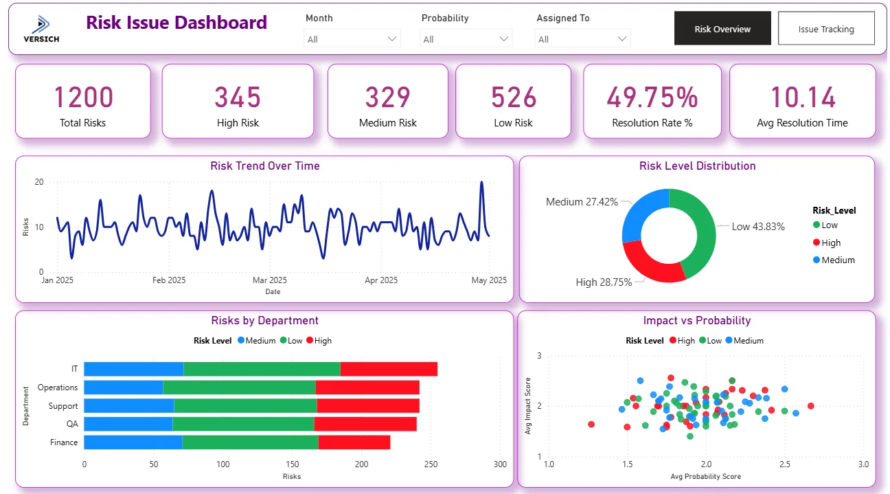
1. KPI Row Six Numbers That Define Portfolio Risk Health
Total Risks (1,200), High Risk (345), Medium Risk (329), Low Risk (526), Resolution Rate % (49.75%), and Avg Resolution Time (10.14) sit across the top. With 345 High risks representing 28.75% of the total portfolio, more than a quarter of all risks require urgent attention. The Resolution Rate of 49.75% tells you roughly half of all risks have been resolved while the other half remain open. An Avg Resolution Time of 10.14 tells you how long it is typically taking to close a risk once it is identified, which is the number to track over time as risk management processes improve.

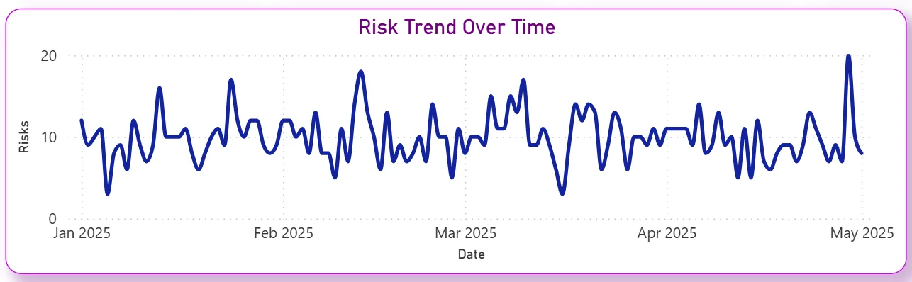
2. Risk Trend Over Time
The line chart tracks daily risk counts from January 2025 through May 2025. The trend oscillates between 5 and 20 risks per day throughout the period with a noticeable spike in late April and early May. That recent uptick tells you new risks are being identified at a higher rate than usual, which could reflect a project phase change, new project intake, or an underlying issue surfacing across multiple workstreams. For a risk manager, identifying what changed in late April is the priority question this chart raises.
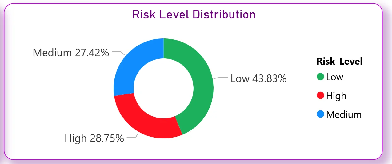
3. Risk Level Distribution
The donut chart shows the portfolio split: Low at 43.83%, High at 28.75%, and Medium at 27.42%. Low risks leading the portfolio is reassuring at first glance, but 28.75% High risk means more than one in four identified risks is in the most critical category. For leadership, the donut makes the severity distribution impossible to misread. High and Medium risks combined represent 56.17% of the total portfolio, meaning the majority of risks require active monitoring or immediate mitigation.
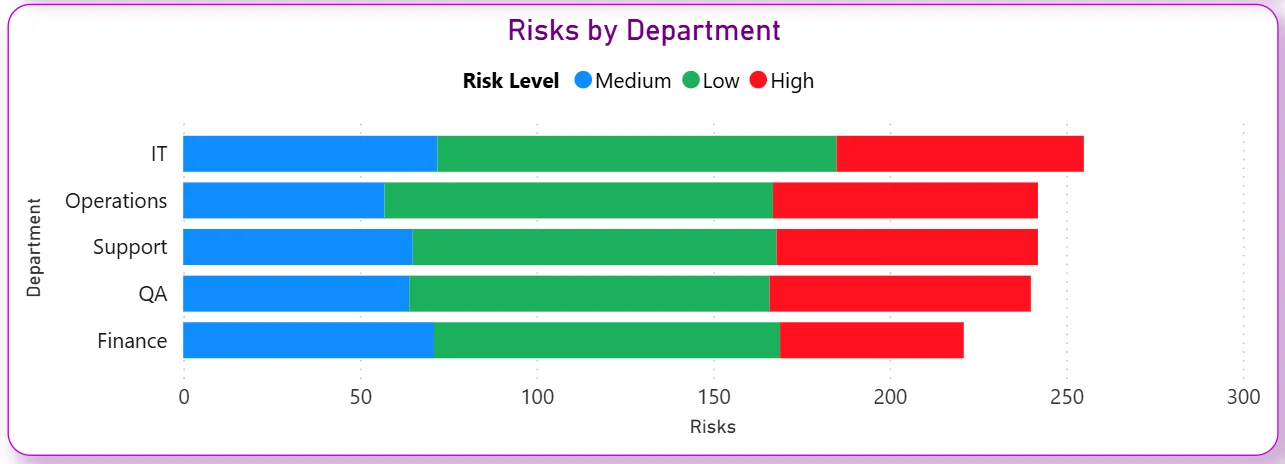
4. Risks by Department
The stacked bar chart breaks risks across five departments: IT, Operations, Support, QA, and Finance with each bar coloured by risk level Medium in blue, Low in green, and High in red. IT carries the highest total risk count, followed by Operations, Support, QA, and Finance. The red High risk segment within each department bar immediately shows which teams have the most critical exposure. IT's High risk segment being notably larger than Finance's tells you technology-related risks need the most immediate attention in the current portfolio.
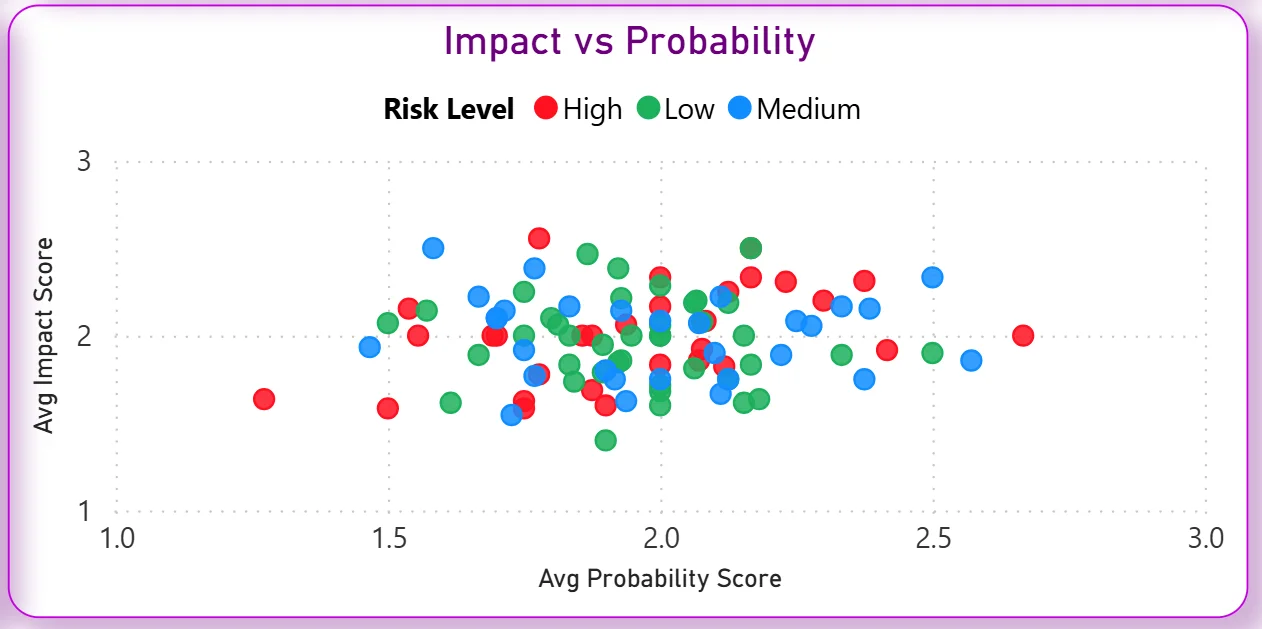
5. Impact vs Probability Scatter Chart
The scatter chart plots every risk by its average probability score on the X axis and average impact score on the Y axis, colour-coded by risk level. Risks that cluster in the top right corner, high probability and high impact, are the ones that need immediate mitigation plans. The chart immediately shows whether your High risks are genuinely high on both dimensions or whether some are high impact but low probability, which changes the mitigation approach entirely. No spreadsheet-based risk register can produce this kind of cross-dimensional view as quickly.
Issue Tracking Tab - Managing Active Issues to Resolution
The second tab is for the day-to-day management of active issues, tracking which ones are overdue, which are close to resolution, and where resolution effort needs to be concentrated across departments.
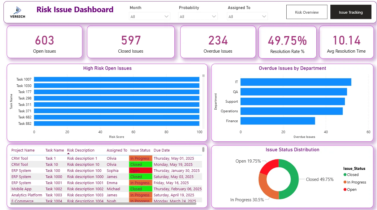
6. KPI Row Five Issue Numbers at a Glance
Open Issues (603), Closed Issues (597), Overdue Issues (234), Resolution Rate % (49.75%), and Avg Resolution Time (10.14). Open and Closed issues being almost exactly level at 603 vs 597 tells you the team is resolving issues at roughly the same rate as new ones are being opened. That near-perfect balance sounds stable but 234 overdue issues means a meaningful number of issues are not being closed within their expected timeframe. For an issue manager, overdue is more urgent than open because it represents commitment failures rather than just active work.

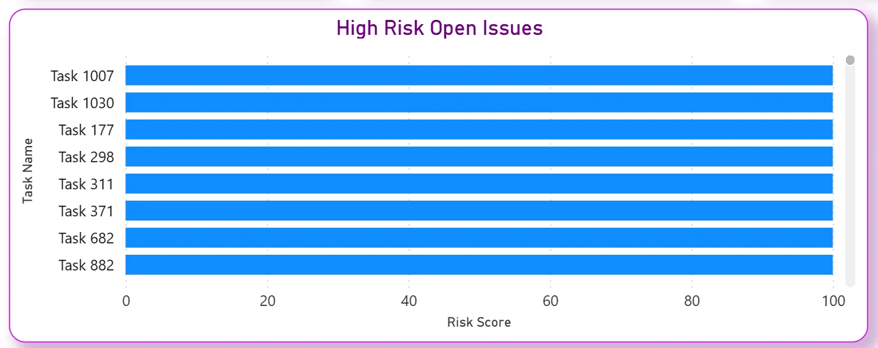
7. High Risk Open Issues
The bar chart ranks the highest risk score open issues by task name: Task 1007, Task 1030, Task 177, Task 298, Task 311, Task 371, Task 682, and Task 882 all showing risk scores approaching 100. These are the issues that need to be on every project manager's radar right now. The chart is sorted by risk score so the most critical unresolved issues are immediately visible without scrolling through a full issue log. Applying the Assigned To filter narrows this list to specific team members in one click.
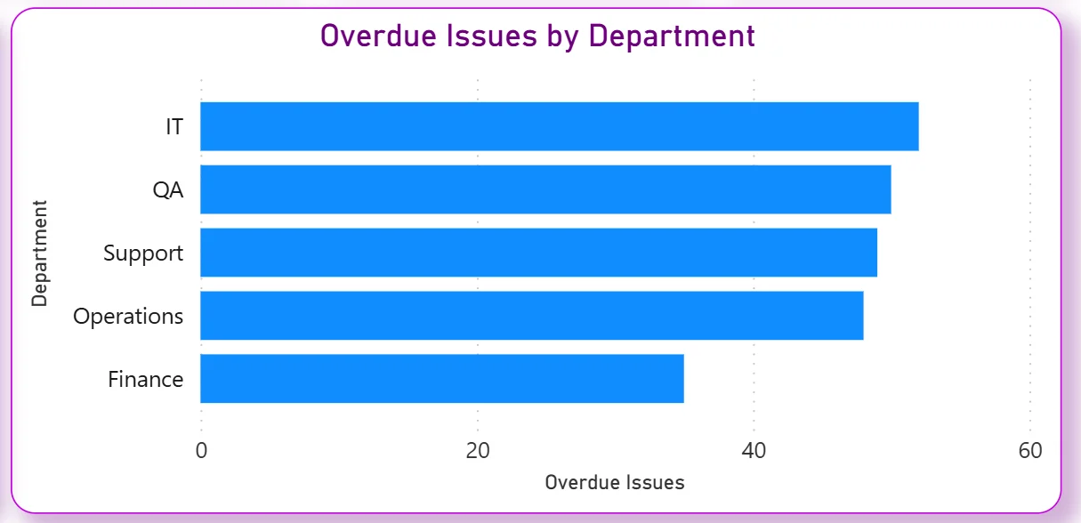
8. Overdue Issues by Department
The horizontal bar chart ranks five departments by overdue issue count: IT leading, followed by QA, Support, Operations, and Finance. IT having the highest overdue count matches its position in the Risk Overview tab as the highest total risk department. For a PMO or department head, this chart makes the escalation priorities clear. IT and QA together are carrying a disproportionate share of the overdue issues, which points to either resourcing pressure or complexity-related delays in those teams specifically.
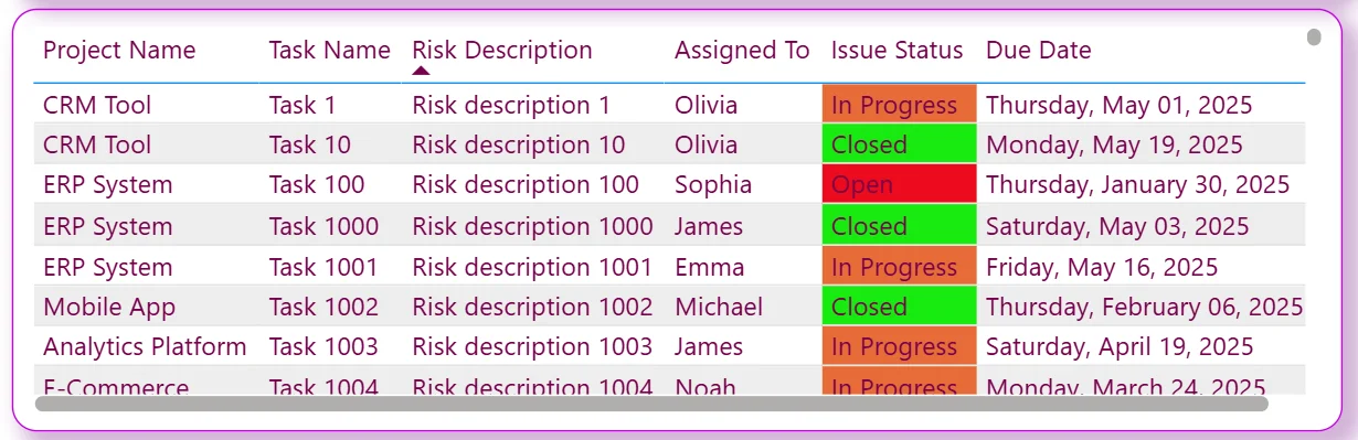
9. Issue Detail Table
The table shows every issue with project name, task name, risk description, assigned person, colour-coded issue status, and due date. In Progress issues are shown in orange, Closed in green, and Open in red. The due date column sitting next to the status makes it immediately visible which open issues are past their deadline without needing to sort or filter. A project manager can isolate all In Progress issues assigned to a specific person with a due date that has already passed in two filter clicks.
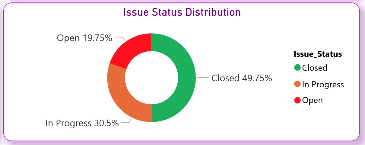
10. Issue Status Distribution
The donut chart shows Closed at 49.75%, In Progress at 30.5%, and Open at 19.75%. Half of all issues being closed matches the Resolution Rate KPI. The 30.5% In Progress segment tells you nearly a third of all issues are actively being worked on. The 19.75% Open but not yet in progress is the pool of issues that have been identified but not yet picked up, which combined with the 234 overdue count tells you issue intake is running ahead of team capacity to resolve.
How It Works Under the Hood
The dashboard connects to risk registers, issue logs, and project management data through a unified Power BI data model. DAX measures calculate resolution rates, average resolution times, overdue counts, and risk score aggregations consistently across all projects, departments, and assignees. The three filters at the top of both tabs connect to every visual simultaneously so any month, probability, or assignee selection updates the entire current tab in one action.
The two tabs are designed to answer different but related questions. Risk Overview tells you where the risk exposure sits across the portfolio. Issue Tracking tells you how well the team is managing the issues that have already materialised. A portfolio with high risks but strong issue resolution is in a different position from one with lower risks but a growing overdue backlog. Both tabs together give the complete picture.
Business Benefits
What changes when your team has this dashboard
- Risk reviews start with the full 1,200 risk portfolio already categorised by level, department, and trend without anyone having to pull a report.
- The Impact vs Probability scatter chart makes risk prioritisation visual so mitigation resources go to genuinely critical risks rather than the most recently mentioned ones.
- The 234 overdue issues are visible by department so escalation conversations are targeted at the teams with the highest overdue counts.
- High risk open issues are ranked by risk score so the team always knows which eight issues need resolution attention first.
- Resolution rate and average resolution time are tracked automatically so improvement over time is measurable rather than claimed.
- The issue detail table with colour-coded status and due dates replaces manual issue log reviews for daily stand-ups and weekly risk reviews.
Strategic Advantages for Risk and PMO Leaders
Beyond the weekly risk review improvements, having this kind of dashboard available over months and quarters changes how risk and PMO leaders make longer term decisions.
When you can see the Risk Trend chart spiking in late April and early May every year, you can anticipate that pattern in future years and pre-position mitigation resources before the spike happens rather than scrambling after it. When the Impact vs Probability scatter consistently shows IT risks clustering in the high-high quadrant quarter after quarter, you can make a structural investment in IT risk controls rather than treating each individual IT risk as an isolated incident. When the Resolution Rate stays flat at 49.75% across multiple periods, you know the issue is process or capacity rather than individual performance, and the intervention needs to match that diagnosis.
This is the difference between a dashboard that helps you manage this week's risks and one that helps you build a more resilient risk management operation over time. The Versich Risk Issue Dashboard is designed to do both.
Conclusion
Risk management teams are not short of risk data. They are short of a way to see 1,200 risks categorised, trended, and distributed across departments in one view, with active issues, overdue counts, and resolution rates all connected to the same filters.
This dashboard provides that across two tabs. Risk Overview gives you the full portfolio risk picture down to the impact-probability level. Issue Tracking shows you exactly which issues are open, overdue, and assigned to whom with due dates visible in a colour-coded table. Both tabs respond to the same three filters and draw from the same data model.
If your risk reviews still involve manually assembled spreadsheets or overdue issues are only surfaced when someone escalates them, the data is already in your project management and risk tools. A well-built Power BI dashboard just makes it visible when it can still be acted on.