What is a Project Portfolio Overview Dashboard?
Running 246 projects across multiple departments, project managers, and risk levels is not a visibility problem if you have the right dashboard. It becomes one when all of that information lives in separate spreadsheets, project tools, and status update emails that nobody can see together at the same time.
A Project Portfolio Overview Dashboard built in Power BI brings everything into one place. On-time delivery rates, budget utilisation by department, project status splits, risk levels, and individual project completion percentages all filterable by year, department, project manager, and risk level so any portfolio question gets answered in seconds rather than in a weekly status call.
We built this Project Portfolio Overview Dashboard in Power BI for PMO leaders, operations heads, and senior management who need to see the health of 246 projects without opening a single project management tool or waiting for a compiled report.
Why Portfolio Teams Are Still Missing the Full Picture
Here is what we hear from PMO leads and operations directors before they have a proper portfolio dashboard. On-time delivery rates are calculated manually at month end. At-risk projects are only surfaced when a project manager escalates. Budget utilisation by department requires a finance team export. And when a board member asks how the portfolio is performing this quarter, the answer takes two days to compile across five different tools.
With 246 projects across eight departments and multiple project managers, that manual approach means leadership is always looking at last month's picture rather than today's reality. This dashboard was built to change that.
The Dashboard We Built
This is a single-page portfolio dashboard designed for senior leadership and PMO teams who need the complete portfolio picture in one screen. Four filters sit across the top: Year, Department, Project Manager, and Risk Level. Every visual on the page updates simultaneously when any filter is applied. A department head checking only their at-risk projects managed by a specific project manager can do that in three clicks.
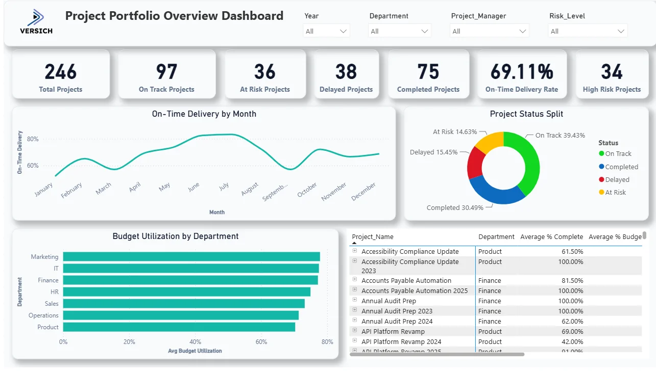
Here is the interactive version of the Project Portfolio Overview Dashboard : Project Portfolio Overview Dashboard Blueprint | Versich
What the Dashboard Actually Shows
There are five main visuals in this dashboard and each one is answering a specific question that portfolio and PMO teams deal with every single week.
1. KPI Row Seven Numbers That Define Portfolio Health
Total Projects (246), On Track Projects (97), At Risk Projects (36), Delayed Projects (38), Completed Projects (75), On-Time Delivery Rate (69.11%), and High Risk Projects (34) sit across the top. The numbers tell an immediate story. Of 246 projects, only 97 are on track that is less than 40% of the active portfolio. 36 are at risk and 38 are delayed, meaning 74 projects need active attention right now. With a 69.11% on-time delivery rate and 34 high-risk projects, leadership has the complete health picture before looking at a single chart. That is the point of the KPI row context first, detail second.

2. On-Time Delivery by Month
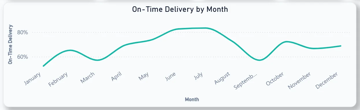
The line chart tracks on-time delivery percentage month by month across the full year. Delivery starts around 60% in January, climbs steadily to a peak above 80% in the middle of the year, then dips back down to around 65% toward December. That mid-year peak followed by a second-half decline is the most important signal in this chart. For a PMO leader, understanding what drove the improvement between March and July whether it was better resourcing, fewer new project intakes, or improved processes and why it did not sustain into the second half is a direct input for planning next year's operating model.
3. Project Status Split
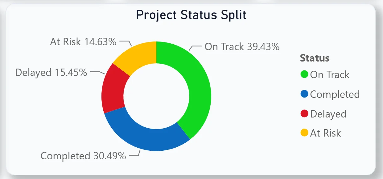
The donut chart breaks the full 246-project portfolio into four status categories: On Track at 39.43%, Completed at 30.49%, Delayed at 15.45%, and At Risk at 14.63%. On Track and Completed together make up nearly 70% of the portfolio. But Delayed and At Risk combined at 30% means roughly one in three projects is either behind or at risk of becoming so. For leadership reviewing portfolio health, this donut gives the proportional picture that the raw KPI numbers alone cannot convey.
4. Budget Utilisation by Department
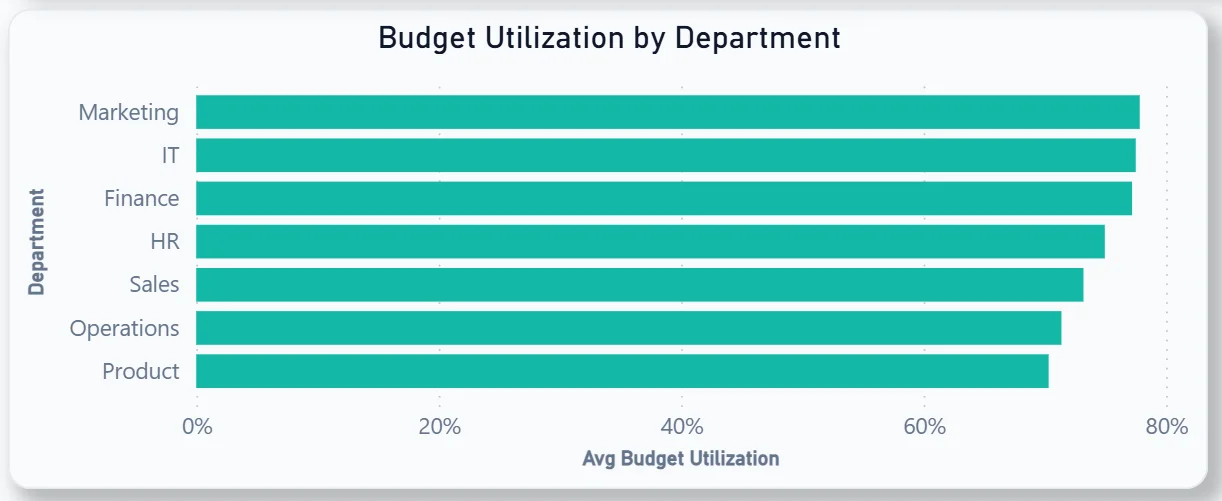
The horizontal bar chart ranks eight departments by average budget utilisation: Marketing at the top approaching 80%, followed by IT, Finance, HR, Sales, Operations, and Product at the bottom. Marketing consuming the highest proportion of its budget and Product consuming the least tells the finance team something important about which departments are running at full capacity versus which have headroom. Filtering this chart by risk level shows whether high-budget-utilisation departments are also carrying the most at-risk projects a correlation that, if it exists, points to overextension as the root cause rather than project management quality.
5. Project Detail Table
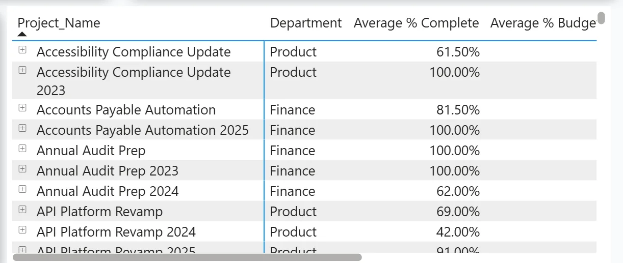
The table on the right shows every individual project with its department, average percentage complete, and average budget utilisation side by side. Projects like Accounts Payable Automation 2025 showing 100% completion confirm it is done. Annual Audit Prep 2024 at 62% completion alongside its budget figure tells the finance team exactly where that project stands without opening the project file. The table is scrollable and responds to all four filters so a project manager can instantly see only their projects in a specific department with the completion and budget context visible without a separate report.
How It Works Under the Hood
The dashboard connects to project management and financial data through a unified Power BI data model. DAX measures calculate on-time delivery rates, risk classifications, budget utilisation percentages, and status counts consistently across all 246 projects. The four filters at the top connect to every visual simultaneously so any year, department, project manager, or risk level selection updates the entire dashboard in one action.
Business Benefits
What changes when your PMO has this dashboard
- Weekly portfolio reviews start with the on-time delivery rate and status split already on screen rather than compiled from individual project updates.
- The 34 high-risk projects are identifiable by department and project manager in one filter click rather than requiring escalation reports from each team.
- Budget utilisation by department is visible without a finance team export available on demand for any filter combination.
- The on-time delivery trend shows whether performance is improving or declining month by month so course corrections happen before the quarter closes.
- Individual project completion and budget percentages are in one table rather than spread across project tool logins and finance system exports.
- Department heads can filter to their own projects and have their portfolio conversation with leadership backed by the same live data everyone else is seeing.
Strategic Advantages for PMO and Operations Leaders
Beyond the weekly review improvements, having this kind of portfolio dashboard available over quarters and years starts to change how PMO and operations leaders make longer term decisions.
When you can see the on-time delivery trend climbing to 80% mid-year and declining in the second half every year, you can investigate whether the pattern reflects seasonal resource availability, project intake volume, or a specific cohort of projects that always slip in Q3 and Q4. When the budget utilisation chart consistently shows Marketing and IT running at the highest utilisation rates, you can make capacity planning and hiring decisions for those departments before they become delivery bottlenecks. When high-risk projects consistently cluster in the same two departments regardless of the year filter, you can address the root cause structurally rather than managing each high-risk project individually.
This is the difference between a dashboard that reports on the portfolio and one that drives how the portfolio is managed. The Project Portfolio Overview Dashboard is built to do both.
Conclusion
Managing a 246-project portfolio without a proper dashboard means leadership is always reacting to problems that a good dashboard would have surfaced two weeks earlier. On-time delivery declines, budget overruns, and at-risk project clusters are all visible in this dashboard before they become escalations.
In one screen you get the full portfolio KPI summary, a monthly on-time delivery trend, a status split donut showing the proportion of on-track, completed, delayed, and at-risk projects, department-level budget utilisation, and a scrollable project detail table with individual completion and budget figures. Four filters cover every cross-section of that data. Nothing requires a manual report or a tool login.
If your PMO is still compiling portfolio status from individual project updates or discovering at-risk projects after they have already escalated, the data is already in your project management system. A well-built Power BI dashboard just makes it visible where decisions actually get made.
If you want to see what a project portfolio dashboard could look like for your organisation, get in touch with the Versich team and we can walk you through it.