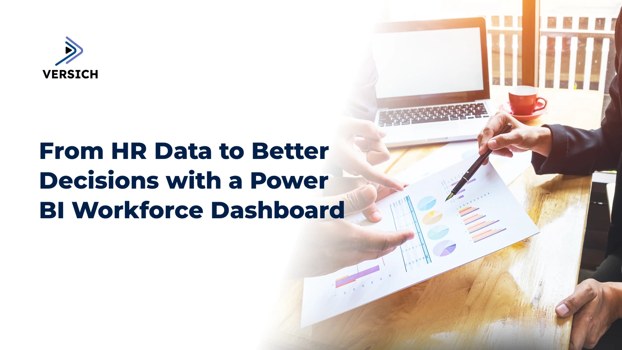
Human resources teams manage information that directly affects business performance, including headcount, hiring, turnover, absence, engagement, compensation, performance, and workforce capacity. Yet this information frequently sits across HR platforms, payroll systems, spreadsheets, recruiting tools, and employee records.
A Power BI HR analytics dashboard brings these sources together in one reporting environment. Instead of waiting for manually prepared reports, HR leaders and business managers gain a consistent view of workforce activity, trends, and risks.
The value is not the dashboard itself. The value comes from turning fragmented HR data into decisions that improve workforce planning, employee retention, operational efficiency, and leadership visibility.
Why HR Reporting Needs More Than Spreadsheets
Spreadsheets remain useful for targeted analysis, but they become difficult to manage when HR reporting involves multiple data sources, frequent updates, complex calculations, and different audiences.
A spreadsheet-based reporting process creates several recurring problems. Data is copied from one system to another, formulas are changed manually, reports become outdated quickly, and different departments produce conflicting versions of the same metric. HR teams then spend more time preparing reports than interpreting them.
A Power BI dashboard changes the reporting model by creating a central analytical layer. Data is extracted from approved sources, transformed into a consistent structure, and presented through interactive reports. Users can filter results by department, location, employment type, job family, manager, tenure, or time period without requesting a new report for every question.
This creates a more reliable foundation for workforce decisions. Leaders can see what is happening, HR can investigate why it is happening, and managers can act on relevant information without gaining unnecessary access to sensitive employee data.
Our approach to dashboard development follows the same principle we use in other data environments: connect the right sources, define trustworthy metrics, and design reporting around decisions rather than visual decoration. Our guide to connecting any data source to Power BI provides useful context on the integration and governance considerations involved.
What a Power BI HR Analytics Dashboard Should Show
An effective HR dashboard does not attempt to place every available metric on one page. It provides a structured view of workforce performance, then allows users to move from a high-level indicator to the underlying detail.
The right dashboard structure depends on the organisation’s priorities, data maturity, and reporting requirements. However, most HR analytics solutions benefit from several connected views.
Dashboard area | Typical questions answered | Example measures |
|---|---|---|
Workforce overview | How is the workforce changing? | Headcount, active employees, new hires, exits, workforce composition |
Recruitment | Is hiring progressing effectively? | Open roles, applications, time to hire, offer acceptance, source performance |
Retention | Where are turnover risks emerging? | Attrition, voluntary turnover, involuntary turnover, tenure patterns |
Absence and attendance | How are absence patterns affecting operations? | Absence rate, absence days, recurring absence, department trends |
Diversity and representation | How is workforce composition changing? | Representation by level, department, gender, age band, or other approved dimensions |
Performance and development | Are employees receiving the support they need? | Review completion, training participation, development activity, and performance outcomes |
Workforce planning | Do workforce levels match business requirements? | Budgeted positions, filled positions, vacancies, labour demand, capacity indicators |
These views should connect. For example, a leader reviewing turnover in a department should be able to explore tenure, job role, manager, absence, recruitment history, or employee sentiment where those data points are appropriately available.
Core HR KPIs for Power BI
The dashboard should distinguish between descriptive metrics, which show what happened, and diagnostic or predictive indicators, which help users explore causes and prepare for future conditions.
Headcount is a starting point, not a comprehensive measure of the workforce. A useful model categorizes employees into active employees, joiners, leavers, contractors, temporary workers, full-time employees, and part-time employees. It should also define whether headcount is measured at a point in time or as an average across a period.
Turnover requires similar care. A single turnover percentage hides important differences between voluntary and involuntary exits, regrettable and non-regrettable turnover, early-tenure departures, and turnover within specific roles or departments. A well-designed dashboard makes these distinctions visible while protecting individual privacy.
Recruitment reporting should go beyond the number of open vacancies. HR leaders need to understand how long roles remain open, where candidates enter the process, how many offers are accepted, and where delays occur. These measures connect hiring activity to workforce capacity and operational delivery.
Absence reporting should also be interpreted in context. A rise in absence might relate to seasonal patterns, a particular department, role requirements, scheduling issues, or changes in reporting behaviour. Power BI makes it easier to compare periods and segments, but the interpretation still requires sound HR governance and subject-matter knowledge.
The following principles keep KPI design useful:
Define every measure clearly. A metric such as attrition needs a stated numerator, denominator, time period, and employee population.
Use consistent dimensions. Department, role, location, manager, employment type, and tenure should come from governed reference data.
Show context with trends. A current value is more useful when users can compare it with prior periods, targets, budgets, or business cycles.
Separate reporting from diagnosis. A dashboard should identify an issue without presenting correlation as proof of causation.
Limit sensitive detail. Employee-level information requires appropriate access controls, aggregation, and privacy safeguards.
Connecting HR Data Sources to Power BI
HR data rarely lives in one system. A dashboard might combine information from an HRIS, payroll platform, applicant tracking system, time and attendance solution, learning management system, employee engagement tool, finance system, and spreadsheets used by individual teams.
Power BI supports a broad range of connection methods, including database connectors, APIs, cloud services, files, and dataflows. The connection method should reflect the source system, refresh requirements, security model, and technical ownership.
A robust HR data architecture normally includes:
A source layer that preserves data from HR and related business systems.
A transformation layer that standardises names, dates, employee identifiers, organisational structures, and employment statuses.
A semantic model that defines relationships and reusable measures.
A report layer that presents dashboards for HR, executives, managers, and operational teams.
A governance layer that controls access, refresh schedules, documentation, lineage, and data quality.
Data integration is one of the most important parts of the project. If employee IDs do not match across systems, department names vary between sources, or exit dates are recorded inconsistently, the dashboard will produce misleading results regardless of how polished the visuals appear.
We recommend resolving these issues during data modelling rather than relying on manual corrections inside individual report pages. Power Query, dataflows, SQL transformations, and properly designed Power BI semantic models help create a repeatable reporting process.
For organisations using SAP or related enterprise platforms, our article on Power BI dashboard development on SAP data explains the broader considerations involved in connecting enterprise data to Power BI.
Designing the Dashboard for Different Users
One HR dashboard should not serve every audience in the same way. Executives need an overview of workforce health and business impact. HR business partners need analytical detail. Managers need relevant information about their teams. Recruitment leaders need pipeline and vacancy visibility.
A role-based design gives each audience the right level of detail without creating multiple disconnected reports. The underlying model remains governed and consistent, while the report experience changes according to the user’s responsibilities.
For example, an executive page might highlight headcount movement, turnover, critical vacancies, workforce cost indicators, and key organisational trends. An HR operations page might focus on data quality, employee lifecycle events, absence, and reporting completeness. A manager page might provide aggregated team information, open roles, absence trends, and development activity where policy permits.
This design also supports row-level security, which restricts data according to the user’s role, department, or organisational responsibility. Security should be planned at the beginning of the project, not added after the dashboard is complete.
HR reporting requires particular care because employee data can be sensitive. A sound solution should address:
Row-level security and workspace permissions.
Aggregation thresholds for small employee groups.
Separation of personally identifiable information from analytical reporting.
Appropriate treatment of compensation and performance data.
Controlled export and sharing permissions.
Auditability and documentation of access decisions.
Retention and deletion requirements.
Power BI security does not replace organisational policy or legal review. It supports a broader governance framework that defines who should access information, for what purpose, and under which controls.
How HR Teams Use the Dashboard in Practice
A dashboard becomes valuable when it is integrated into regular decision-making. HR leaders can use it to review workforce movement, identify areas requiring investigation, and prepare evidence for leadership discussions. Managers can use team-level trends to discuss capacity, absence, hiring, and development with HR partners.
Recruitment teams can use the dashboard to monitor open positions and identify process bottlenecks. Workforce planning teams can compare approved positions with actual staffing levels. Finance and operations leaders can connect workforce movement with business planning, while maintaining appropriate separation for sensitive data.
The dashboard should support a clear path from signal to action:
Spot the change. A trend, variance, or threshold indicates that something deserves attention.
Explore the context. Filters and drill-through pages reveal where the change is concentrated.
Validate the interpretation. HR and business owners confirm that the data reflects the real situation.
Agree on an action. The responsible team defines an intervention, owner, and review date.
Measure the result. Subsequent reporting shows whether the action changed the relevant outcome.
This process prevents dashboards from becoming passive reporting screens. It also discourages users from treating every fluctuation as a problem. Good analytics helps teams focus their attention on meaningful workforce issues.
Power BI Features That Improve HR Analysis
Power BI provides several capabilities that make HR reporting more useful and maintainable.
Interactive filtering allows users to analyse workforce measures by time period, department, job family, employment type, tenure, or other approved dimensions. Filters should be intuitive and limited to dimensions that support a real business question.
Drill-through pages allow users to move from a summary view into a more detailed analysis. For example, a user might select a department with increasing attrition and investigate tenure bands, roles, or exit categories.
Tooltips add context without overcrowding the report. A trend visual can reveal additional measures when a user hovers over a period, such as headcount, joiners, leavers, or absence.
Bookmarks and navigation help separate executive summaries, operational reporting, and detailed analysis into a coherent experience.
Alerts and subscriptions support regular awareness of important changes, subject to workspace configuration and organisational policy. They should be used for defined actions rather than indiscriminate notifications.
Natural language and AI-assisted capabilities can help users explore governed data, but they require carefully designed models, clear measure definitions, and appropriate security. AI features do not correct poor data quality or ambiguous KPIs.
Building a Reliable Implementation Plan
HR dashboard projects fail when they start with visual design instead of business requirements. Before creating charts, we establish the decisions the dashboard must support, the audiences involved, the source systems available, and the definitions that need agreement.
A practical implementation process includes the following stages:
Discovery and requirements. Identify stakeholders, decisions, reporting pain points, priority use cases, and data sensitivities.
Data assessment. Review source systems, field definitions, identifiers, historical coverage, refresh options, and known quality issues.
KPI agreement. Document calculation rules, ownership, targets, time periods, exclusions, and dimensional requirements.
Data modelling. Build relationships, dimensions, fact tables, measures, and security structures that support scalable reporting.
Prototype and validation. Test the dashboard with real users using representative data and realistic questions.
Deployment and adoption. Configure workspaces, permissions, refresh, documentation, training, and an improvement process.
This staged approach keeps the project focused. It also exposes difficult questions early, such as whether historical department structures are available, how rehires should be counted, or how temporary workers should be represented.
The dashboard should be tested from three perspectives. Technical testing confirms that refreshes, calculations, relationships, and permissions work correctly. Business testing confirms that measures answer the intended questions. User testing confirms that people can find and interpret the information without unnecessary complexity.
Data Quality and Governance Are Not Optional
A visually impressive report with unreliable data reduces trust in the entire HR function. Governance is therefore a core part of the solution, not an administrative task added at the end.
Every important KPI should have an owner and a definition. Users should know where the data comes from, when it was refreshed, what period it covers, and what limitations apply. Changes to source systems, organisational structures, and calculation rules should be recorded and communicated.
Data quality checks should identify missing employee IDs, duplicate records, invalid dates, inconsistent employment statuses, unassigned departments, and unexplained changes in source volumes. These checks can be surfaced in a data quality page for authorised users, helping the HR team address issues before they reach leadership reporting.
A well-governed semantic model also reduces duplication. Instead of rebuilding the same attrition calculation in multiple reports, teams use a shared measure with a documented definition. This supports consistency as reporting expands across the organisation.
Our work on broader operational reporting follows the same logic. The examples in 10 operations dashboards to improve business performance show how structured dashboards connect operational measures with management decisions.
Measuring the Value of the Dashboard
The dashboard’s success should not be judged by the number of visuals or pages. It should be judged by whether it improves the quality and speed of workforce decisions.
Useful measures of success include the reduction in manual reporting effort, improved consistency of KPI definitions, faster access to current information, stronger adoption among intended users, fewer recurring data questions, and clearer accountability for follow-up actions.
The organisation should also evaluate whether the dashboard supports better workforce outcomes. Examples include more timely recruitment interventions, improved visibility into absence patterns, earlier identification of retention concerns, and stronger alignment between workforce planning and business requirements. These outcomes require appropriate analysis and should not be attributed to the dashboard alone without evidence.
A phased delivery model works well. Start with a focused set of trusted measures, establish the data model and security framework, gather user feedback, and then expand into recruitment, performance, learning, workforce planning, or predictive analysis.
For additional perspective on using Power BI across business functions, see our article on Power BI for project management and PSA organisations. The same principles apply, define the operating questions, model the data carefully, and make the reporting experience useful for the people who act on it.
When to Work with a Power BI Development Partner
Internal teams often understand HR processes deeply but lack the capacity to manage data engineering, semantic modelling, Power BI architecture, security, testing, and deployment at the same time. A development partner provides specialist support while keeping HR stakeholders involved in the decisions that shape the solution.
External support is especially valuable when the project involves multiple source systems, complex organisational structures, sensitive employee data, legacy reporting, or a need to scale beyond one dashboard.
A strong partner should help with requirements, source assessment, data integration, KPI design, security, visualisation, testing, documentation, and enablement. The result should not be a black-box report that only the supplier can maintain. It should be a governed solution that internal teams understand and can extend.
Versich has also worked on Power BI solutions for HR and workforce performance management. Our HR and workforce performance management Power BI solution demonstrates the relevance of Power BI to workforce-focused reporting environments.
If your organisation is replacing spreadsheet-based HR reporting or planning a new workforce analytics solution, contact us to discuss the data, decisions, and reporting model you need to support.
Conclusion
A Power BI HR analytics dashboard gives HR and business leaders a consistent way to understand workforce activity and act on it. It replaces fragmented reporting with governed data, interactive analysis, and role-based visibility.
The strongest solutions begin with decisions, not charts. They define KPIs clearly, connect reliable data sources, protect sensitive information, and create a reporting experience that supports executives, HR teams, managers, and workforce planners.
Power BI is the reporting platform, but the real value comes from the model behind it and the decisions it enables. With the right implementation approach, our teams can turn HR data into a practical foundation for better planning, stronger accountability, and more informed workforce management.