Most teams using Zoom Phone for customer-facing or internal calls are sitting on data they never properly use. Total call counts, average handle time, missed call rates, and agent-level performance metrics are all being captured by Zoom, but the reporting built into the Zoom web portal was designed for quick snapshots, not structured analysis. It exports CSVs, shows one month at a time, and cannot easily surface the kind of trend analysis or staffing insight that actually changes how a call operation runs.
That is the problem our free Power BI Zoom calls dashboard was built to solve. This article walks through exactly what the dashboard does, what data it surfaces, how the Versich connector keeps it up to date automatically, and how teams can go beyond the phone call template to build fully custom Zoom webinar and meeting dashboards on top of the same data feed. If you want a broader look at how Power BI handles all three Zoom data streams together, our Zoom Analytics Dashboard guide covers the full three-tab setup in detail.
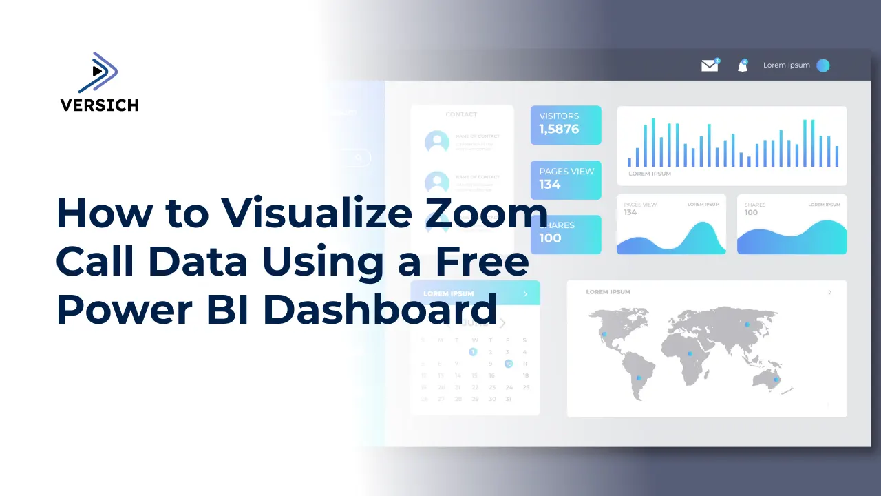
What the Free Zoom Calls Dashboard Covers
The free template targets Zoom Phone data specifically. It is not a broad communications dashboard or a webinar performance tracker. It is designed for call centre managers, operations leads, and IT administrators who need to understand how their Zoom phone environment is performing across calls, agents, and time.
When connected to your Zoom account, the template visualises:
- Total call volume, answered calls, answer rate, average call duration, missed calls, average wait time, and average hold time as KPI cards
- Missed calls broken out by hour of day so staffing gaps are immediately visible
- Average hold time by hour to show whether handling time varies across the working day
- Agent-level performance across total calls, answered calls, missed calls, answer rate, and average wait time
- Inbound versus outbound call volumes broken down by month across the full year
Filters sit at the top of the dashboard and apply to every visual simultaneously, so any manager can slice the entire view by date range, call outcome, call type, phone number, or call initiator without rebuilding the analysis from scratch.
Why Zoom Native Reports Are Not Enough for Call Operations
Zoom does provide reporting inside the web portal, but several structural limitations mean it rarely becomes a tool that operations or call centre teams use regularly for decision-making.
| Zoom Native Reports | Power BI Dashboard with Versich Connector |
|---|---|
| Manual CSV export required for each period | Automatic data sync every 30 minutes |
| One month viewable at a time | Full historical trend analysis across any date range |
| Admin-only access to org-wide data | Shareable dashboard with role-level access control |
| No agent-side performance comparison | Side-by-side agent table with answer rate and wait time |
| No integration with other business data | Blendable with CRM, ERP, or other data sources in Power BI |
| Limited to Zoom's own retention window (12-15 months) | Data retained in your own Azure SQL database indefinitely |
The core issue is not that Zoom's reports are badly designed. They serve the purpose they were built for: giving an admin a quick check on call volume and basic metrics. They were not designed to support the level of analysis that a call centre manager or operations leader needs week over week.
How the Versich Zoom Connector Keeps the Dashboard Current
The free template is most valuable when it is connected to live, automatically refreshed Zoom data rather than a static CSV import. The Versich Power BI connector handles this by extracting Zoom Phone data from the Zoom API on a 30-minute cycle and landing it in an Azure SQL Server database. Power BI connects to that database rather than directly to Zoom, which means:
- Data refreshes automatically without any manual export or intervention
- Historical data accumulates in your own database beyond Zoom's native retention window
- The template can be extended to include webinar and meeting data from the same Zoom account
- Multiple Zoom accounts can be consolidated into a single database for organisations with complex account structures
Once the connector is set up, the entire process from Zoom data to updated Power BI visuals runs in the background. The dashboard simply reflects the most current available data every time a user opens it.
For teams that are already running Power BI across other business data, this approach also means the Zoom call data sits in the same environment as everything else, making it straightforward to blend Zoom call volume with CRM data, financial reporting, or operational metrics if that cross-functional view becomes useful.
Setting Up the Free Dashboard in Five Steps
Getting the template connected to your Zoom data is a short process once the connector is installed. Here is how it works end to end:
| Step | What Happens | Time Required |
|---|---|---|
| 1. Register with the connector | Create an account on the Versich connector portal. A 14-day free trial is included. | 2 minutes |
| 2. Install the Zoom connector | Navigate to the Zoom window in the connector portal and select Install. We handle the Zoom API authorisation. | 3 minutes |
| 3. Authorise your Zoom account | Sign in to your Zoom account and select which companies or accounts to connect. | 2 minutes |
| 4. Let the first sync run | The connector creates the required tables in your Azure SQL database and runs the first data pull. | 5 to 10 minutes |
| 5. Connect the Power BI template | Open the free .pbit template file and point it at your Azure SQL Server database instead of the default sample data. | 2 minutes |
That is roughly 15 minutes from sign-up to a live dashboard showing your actual Zoom call data. From that point forward, the 30-minute sync cycle runs automatically and the dashboard stays current without any further input.
The KPIs the Dashboard Surfaces and How to Read Them
Each KPI in the template is there to answer a specific operational question. Understanding what each metric is actually telling you is what separates a dashboard that gets glanced at from one that changes how a team is managed.
| KPI | What It Measures | What to Act On |
|---|---|---|
| Answer Rate | Percentage of total calls that were answered | Below 85% suggests a staffing or routing problem during peak periods |
| Missed Calls | Total volume of unanswered calls in the period | Rising missed call count signals growing demand without matching capacity |
| Avg Wait Time | Average time before a call is answered or abandoned | High wait time with low hold time means callers are waiting in queue, not on hold |
| Avg Hold Time | Average time callers spend on hold once connected | Consistent hold time across hours means handling is stable; spikes point to process issues |
| Missed Calls by Hour | Hourly distribution of unanswered calls | Peaks reveal the exact hours where staffing does not match inbound demand |
| Agent Answer Rate | Per-agent percentage of calls answered vs. total routed | Clustered rates mean structural issue; outliers mean individual performance issue |
| Inbound vs Outbound by Month | Monthly split of call direction across the year | Growing inbound-to-outbound ratio may signal increasing customer demand |
One practical example: if the missed calls by hour chart shows a consistent spike between 11am and 1pm every day regardless of the month, that is a lunch-period staffing gap, not a demand surge. The fix is staggered breaks, not additional headcount. Without the hourly breakdown, the same missed call volume looks like an overall capacity problem and gets solved with the wrong intervention.
Going Beyond Phone Calls: Webinar and Meeting Dashboards on the Same Data
The free phone calls template is the starting point. Once the Versich connector is running and your Zoom data is flowing into Azure SQL, the same data feed also captures Zoom Meetings and Zoom Webinars data alongside phone call records.
That means the same setup that powers the phone calls dashboard also supports:
- A webinar dashboard showing registrations versus actual attendance, attendance rate by webinar, registrant source by marketing channel (Facebook Ads, Email, Organic, LinkedIn, Google Ads), and geographic attendance mapped by country
- A meeting analytics dashboard showing total meeting hours by department, meeting frequency and duration trends over time, host-level meeting volume, and hour-of-day meeting load across the month
- A consolidated communications view that brings all three data streams together for operations leaders who need a single picture of how the organisation is communicating across all Zoom products
Our article on Zoom Analytics Insights in Power BI covers the full three-stream setup in more depth, including the data model structure and DAX measure design for attendance rates, answer rates, and duration calculations.
Who Gets the Most Value From This Dashboard
The phone calls dashboard was built with a specific set of roles in mind. How each role uses the data tends to differ even within the same organisation.
| Role | Primary Questions Answered | Most Useful Visuals |
|---|---|---|
| Call Centre Manager | Are we answering enough calls? Where are we missing them? | Missed Calls by Hour, Agent Performance Table, Answer Rate KPI |
| Operations Leader | Is our call volume stable or growing? Are we staffed correctly? | Inbound vs Outbound by Month, Missed Calls trend, Avg Wait Time |
| IT Administrator | Is the Zoom Phone environment performing correctly? Are there routing issues? | Agent-level answer rate distribution, Avg Hold Time by Hour |
| HR / Workforce Planner | When is call demand highest? How should we structure shifts? | Missed Calls by Hour, hourly pattern analysis |
| Finance | Is Zoom Phone generating sufficient call handling efficiency for its cost? | Total call volume trend, answer rate, average duration |
Best Practices for Getting the Most From the Dashboard
Having the dashboard is the first step. How an organisation uses it over time determines whether it becomes a decision-making tool or just a display screen.
- Review the Missed Calls by Hour pattern weekly, not just monthly. Daily staffing adjustments are impossible to make from a monthly view, and the hourly pattern is where the actionable detail lives.
- Use the agent performance table as a starting point for coaching conversations, not as a performance ranking. A tightly clustered answer rate across agents tells you the issue is structural. An outlier tells you to investigate that individual's routing or schedule first before drawing performance conclusions.
- Set a baseline in the first month of connection. The first four weeks of data give you a reference point for what normal looks like in your call environment. Month two is when trend analysis starts to become meaningful.
- Layer in seasonal context when interpreting volume changes. A 15% rise in missed calls in December may reflect demand patterns rather than a staffing failure. The inbound vs outbound by month chart helps separate genuine demand growth from seasonal fluctuation.
- Make the dashboard available to team leads in read-only mode through Power BI Service. Centralised access means managers do not need to request reports and IT does not need to generate exports. The data is always current and always accessible.
Extending the Dashboard to Fit Your Organisation
The free template is designed to be a working starting point, not a final product. Most organisations that deploy it end up customising it over time to reflect their specific structure, KPIs, and reporting cadence. Our Power BI Services team can extend the template in a number of directions depending on what the business needs:
- Adding a department or team filter if your Zoom account is shared across multiple teams with different call operation structures
- Building a call quality tab using Zoom Phone quality metrics alongside volume data
- Blending Zoom call data with CRM data to connect call volume and answer rates to customer satisfaction scores or support ticket resolution times
- Creating a scheduling recommendation layer that uses historical hourly call patterns to inform shift planning rather than just displaying what happened
- Automating a daily or weekly email report from Power BI Service so call centre managers receive a summary without having to log into the dashboard
All of these extensions use the same underlying Zoom data that the free template already connects to. The connector infrastructure does not change. The data model expands to support the additional views.
Conclusion
Zoom Phone generates a continuous stream of data that most organisations only partially use. Call counts and basic averages are visible inside the Zoom portal, but the level of analysis that actually improves staffing decisions, reduces missed calls, and surfaces agent-level performance patterns requires something more capable than a CSV export and a spreadsheet.
The free Power BI Zoom calls dashboard gives call centre managers and operations leaders a structured, automatically refreshed view of the metrics that matter, without requiring a custom build from scratch. The template is ready to connect, the Versich connector keeps it current, and the same infrastructure scales to cover webinar and meeting analytics if the organisation needs a broader communications view.
If you are ready to connect your Zoom call data to Power BI or want to explore what a broader Zoom analytics setup could look like for your team, contact our team and we will walk you through the setup.