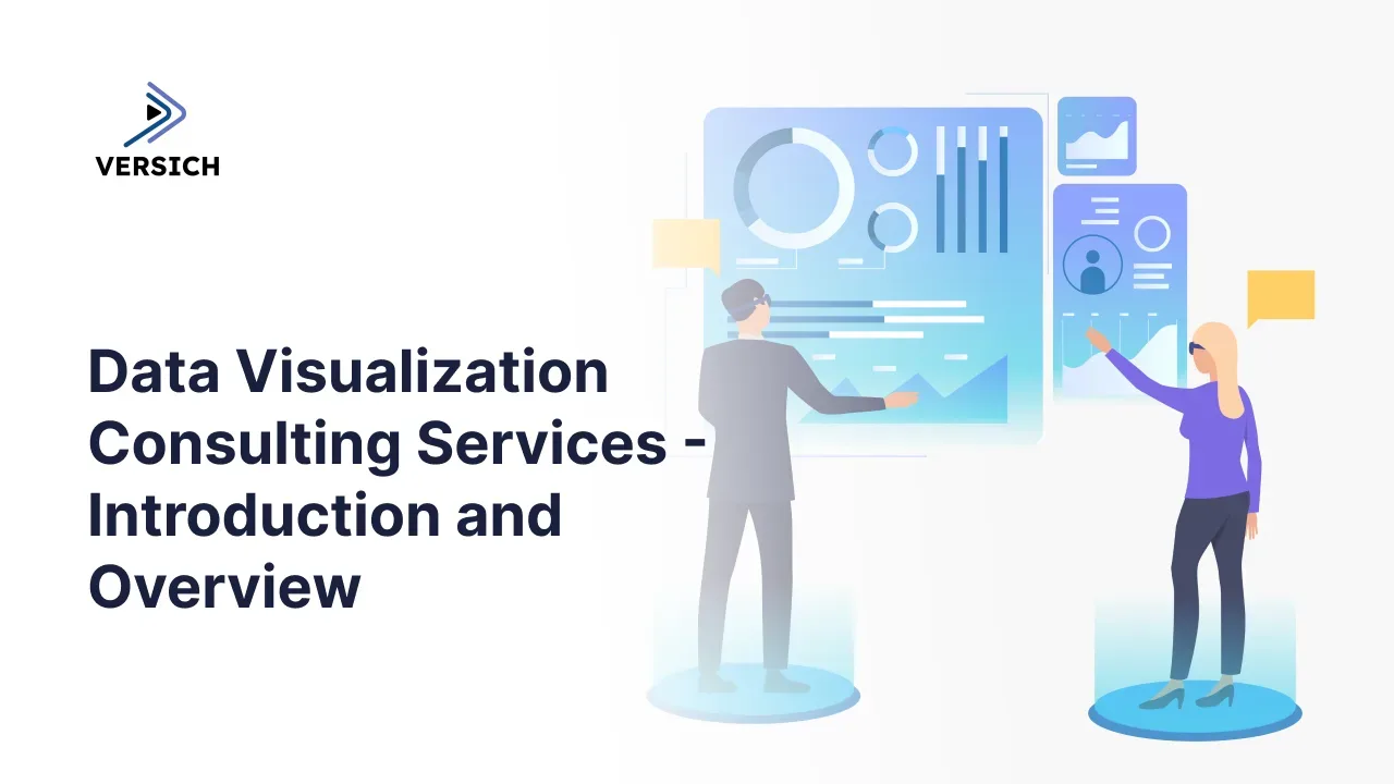
Introduction
Businesses generate data from almost every part of their operations. Sales transactions, financial systems, customer interactions, marketing platforms, inventory applications, enterprise resource planning systems and operational tools all produce valuable information.
However, having large volumes of data does not automatically lead to better decisions. Many organizations still rely on disconnected spreadsheets, manually prepared reports and static presentations that make it difficult to understand what is happening across the business.
Data visualization consulting services help organizations convert complex, fragmented data into clear dashboards, reports and visual insights. Instead of reviewing thousands of rows in a spreadsheet, decision-makers can monitor key performance indicators, identify trends, investigate exceptions and make informed decisions from a single interactive dashboard.
An experienced data visualization consultant does more than create charts. The consultant helps define reporting objectives, select meaningful metrics, connect different data sources, build reliable data models and develop dashboards that support practical business decisions.
This article explains what data visualization consulting services include, the benefits they provide and how businesses can apply data visualization across finance, sales, operations, marketing and other departments.
What Is Data Visualization Consulting Services?
Data visualization consulting services help organizations design and implement reports, dashboards and analytical solutions that present business data in an understandable visual format. These services combine business analysis, data integration, data modelling, user experience design and business intelligence development. The objective is to ensure that employees and decision-makers can access the right information at the right time.
A data visualization consultant may help an organization:
- Identify the most important business metrics.
- Evaluate existing reporting processes.
- Consolidate information from multiple systems.
- Design executive and operational dashboards.
- Develop interactive reports.
- Automate recurring reporting activities.
- Improve the performance of existing dashboards.
- Implement data security and governance controls.
- Train employees to use business intelligence tools.
- Provide ongoing dashboard support and optimization.
The result is a reporting environment that replaces fragmented information with a more consistent and accessible view of the business.
Why Businesses Need Data Visualization Consulting Services
Organizations often invest in software and data collection without creating an effective way to use the information. Data may exist across ERP platforms, customer relationship management systems, accounting tools, cloud applications and spreadsheets, but employees can struggle to combine it into a reliable report. This creates several common problems.
Reports may take days to prepare because employees must manually download, clean and combine information. Different departments may calculate the same metric differently, leading to disagreements during management meetings. Senior leaders may receive reports that are already outdated by the time they are reviewed.
Poorly designed dashboards create additional challenges. A dashboard may contain too many charts, use confusing layouts or present metrics without enough context. Although the report may look visually attractive, it may not help users understand what action to take.
Data visualization consulting addresses these challenges by combining technical implementation with business understanding. Consultants work with stakeholders to determine which questions the dashboard should answer, how the data should be structured and how users will interact with the information.
What Is Included in Our Data Visualization Consulting Services?
The exact scope of our data visualization engagement depends on the organization’s needs, reporting maturity and business objectives. However, most of our projects include several core services.
Data Visualization Strategy
A successful project begins with a clear reporting and analytics strategy.
Our consultants assess the organization’s current reporting environment, business objectives, available data and technical capabilities. They identify gaps in the existing process and develop a practical roadmap for improvement. This typically addresses
- Priority dashboards and reports.
- Target users and departments.
- Data sources and integration requirements.
- Business intelligence platform selection.
- Data governance and security.
- Dashboard development standards.
- Implementation phases and timelines.
- Training and user adoption.
This planning stage helps ensure that dashboard development is connected to measurable business outcomes.
KPI Definition and Reporting Requirements
Dashboards are only useful when they measure the right information. Data visualization consultants conduct discovery sessions with executives, managers and operational teams to understand their responsibilities and reporting needs. These discussions are used to define key performance indicators and determine how each metric should be calculated.
For example, a sales dashboard may track revenue, pipeline value, conversion rate, average deal size and sales cycle length. A finance dashboard may focus on cash flow, profitability, expenses, working capital and budget performance.
Defining these calculations early prevents departments from using inconsistent versions of the same metric.
Data Source Assessment
Organizations frequently store information across several applications. A company may manage financial transactions in NetSuite, customer relationships in Salesforce, operational data in an internal database and budgets in spreadsheets.
A consultant reviews each relevant data source to understand:
- Where the data is stored.
- How the information can be accessed.
- How frequently it changes.
- Whether the data is complete and accurate.
- How records from different systems can be connected.
- Which fields are required for reporting.
The assessment provides the foundation for a reliable data integration and modelling approach.
Data Integration
A dashboard should provide a consolidated view of information without requiring users to manually combine files. Data visualization consulting services may include connecting business intelligence platforms to:
- ERP systems such as NetSuite, SAP and Oracle.
- CRM applications such as Salesforce and Microsoft Dynamics 365.
- Accounting and finance systems.
- Marketing and advertising platforms.
- E-commerce applications.
- Human resources systems.
- Cloud data warehouses.
- SQL databases.
- Excel and CSV files.
- APIs and custom applications.
Depending on the requirements, consultants may use direct connectors, APIs, middleware, ETL tools or cloud data platforms to move information into a central reporting environment.
Data Cleaning and Transformation
Business data is rarely ready for visualization without preparation. The same customer may appear under different names in separate applications. Product codes may be formatted inconsistently. Dates, currencies and categories may use different standards. Some records may be incomplete or duplicated. Consultants clean and transform this information before it reaches the dashboard. This may include:
- Removing duplicate records.
- Standardizing names and categories.
- Correcting data types.
- Managing missing values.
- Combining related tables.
- Creating calculated fields.
- Mapping data between systems.
- Applying business rules.
- Validating results against source systems.
Reliable visualizations depend on reliable underlying data.
Data Modelling
A data model organizes information into a structure that supports reporting and analysis. The model defines how transactions, customers, products, departments, locations and time periods relate to each other. A well-designed model improves dashboard performance and makes calculations easier to maintain. For example, a financial model may connect the general ledger to subsidiaries, accounts, departments, classes, currencies and accounting periods. This allows users to analyze revenue or expenses across different business dimensions. Poor data modelling can create slow dashboards, inaccurate totals and complicated formulas. A consultant helps ensure that the model is scalable, efficient and aligned with reporting requirements.
Dashboard Design and Development
Dashboard development combines analytical functionality with user-friendly design. Consultants determine which visualizations are best suited to each business question. They may use:
- KPI cards for headline metrics.
- Line charts for trends over time.
- Bar charts for category comparisons.
- Maps for geographic analysis.
- Waterfall charts for financial movements.
- Scatter charts for relationships between variables.
- Tables for detailed transactional analysis.
- Heatmaps for patterns and exceptions.
- Funnel charts for sales and marketing performance.
The dashboard may also include filters, drilldowns, tooltips, bookmarks and navigation features that allow users to investigate the information. The goal is not to display as many charts as possible. The goal is to create a focused experience that helps users understand performance and determine what action is required.
Dashboard Performance Optimization
Business intelligence reports can become slow as data volumes and calculations increase. Consultants review the data model, queries, calculations and visual design to identify performance bottlenecks. Optimization may involve reducing unnecessary columns, simplifying calculations, improving relationships, using aggregations or changing how data is refreshed. Performance optimization improves user adoption because employees are less likely to use dashboards that take too long to load.
Security and Governance
Not every employee should have access to every piece of business information. Data visualization consulting services can include role-based security, row-level security and workspace access controls. These controls allow different users to view information appropriate to their responsibilities. For example, a regional sales manager may only see customers and revenue within their region, while the sales director can view company-wide performance. Governance also establishes standards for naming, publishing, sharing, validating and maintaining reports. This prevents uncontrolled dashboard growth and reduces the risk of employees using outdated information.
Training and Ongoing Support
Technology alone does not create a data-driven organization. Employees need to understand how to use dashboards and interpret the information correctly. Consultants may provide training for report users, developers and administrators. Training can cover dashboard navigation, filtering, exporting, analysis, report creation and platform administration.
Ongoing support may include:
- Resolving refresh failures.
- Updating calculations.
- Adding new data sources.
- Creating additional dashboards.
- Monitoring performance.
- Supporting platform upgrades.
- Managing user access.
- Improving existing visualizations.
This ensures that the reporting environment continues to support the organization as its requirements change.
Key Benefits of Data Visualization Consulting Services
Faster Decision-Making
Interactive dashboards reduce the time required to understand business performance. Executives do not have to wait for employees to prepare multiple spreadsheets before reviewing results. They can access current information, compare performance across periods and investigate unexpected changes directly from a dashboard. This enables quicker responses to emerging risks and opportunities.
A Single Source of Truth
Departments frequently create their own versions of reports using different data sources and calculations. Data visualization consulting helps establish a centralized reporting environment with consistent definitions. When finance, sales and operations use the same validated information, management discussions can focus on decisions rather than disagreements about whose numbers are correct.
Reduced Manual Reporting
Manual reporting requires employees to export data, update formulas, copy charts and distribute files. The process consumes time and introduces the risk of human error. Automated dashboards can refresh data on a scheduled basis and distribute reports to the appropriate users. Employees spend less time preparing reports and more time analyzing results.
Improved Understanding of Complex Data
Large tables can make it difficult to identify trends and relationships. Visualizations organize information into patterns that are easier to understand. A line chart can immediately show a decline in revenue. A heatmap can reveal high-risk regions. A variance chart can highlight departments exceeding their budgets. This makes analytical information more accessible to users who do not have technical or statistical backgrounds.
Earlier Identification of Problems
Dashboards help organizations identify exceptions before they become larger problems. A finance team can detect rising expenses. A sales manager can identify a decline in pipeline activity. A warehouse team can monitor inventory shortages. A project manager can see which projects are exceeding their planned costs. Alerts and conditional formatting can draw attention to areas requiring immediate review.
Better Collaboration Between Departments
Centralized dashboards create shared visibility across the organization. Sales teams can see whether products are available before committing to delivery dates. Finance can monitor the revenue impact of sales activity. Operations can understand future demand based on pipeline information. This improves coordination and reduces decisions made in departmental isolation.
More Effective Performance Management
Dashboards allow organizations to connect strategic goals with measurable indicators.
Managers can compare actual results with targets, budgets and previous periods. Employees can understand how their work contributes to wider company objectives.
Clear performance visibility also makes it easier to conduct reviews, allocate resources and adjust priorities.
Greater Scalability
Spreadsheet-based reporting becomes increasingly difficult to maintain as an organization grows.
Data visualization consultants can design solutions that accommodate additional users, transactions, departments, subsidiaries and data sources. A scalable architecture reduces the need to rebuild the reporting environment every time the business changes.
Improved Data Accessibility
Self-service dashboards allow authorized employees to answer common business questions without depending on the IT or finance department for every report.
Users can filter results, drill into details and explore different dimensions of the data while working within a governed reporting environment.
Practical Applications of Data Visualization
Data visualization can be applied across almost every business function.
Executive Dashboards
Executive dashboards provide senior leaders with a consolidated view of company performance.
These dashboards may include:
- Revenue and profitability.
- Cash position.
- Sales pipeline.
- Customer retention.
- Operational efficiency.
- Project performance.
- Workforce metrics.
- Strategic initiatives.
Executives can review high-level indicators and drill into areas requiring further investigation.
Financial Planning and Analysis (FP&A) Functionalities
Finance departments can use dashboards to automate recurring reporting and improve financial visibility.
Practical applications include:
- Profit and loss analysis.
- Balance sheet reporting.
- Cash flow monitoring.
- Budget versus actual analysis.
- Revenue and expense trends.
- Accounts payable analysis.
- Accounts receivable ageing.
- Working capital management.
- Financial forecasting.
- Subsidiary and departmental performance.
When integrated with an ERP system such as NetSuite, SAP or Oracle, financial dashboards can provide a current view of business performance without relying on manual spreadsheet consolidation.
Sales Analytics
Sales dashboards help teams understand pipeline activity and commercial performance.
Common metrics include:
- Revenue by product, customer or region.
- Pipeline value.
- Win rate.
- Average deal size.
- Sales cycle duration.
- Lead conversion rate.
- Sales representative performance.
- Customer acquisition.
- Forecast versus actual revenue.
Managers can identify underperforming territories, stalled opportunities and products generating the highest returns.
Marketing Analytics
Marketing teams collect data from websites, social media platforms, email systems, paid advertising and CRM applications.
A marketing dashboard can bring this information together to analyze:
- Website traffic.
- Campaign performance.
- Cost per lead.
- Customer acquisition cost.
- Conversion rates.
- Engagement.
- Return on advertising spend.
- Lead sources.
- Marketing-qualified leads.
- Revenue influenced by marketing.
This helps marketers allocate budgets to channels and campaigns producing measurable results.
Operational Reporting
Operational dashboards help managers monitor the activities that keep the business running.
Depending on the industry, they may track:
- Order volumes.
- Processing times.
- Production output.
- Equipment utilization.
- Service delivery.
- Quality issues.
- Capacity.
- Downtime.
- Fulfilment performance.
- Operational costs.
Near-real-time visibility helps teams respond quickly when performance moves outside the expected range.
Supply Chain and Inventory Analytics
Supply chain dashboards can provide visibility from purchasing through delivery.
Practical applications include:
- Inventory levels.
- Stock turnover.
- Reorder requirements.
- Supplier performance.
- Purchase order status.
- Delivery times.
- Demand trends.
- Warehouse performance.
- Transportation costs.
- Order fulfilment rates.
These insights can help businesses reduce stockouts, avoid excess inventory and improve supplier management.
Customer Service Analytics
Customer service dashboards help organizations measure service quality and identify recurring customer issues.
Metrics may include:
- Number of open support cases.
- Average response time.
- Average resolution time.
- First-contact resolution rate.
- Customer satisfaction.
- Cases by issue category.
- Escalation rates.
- Agent performance.
- Service-level agreement compliance.
Managers can use these dashboards to improve staffing, training and service processes.
Project Management Dashboards
Project-based businesses can use data visualization to monitor delivery, costs and resources.
Dashboards may track:
- Project status.
- Budget versus actual costs.
- Resource utilization.
- Billable hours.
- Project margins.
- Milestones.
- Risks and issues.
- Forecast completion dates.
- Revenue recognition.
- Customer billing.
This provides project leaders with early visibility into potential delays, cost overruns and resource constraints.
Human Resources Analytics
HR dashboards can help organizations understand workforce trends and make more informed people-related decisions.
Applications include:
- Employee headcount.
- Staff turnover.
- Recruitment activity.
- Time to hire.
- Absence rates.
- Training completion.
- Workforce diversity.
- Employee performance.
- Compensation analysis.
- Resource capacity.
Access to this information should be carefully managed because workforce data may contain confidential information.
Manufacturing Analytics
Manufacturers can use dashboards to connect production, quality, inventory and financial information.
Examples include:
- Production volume.
- Overall equipment effectiveness.
- Machine downtime.
- Defect rates.
- Scrap and waste.
- Cost per unit.
- Planned versus actual output.
- Maintenance requirements.
- Supplier quality.
- On-time delivery.
These dashboards help manufacturing teams identify bottlenecks and improve production efficiency.
Hospitality Analytics
Hotels and restaurants can use dashboards to monitor revenue, occupancy, customer behavior and operational performance.
Useful metrics include:
- Occupancy rate.
- Average daily rate.
- Revenue per available room.
- Food and beverage sales.
- Table turnover.
- Customer satisfaction.
- Labor costs.
- Booking channels.
- Cancellation rates.
- Revenue by location.
These insights support pricing, staffing, inventory planning and customer experience decisions.
Popular Data Visualization Tools
Selecting the right tool depends on the organization’s data environment, budget, technical capabilities and reporting requirements.
Microsoft Power BI
Power BI is commonly used for interactive dashboards, business intelligence reporting and integration with Microsoft technologies.
It supports data modelling, calculated measures, scheduled refreshes, security controls and connections to a wide range of data sources. It is suitable for financial reporting, operational analytics, executive dashboards and enterprise-wide reporting.
Tableau
Tableau is known for flexible visual analysis and interactive data exploration.
It is frequently used by analysts who need to investigate data, create detailed visualizations and share analytical findings with business users.
Qlik Sense
Qlik Sense provides self-service analytics and an associative approach to data exploration.
Users can move between related data points and identify connections that may be less visible in traditional query-based reports.
Zoho Analytics
Zoho Analytics provides cloud-based reporting and visualization capabilities.
It can be suitable for small and growing businesses that want to connect several cloud applications and create dashboards without maintaining a complex analytics infrastructure.
Oracle Analytics Cloud
Oracle Analytics Cloud provides analytics, visualization and enterprise reporting capabilities within the Oracle ecosystem.
It can be particularly relevant for organizations using Oracle applications, databases, data warehouses or enterprise performance management solutions.
The best platform is not necessarily the tool with the largest number of features. It is the platform that fits the organization’s users, systems, reporting objectives and long-term data strategy.
How We Approach Data Visualization Consulting
At Versich, data visualization consulting begins with understanding the decisions that the business needs to make. Rather than immediately building reports, we work with stakeholders to identify reporting challenges, define meaningful KPIs and understand how information flows across the organization.
Our approach includes:
- Discovery and assessment: We review existing reports, business processes, data sources and stakeholder requirements.
- Data strategy and architecture: We define how information will be extracted, transformed, secured and delivered to users.
- Dashboard prototyping: We create initial designs to validate the layout, KPIs and user experience before completing development.
- Data modelling and integration: We connect the required systems and build a reliable reporting model.
- Dashboard development: We develop interactive reports based on approved business requirements.
- Testing and validation: We compare dashboard results with source systems and confirm that calculations are accurate.
- Deployment and training: We publish the solution, configure user access and train employees.
- Support and optimization: We monitor performance, resolve issues and improve the solution as requirements evolve.
Versich supports organizations that need new dashboards as well as businesses that want to improve, migrate or rescue an existing business intelligence implementation. Our experience across business intelligence, finance transformation, ERP systems, CRM platforms, cloud technology and system integration enables us to address both the reporting layer and the underlying data challenges.
What to Look for in a Data Visualization Consultant
Choosing the right consultant is important because the quality of a dashboard depends on both technical execution and business understanding.
Organizations should consider whether the consultant can:
- Understand business processes and reporting objectives.
- Translate stakeholder questions into measurable KPIs.
- Connect to the required applications and databases.
- Build scalable data models.
- Design dashboards for different user groups.
- Implement appropriate security controls.
- Validate calculations and data quality.
- Optimize dashboard performance.
- Provide training and documentation.
- Support the solution after implementation.
A strong consultant should also challenge unnecessary requirements. Adding more charts does not always improve a dashboard. Effective consulting involves simplifying the reporting experience and helping the organization focus on the information that supports action.
Conclusion
Data visualization consulting services help businesses transform disconnected data into practical information that employees and decision-makers can understand and use. A successful solution requires more than selecting a business intelligence platform. Organizations need reliable data, clearly defined metrics, scalable models, effective dashboard design, appropriate security and a plan for user adoption. When these components work together, businesses can reduce manual reporting, identify problems earlier, improve collaboration and make faster decisions based on consistent information.
Versich provides data visualization consulting, dashboard development, business intelligence implementation, data integration, reporting automation and ongoing analytics support. Whether your organization needs an executive dashboard, financial reporting solution, operational analytics platform or a complete reporting transformation, our consultants can help you create a solution aligned with your objectives.
Contact Us to discuss your data visualization requirements and learn how we can help transform your business data into clear, actionable insights.