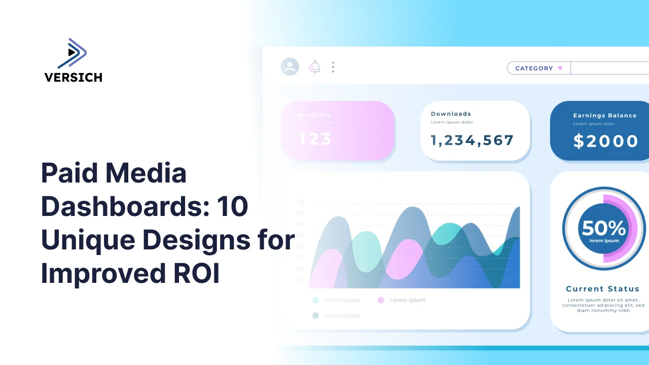
A paid media dashboard pulls data from every advertising platform a business runs into one place, so performance can be tracked and acted on without logging into five separate ad accounts. We typically build these in Looker Studio for marketing agencies and Power BI or Tableau for ecommerce brands and larger enterprises, depending on data volume and reporting complexity.
Over the past five years, Versich has built paid media dashboards for real businesses across Google Ads, Facebook, LinkedIn, YouTube, Amazon, and combined cross-channel reporting. Every example below comes from an actual reporting problem we solved for a client, not a generic template stretched to fit.
This guide walks through 10 distinct dashboard designs, channel-specific, cross-channel, and function-specific, then covers how to build one step by step and how to actually get value out of it once it's live.
Channel-Specific Dashboards
1. Google Ads Performance Dashboard
Built for: PPC specialists, in-house performance teams, and marketing agencies
Assessing campaign effectiveness and reporting results to stakeholders requires more than the default Google Ads interface offers, especially across a multi-client portfolio.
How Versich approaches it: We built this for a Google Ads marketing firm to standardize reporting across their entire client base.
It structures data into daily performance trends, campaign breakdowns, keyword analysis, and conversion tracking by type and location, with comparison toggles and filters letting users drill into any campaign or keyword. That makes it fast to see which campaigns are delivering value, which keywords are converting, and how performance shifts by location, supporting quicker optimization, clearer client communication, and consistent budgeting across the portfolio.
2. Facebook and Instagram Ads Dashboard
Built for: Media buyers, performance marketers, and agency account managers
Understanding how ad spend actually converts to revenue requires tracking engagement, traffic, and conversion together, not as three disconnected reports.
How Versich approaches it: We built this in Looker Studio for a Facebook Ads agency, structured around funnel performance and cost efficiency.
It unifies ad spend, revenue, and ROAS with daily trends, plus engagement metrics like impressions, clicks, and CTR. The funnel itself gets tracked stage by stage, landing page view, add to cart, checkout, purchase, with cost broken out at each step. That makes it possible to spot exactly where users drop off, judge cost at each funnel stage, and read profitability through cost per purchase and AOV, sharpening budget allocation and giving a consistent read on campaign effectiveness over time.
3. YouTube Ads Dashboard
Built for: Media buyers and video marketing teams
Judging which videos and campaigns are actually earning their spend requires comparing creative and targeting performance side by side, not just watching overall account totals.
How Versich approaches it: We built this in Looker Studio for a YouTube Ads agency, pulling data directly from Google Ads.
It tracks cost, clicks, CTR, and cost per conversion, broken down by campaign and by individual video, so different creatives and targeting approaches can be compared directly. That makes it fast to spot which videos are driving the best traffic and conversions, judge cost efficiency at both the campaign and video level, and shift budget toward the creative that's actually performing.
4. LinkedIn Ads B2B Dashboard
Built for: B2B marketers, demand generation teams, and paid media specialists
Judging campaign performance against the right objective is hard when awareness, engagement, lead generation, and follower growth all get lumped into one generic view.
How Versich approaches it: We built this in Power BI, pulling LinkedIn Ads data through a dedicated connector and organizing performance by campaign objective.
Users toggle between objective views, with each one surfacing the KPIs that actually matter for that goal: impressions and CTR for awareness, interaction rate for engagement, leads and cost per lead for lead generation, follower growth for brand-building campaigns. That structure shows spend, how it's distributed, and the result it produced, helping teams judge each campaign against its actual objective and keep reporting consistent across every LinkedIn campaign running.
5. Amazon Ads Dashboard
Built for: Ecommerce teams selling on Amazon
Understanding how paid and organic performance interact on Amazon requires merging Seller Central data with ad spend, which the native reporting tools don't do well.
How Versich approaches it: We built this for an Amazon retailer, unifying organic sales data from Seller Central with Amazon Ads data in one layer.
It tracks total sales, profitability, and the ad contribution to overall performance, broken down by country and product line, with drill-down into individual campaigns by spend and return. That makes it possible to identify top performers, judge exactly how much ads are contributing to revenue, and adjust strategy based on real sales dynamics rather than ad platform numbers alone.
Cross-Channel Dashboards
6. Marketing Mix Dashboard
Built for: Performance marketers and ecommerce teams
Comparing performance across every major channel in one place is the only way to see how each one is actually contributing to traffic, conversion, and ROI.
How Versich approaches it: We built this in Looker Studio for an ecommerce client, unifying Google Analytics, Google Ads, Bing, Facebook, Pinterest, and ShareASale into one consistent report.
Daily purchase data sits alongside cost metrics, organized by channel and campaign, with impressions, CPM, cost per purchase, ROAS, conversion rate, and revenue all visible together. The top section keeps acquisition cost honest against AOV, while channel and campaign-level views beneath it show what's building awareness, what's converting, and where the strongest return is sitting, supporting sharper budget decisions across the whole mix.
7. Google vs Bing Ads Dashboard
Built for: PPC teams and performance marketers
Comparing search performance across Google and Bing properly requires the same metrics, side by side, in the same structure, not two separate platform exports.
How Versich approaches it: We built this combining Google Ads and Microsoft Ads data into one cohesive report.
It reviews impressions, clicks, CTR, and conversions at both the campaign and keyword level on each platform, with consistent definitions throughout. That surfaces exactly where one platform is delivering better traffic quality or conversion efficiency, letting teams adjust bids and budget with real cross-platform evidence instead of a hunch.
Function-Specific Dasboards
8. Creative and Placement Performance Dashboard
Built for: Media buyers optimizing creative, audience, and placement decisions
Knowing which specific image, video, audience, or placement is actually driving results requires breaking performance down well past the campaign level.
How Versich approaches it: We built this style of dashboard to evaluate static and video creative, placement, and audience performance together in one view.
It shows each creative alongside CTR, revenue, conversions, and ROAS, letting media buyers spot which visuals are earning attention and which aren't worth the spend. For video, it tracks watch time and drop-off at 25%, 50%, and 75% to show exactly where attention fades, useful for sharpening the hook in the opening seconds. A placement layer compares cost per click, CPM, and CTR across destinations like Facebook, Instagram, Audience Network, and Messenger, and an audience layer breaks performance down by age, gender, and device. Together, this lets media buyers prioritize the creative, placement, and audience combinations that are actually working and stop spend on the ones that aren't.
9. Account-Level Ad Confidence Dashboard
Built for: Account managers deciding which ads to scale or pause
Deciding whether an ad has genuinely underperformed or simply hasn't run long enough to judge fairly is a common, costly source of indecision.
How Versich approaches it: Working with a leading agency, we built a dashboard that segments ads by total spend and performance against target, then assigns each one a confidence score, low, medium, or high, based on how consistent its results have been.
That confidence layer is what actually speeds up decisions. An account manager can see immediately whether an ad has gathered enough data to judge reliably, instead of guessing. The result is faster, more structured calls on scaling or pausing, less wasted spend, and considerably less hesitation around making the call at all.
10. Agency-Wide Client Performance Dashboard
Built for: Account managers and agency leadership managing multiple client accounts
Knowing which clients need attention right now, across an entire portfolio, is hard without one consolidated view of spend and profitability across every account.
How Versich approaches it: We built this to give account managers a single, portfolio-wide view of every client they manage.
It surfaces total spend and core profitability metrics per client side by side, making it immediately clear which accounts are underperforming and need attention versus which are running well and just need monitoring. That lets account managers direct their time where it actually matters, struggling accounts first, while keeping a steady eye on the accounts that are already performing, supporting more consistent results across the whole portfolio.
Building a Paid Media Dashboard, Step by Step
Building a paid media dashboard is a fairly contained process once you have the data sources sorted. With existing data and a reasonable template, most dashboards can come together in a day or two. The priority throughout is clarity, accuracy, and usability, not visual polish for its own sake.
Step 1:Define Purpose and Audience
Start by identifying exactly who's using the dashboard and what they need to walk away knowing. Media buyers, account managers, and executives need fundamentally different views, so aligning the dashboard to the specific questions it needs to answer, budget allocation, campaign optimization, client reporting, is what determines everything downstream.
Step 2: Connect the Data Sources
Bring every relevant source into one place to establish a real single source of truth: ad platforms like Google Ads, Facebook Ads, and LinkedIn Ads, GA4 for website behavior, and a CRM or ecommerce platform for revenue data. We typically use ready-made connectors from Windsor.ai, or build a custom ETL process into BigQuery when the situation calls for more control.
Step 3: Choose the Right Reporting Tool
Looker Studio is a strong choice for fast, easily shareable dashboards. Power BI suits more complex enterprise reporting. Google Sheets works fine for something lightweight or temporary. The right pick depends on customization needs, data volume, and who's actually going to use it.
Step 4: Start From a Template, Then Customize
A pre-built template speeds up development considerably, giving a proven structure for KPIs, layout, and visualization to adapt rather than starting from a blank page. Customize the metrics to match the actual business model, making sure CPA, ROAS, or conversion rate reflect how performance is genuinely measured internally.
Step 5: Validate Every Number Before Sharing
Before the dashboard goes anywhere near a stakeholder, check every figure against the original platform. This step is what builds trust: reconcile spend, clicks, and conversions against source systems to confirm the data and the calculations are both correct.
Step 6: Share and Train
Roll the dashboard out to the people who need it, with proper permissions and a walkthrough of the key metrics, filters, and drill-downs. That last step is what turns a dashboard into something genuinely used for ongoing decisions instead of something opened once and forgotten.
Example Build Flow Using Looker Studio
Connect Google Ads, Facebook Ads, and GA4 through their built-in connectors. Choose a paid media template and map the KPIs that matter, spend, conversions, ROAS, to the business. Add filters for date range, channel, and campaign to make the report interactive. Validate every number across platforms, then share with view-only access and set automatic refresh to keep it current without manual upkeep.
Getting Real Value From the Dashboard
A paid media dashboard only earns its keep if it's actually used to make decisions. It needs to sit inside a real routine and have someone who owns acting on what it shows. Without that, even a beautifully built dashboard quietly turns into a report nobody opens.
A workable cadence: weekly reviews to catch short-term shifts and make quick campaign adjustments, a monthly deeper look at channel performance, creative, and audience segments to shape strategy, and a quarterly review using that accumulated data to make the bigger calls, budget reallocation, channel mix, growth priorities.
The same core questions are worth asking every time:
- Where could 10% of budget move to generate a stronger return?
- Which ads deserve more spend, and which need to be cut?
- How close are we tracking to spend and conversion targets?
Asking those consistently is what turns the dashboard into a genuine decision-making tool rather than a report glanced at occasionally and forgotten.
Conclusion
A paid media dashboard earns its place when it's built around the actual questions a team needs answered, not a generic free template doing the bare minimum. Versich builds custom dashboards in Looker Studio, Power BI, and Tableau, designed around your specific channels, KPIs, and reporting workflow.