Introduction
At Versich, we work with marketing and finance teams who are drowning in data but starving for clarity. Spreadsheets pile up, exports multiply across ad platforms, CRMs, and web analytics tools, and by the time a report reaches leadership, the numbers are already stale. We built our Power BI practice specifically to solve this problem for our clients.
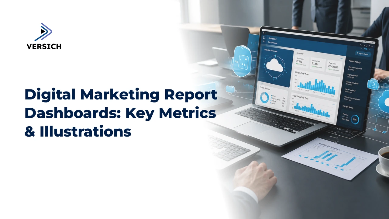
A digital marketing report dashboard pulls together the metrics that actually move the needle, spend, traffic, conversions, customer acquisition cost, and revenue attribution, into a single visual layer that updates automatically. Instead of waiting on a weekly export or chasing down numbers from five different tools, marketing leaders get a live view of performance whenever they need it.
In this article, we walk through the key metrics every digital marketing dashboard should track, the types of illustrations and visuals that make those metrics actionable, and how we approach dashboard design for our clients. We will also point you toward some of our own dashboard work so you can see these principles applied in practice.
Why Digital Marketing Dashboards Matter
Marketing teams generate enormous volumes of data, but data on its own does not drive decisions. A dashboard turns raw numbers into a narrative that a CMO, a finance director, or a campaign manager can act on in seconds rather than hours.
We have found that the organizations getting the most value from their dashboards share a few habits in common. They consolidate data from every channel into one source of truth, they review performance on a consistent cadence, and they design their dashboards around decisions rather than around the data itself.
- Faster decision making, since stakeholders see performance trends without waiting on manual reports
- Reduced reporting overhead, since data refreshes automatically instead of being rebuilt each cycle
- Better cross-channel visibility, since paid, organic, email, and social performance sit side by side
- Stronger accountability, since targets and actuals are visible to the whole team at once
This is the foundation our team builds on when we design a marketing dashboard for a client, whether that client is a retail brand tracking Shopify performance or a B2B company tracking pipeline influence.
There is also a cost dimension to this that often gets overlooked. Marketing teams without a centralized dashboard tend to spend a significant portion of every week on manual reporting, pulling exports from ad platforms, reconciling spend against finance records, and rebuilding the same charts for a recurring leadership update. We have seen this manual cycle consume anywhere from a few hours to a full day per week for a single analyst, time that could otherwise go toward campaign strategy or testing. Once a dashboard is connected and automated, that time gets returned to the team almost immediately.
There is also a trust dimension. When every department pulls its own numbers from its own export, small discrepancies creep in, a slightly different date range here, a different attribution model there, and those discrepancies erode confidence in the data itself. A single dashboard built on one consistent data model removes that friction. Everyone, from the performance marketing manager to the finance director, is looking at the same numbers, calculated the same way, refreshed on the same schedule.
Key Metrics Every Marketing Dashboard Should Track
The right metrics depend on the business model, but most digital marketing dashboards we build for clients include some version of the following categories.
Before we get into specific metrics, it is worth noting how we approach metric selection with a new client. We start by mapping out the decisions the dashboard needs to support, not the data that happens to be available. A dashboard built around available data tends to sprawl, with dozens of metrics competing for attention and no clear hierarchy. A dashboard built around decisions stays focused, because every metric on the page exists to answer a specific question someone on the team actually asks.
Traffic and Engagement Metrics
These metrics tell us how many people are reaching the brand and how they behave once they arrive.
Metric | Why It Matters |
Sessions and unique visitors | Shows overall reach across channels and time periods |
Bounce rate | Flags landing pages or campaigns that are not resonating |
Average session duration | Indicates content or offer relevance |
Traffic source breakdown | Separates paid, organic, social, email, and direct traffic |
Conversion and Revenue Metrics
These metrics connect marketing activity to business outcomes, which is where most of our clients want the dashboard to focus.
Metric | Why It Matters |
Conversion rate | Measures how effectively traffic turns into leads or sales |
Customer acquisition cost (CAC) | Shows the true cost of winning a new customer by channel |
Return on ad spend (ROAS) | Ties spend directly to revenue generated |
Average order value (AOV) | Highlights upsell and cart performance, especially for ecommerce |
Marketing-attributed revenue | Connects campaigns to closed deals or completed purchases |
Channel Performance Metrics
Channel-level metrics help teams decide where to shift budget.
Metric | Why It Matters |
Cost per click (CPC) and cost per mille (CPM) | Tracks paid media efficiency over time |
Email open and click-through rate | Measures list health and content relevance |
Social engagement rate | Reflects how well content resonates on each platform |
Organic search rankings and impressions | Shows long-term SEO progress |
Pipeline and Funnel Metrics
For our B2B clients in particular, dashboards often need to bridge marketing activity with sales pipeline stages.
- Marketing qualified leads (MQLs) and sales qualified leads (SQLs)
- Lead-to-opportunity conversion rate
- Pipeline velocity by campaign or source
- Win rate by lead source
When we design a dashboard, we typically group metrics into these four categories and let the client choose which sit on the primary view versus a drill-down page. This keeps the main dashboard clean while still giving analysts a path to deeper detail.
We also pay close attention to how metrics are defined before they ever reach the dashboard. A conversion rate calculated against all sessions tells a different story than a conversion rate calculated against unique visitors, and a CAC that includes only media spend tells a different story than one that also includes salaries and tooling costs. Getting these definitions agreed upon and documented early avoids a common problem we see when we inherit an existing report: two departments looking at the same dashboard but disagreeing on what a number actually means.
Illustrations and Visual Elements That Bring Dashboards to Life
Metrics alone are not enough. How a metric is visualized determines whether a stakeholder understands it at a glance or has to stop and interpret it. Our design approach in Power BI focuses on matching the right visual to the right type of insight.
A common mistake we see in self-built dashboards is choosing a visual because it looks impressive rather than because it communicates clearly. A 3D pie chart or a dense table with twenty rows might look sophisticated, but it slows down the very people the dashboard is meant to help. We default to the simplest visual that accurately represents the data, and we only add complexity when the underlying insight genuinely requires it.
Trend Lines and Time Series Charts
Line charts remain one of the most effective ways to show performance over time, whether that is daily ad spend, weekly website traffic, or monthly revenue. We typically pair a trend line with a comparison period, such as the same range last year, so stakeholders can see growth or decline in context rather than in isolation.
KPI Cards and Scorecards
At the top of most dashboards we build, we place a row of KPI cards showing the headline numbers, total spend, total conversions, ROAS, and CAC, alongside a small indicator showing whether each metric is trending up or down against target. These cards give executives the thirty-second summary before they dive into channel-level detail.
Funnel Visuals
Funnel charts are particularly useful for showing where prospects drop off between awareness, consideration, and conversion stages. We use these heavily in B2B dashboards where the marketing-to-sales handoff needs to be visible to both teams.
Heat Maps and Geographic Visuals
For clients running multi-region campaigns, geographic heat maps make regional performance differences immediately obvious. Combined with a heat map table showing day-of-week and hour-of-day engagement, these visuals often reveal scheduling opportunities that raw numbers would not surface.
Comparison and Breakdown Charts
Stacked bar charts and donut visuals are effective for channel mix comparisons, showing how spend or conversions are distributed across paid search, paid social, email, and organic. We are careful to limit these to a small number of categories so the visual stays readable rather than cluttered.
Drill-Through Pages
One of the advantages of building these dashboards in Power BI is the ability to let a user click into a single metric, such as a campaign or a channel, and drill through to a dedicated detail page. This keeps the primary dashboard simple while still giving analysts the depth they need without building a separate report.
Combination Charts
Combination charts, which pair a bar chart with an overlaid line, are particularly useful for showing spend against output, such as ad spend by week alongside the resulting conversion rate. Seeing both metrics on the same chart makes it easy to spot whether increased spend is actually translating into proportional results, or whether returns are starting to diminish.
Tooltips and Contextual Detail
Power BI allows us to build custom tooltips that appear when a user hovers over a data point, showing supporting detail without cluttering the main visual. We use this frequently on trend lines, so a stakeholder can hover over a spike or dip in performance and immediately see the campaign or event that drove it, rather than having to navigate to a separate page to investigate.
Best Practices We Follow When Designing Marketing Dashboards
Across the dashboards we have built for clients, a handful of design principles consistently produce better adoption and better decisions.
- Design around questions, not data tables. Start with the decision a stakeholder needs to make, then choose the metrics and visuals that answer it
- Limit each view to one screen. If a dashboard requires scrolling to see the full picture, key metrics get missed
- Use consistent color coding across pages so that, for example, paid media is always the same color regardless of which page it appears on
- Build in comparison periods by default, since a number without context rarely tells the full story
- Automate data refresh so the dashboard reflects current performance without manual intervention
- Separate executive summary views from analyst detail views so each audience sees the right level of depth
These principles guide how our team approaches every Power BI engagement, whether we are building a dashboard from scratch or restructuring an existing report that has become difficult to maintain.
Common Pitfalls We Help Clients Avoid
Many of the dashboard engagements we take on start as a rebuild rather than a fresh build, because an existing report has run into one of a few recurring problems.
Metric Sprawl
Dashboards built incrementally over time, with a new chart added every time someone asks a question, tend to accumulate far more metrics than any single view can support. We regularly inherit dashboards with thirty or more visuals on one page. Part of our process involves working with the client to identify which metrics genuinely drive decisions and archiving the rest to a secondary or drill-down page.
Manual Data Refresh
If a dashboard depends on someone manually exporting and uploading a spreadsheet each week, it is only as current as the last manual update, and it is vulnerable to being skipped during busy periods. We connect dashboards directly to source systems wherever possible so refresh happens automatically on a schedule.
Inconsistent Definitions Across Teams
As mentioned earlier, this is one of the most common issues we encounter. Marketing might define a lead differently than sales does, or finance might calculate revenue on a cash basis while marketing reports on an accrual basis. We work with stakeholders early in the engagement to align on shared definitions before any visual gets built, which avoids painful rework later.
Designing for Every Audience at Once
A single dashboard view trying to serve executives, analysts, and campaign managers simultaneously usually ends up serving none of them well. We typically recommend a tiered structure: a high-level executive summary, a channel-level operational view, and a detailed analyst page, all built on the same underlying data model so the numbers always reconcile.
How Our Team Helps Build These Dashboards
We design and build digital marketing dashboards end to end, starting with connecting source systems, ad platforms, CRMs, ecommerce platforms, and web analytics tools, through to designing the final visual layer in Power BI. Our team handles the data modeling work behind the scenes so that the metrics shown on screen are accurate and consistent, not just visually appealing.
For clients who need ongoing dashboard development, our Power BI Consulting Services team scopes and builds custom dashboards aligned to specific business goals, from marketing performance reporting to full executive reporting suites.
Once a dashboard is live, it still needs care. Data sources change, new campaigns get added, and report requirements evolve. Our Power BI Support Services team provides ongoing maintenance and enhancement so dashboards stay accurate and useful long after the initial build.
If you want to see examples of the dashboard styles and visual approaches we have covered in this article, our Power BI Portfolio showcases interactive dashboards we have delivered across multiple industries, including marketing and revenue reporting.
For a closer look at the business outcomes these dashboards have driven for our clients, our Power BI Case Studies walk through real engagements, the challenges clients faced before working with us, and the results delivered after launch.
Conclusion
A well-designed digital marketing dashboard does more than display numbers. It gives marketing and leadership teams a shared, real-time view of performance that supports faster, better-informed decisions. By focusing on the right metrics, traffic, conversions, revenue, channel performance, and pipeline, and pairing them with visuals that make trends and outliers immediately clear, we help our clients move from reactive reporting to proactive strategy.
If your team is ready to build a marketing dashboard that actually drives decisions rather than just displaying data, we would be glad to talk through your requirements.
Get in touch with our team on our Contact Us page to start the conversation.