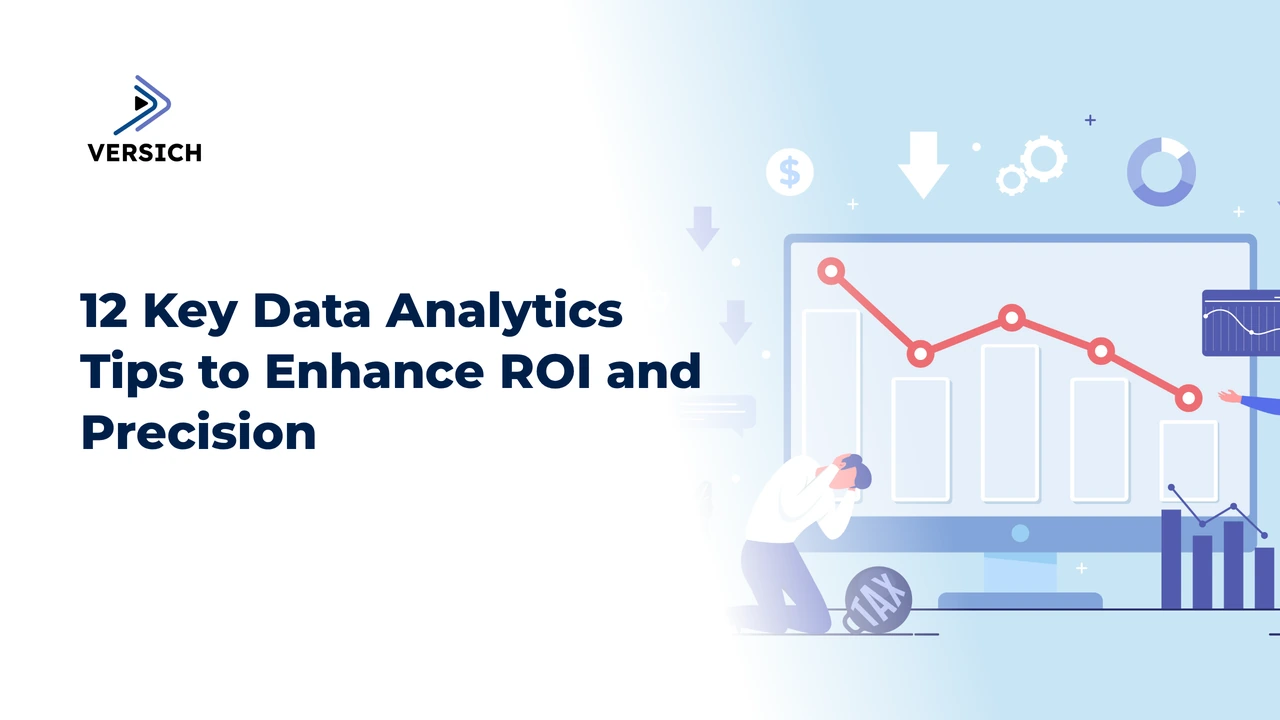
The gap between a dashboard that just looks good and one that actually drives a decision usually comes down to a handful of fundamentals. Plenty of organizations invest heavily in analytics and still struggle to turn data into anything actionable, almost always because one of those fundamentals got skipped.
Versich's BI consultancy has completed 1,000+ data analytics projects for 600+ clients, including major global brands. Some of the executive dashboards we've built have driven $100K+ in measurable value, which is exactly the kind of outcome these practices are built to produce.
This guide walks through 12 essential best practices, from defining the right business question to choosing the right KPIs, protecting data quality, picking the right tools, and designing dashboards that actually drive decisions. We'll also cover the most common pitfalls and a practical 90-day plan for putting all of this into action.
Why These Practices Matter Now
Organizations can no longer afford to accumulate data without a plan. The expectation now is real-time value, drawn from systems built to adapt as conditions shift, which makes these fundamentals essential rather than optional.
In our experience, when an organization doesn't see a real return on its analytics investment, the cause is almost always a missed fundamental, not a technology problem, in roughly 9 out of 10 cases. Committing to proven practice is what turns a data initiative from an expensive experiment into a reliable source of growth and real competitive advantage.
12 Essential Data Analytics Best Practices
1. Start With a Business Question
Every analytics effort should start from a clearly defined business question tied directly to a commercial goal, improving marketing ROI, cutting operational cost, lifting retention. The sharper the question, the easier it is to know which KPIs to track, how to structure the data, and what kind of analysis actually drives action.
Without a clear question, analytics drifts away from real decision-making fast. Teams end up building dashboards and reports that don't produce meaningful insight, wasting effort on low engagement and unclear ROI. Without a focused starting point, organizations track too many irrelevant metrics or misread what they're looking at, which slows decisions and erodes trust in the data.
From our work: We worked with a medical device company that needed a clear answer to one question: how do you track machine utilization and catch failures before they hurt performance? We built Power BI reports centered on component cycles, utilization trend, and maintenance triggers, letting the team catch early signs of declining use, act proactively, and re-engage customers on time. The result was a 20% increase in service revenue alongside lower operating costs.
2. Establish Clear KPIs
Once the business question is clear, it needs to translate into specific, measurable goals tied to coherent KPIs. That starts with one north star metric representing the core goal, revenue growth, pipeline value, retention, with every other KPI built to explain what's driving that number and where the room for improvement actually sits.
Without a coherent KPI structure, analytics becomes unwieldy fast. Teams end up tracking a pile of disconnected metrics, which breeds confusion and slows decisions. Without a north star, success stays ambiguous, and stakeholders end up fixated on metrics that don't actually move the business.
From our work: We worked with a global outsourcing company's marketing leadership to build a Power BI sales pipeline dashboard showing exactly how marketing was contributing to revenue. We set expected revenue from marketing as the central metric and built every supporting KPI, leads by source, stage conversion rate, opportunities by region, around it. That structure let stakeholders see clearly which channels were actually building pipeline and where performance was falling short, eliminating 6 hours of manual reporting and replacing it with automated daily insight that sharpened decisions on underperforming lead sources.
3. Improve Data Quality
Strong data is the foundation everything else rests on. That means verifying sources, fixing inconsistencies, removing duplicates, and confirming tracking and data collection are actually working as intended, with clear data ownership and ongoing monitoring as systems change.
Poor data quality produces misleading insight and quietly erodes trust in analytics altogether. Once stakeholders hit inconsistent or wrong numbers, they stop trusting reports entirely, which slows decisions, adds manual double-checking, and pushes teams back toward spreadsheets instead of the dashboard built to replace them.
From our work: A large automotive marketing agency was dealing with inconsistent GA4 tracking across 70+ client websites, the result of different developers working without a shared strategy. We audited the setup to find the discrepancies, then standardized data collection with structured GTM templates and one consistent tracking methodology, making sure key events and metrics were captured the same way everywhere. Reporting accuracy rose 40%, and setup time per website dropped from 8-10 hours down to 2-5.
4. Select the Right Tools
Choosing the right tools matters for building something scalable, covering data integration, warehouse storage, and BI reporting, all chosen to fit your actual data sources, audience, and analytical needs.
The wrong tool choice can disrupt the whole analytics effort. Some BI platforms need paid licenses per user, which complicates external sharing and adds administrative weight. Others, like Looker Studio, share easily without licensing but trade off some advanced visualization. A tool that doesn't integrate cleanly, or is too complex for the team using it, sees usage drop and value along with it.
From our work: We saw this clearly in a project moving 40+ dashboards from Tableau to Power BI to better fit a client's Microsoft ecosystem and cut cost. We rebuilt the dashboards for clarity and smooth integration with existing data sources, and the client cut licensing spend by $2,500 a month while ending up with a more intuitive, scalable reporting setup.
5. Build Analytics That Actually Drives Decisions
Dashboards should be built to support a decision, not just display data. That means structuring around real business questions, using clear KPIs, and keeping visuals simple enough to navigate, guiding users from a high-level view down to detail through filters, drill-downs, and a consistent layout.
A cluttered, inconsistent, or overly complex dashboard overwhelms users and slows decisions instead of speeding them up, leading to low engagement, excessive manual analysis, and insight that gets missed simply because it wasn't presented clearly.
From our work: In one project, we built automated Power BI reports on top of a massive ERP database with millions of rows, used daily by sales, marketing, procurement, operations, and finance. We focused the dashboards on revenue, cash flow, and cost analysis, optimized for performance, and built clear navigation for a genuinely diverse set of stakeholders. Users quickly identified cost-saving opportunities and revenue drivers, producing an immediate €50,000 in savings, an extra €10K-20K in monthly recurring revenue, and the elimination of a full-time analyst role previously spent on manual Excel reporting.
6. Follow Real Data Visualization Principles
Good visualization is about clarity, not complexity, the right chart type, consistent design, and a clear visual hierarchy. A useful framework here, from Storytelling with Data, focuses on cutting clutter, prioritizing what matters, and guiding the viewer through the insight deliberately.
Ignoring these principles makes a dashboard genuinely hard to read. Users misread trends, miss real insight, or burn time just trying to decode the chart in front of them, which erodes trust in the analytics even when the underlying data is completely accurate.
From our work: We built a dashboard for a children's care home in the UK, designed to present key metrics clearly while linking supporting evidence through SharePoint, so users could understand a case quickly and present clearly to regulators. Structuring the visuals around clarity and usability made the dashboard genuinely useful day to day, supporting consistent standards of care and opening the door to expanding analytics into other parts of the organization.
7. Evaluate Analytics Performance
Analytics needs to do more than present insight, it needs to measure the impact of acting on that insight. That means tracking how decisions shaped by analytics actually move the north star metric, revenue, cost efficiency, retention, and watching supporting KPIs to see which specific change is driving the improvement.
Without a way to measure this, proving the value of an analytics effort becomes nearly impossible, and so does improving it over time. Teams keep running dashboards without knowing whether they're genuinely affecting the bottom line, which wastes resources and leaves ROI permanently unclear.
From our work: A client wanted customer acquisition cost as their north star metric. We built a dashboard tracking CAC alongside conversion rate, channel performance, and lead quality. Over time, the client used that insight to shift budget away from underperforming channels and toward stronger ones, and by measuring the impact of each shift, cut CAC by more than 25% while still growing revenue, a clear, measurable case for the analytics investment.
8. Train Your Users
Even a brilliantly built dashboard fails if users don't understand it. Training matters, not just explaining what each metric means, but how to navigate the dashboard and turn what it shows into an actual decision, which matters even more on cross-functional teams with uneven data literacy.
Skipping training creates real problems: misread data, a dashboard nobody opens, or in the worst cases, decisions made on a completely wrong conclusion. That leads to poor outcomes, weak adoption, and a general distrust of the whole analytics effort.
From our work: The strongest analytics projects we've run include hands-on training tailored to each user group, often a workshop walking stakeholders through real business scenarios directly on their own dashboard, showing exactly how to read a metric and act on it. That builds real confidence, drives adoption, and makes analytics a genuine part of how decisions get made.
9. Build a Single Source of Truth
A single source of truth means every team works from one consistent data model, typically through a centralized BI data warehouse pulling from multiple systems, applying one consistent logic, and feeding every dashboard and report from that same foundation. That removes inter-departmental discrepancy and gives decisions a solid base to stand on.
Without it, organizations end up with conflicting numbers and fragmented data silos. Different teams work from different datasets, leading to inconsistency, duplicated effort, and ongoing arguments about whose number is actually correct, all of which slows decisions and weakens trust in analytics company-wide.
From our work: We helped a platform company build a centralized cloud database, integrating multiple systems through APIs into one Azure-based database. That eliminated data silos and gave them one unified model for every report. They cut manual data consolidation dramatically, dropped report generation time from 48 hours to under 5 minutes, sped up decision-making by 40%, and lifted data accuracy to 99.7%, giving them real confidence in relying on live data.
10. Implement Strong Data Governance
Governance keeps data accurate, secure, and consistently managed across the organization, built on four pillars: data quality, stewardship (clear ownership), protection (access and compliance), and management (the full data lifecycle from collection through storage).
Without real governance, analytics becomes a genuine liability. Inconsistent definitions, unclear ownership, and weak security controls open the door to data breaches and compliance trouble, slowing decisions and exposing the organization to real legal and financial risk, especially with sensitive data involved.
From our work: We worked with a client struggling with inconsistent reporting across departments, the result of unclear data ownership and multiple definitions for the same metric. We built a governance framework defining KPI ownership, standardizing metric definitions, and adding role-based access controls across the BI environment, along with data quality checks and audit logs to monitor usage proactively. Reporting inconsistencies disappeared, stakeholder trust in the data rose sharply, and leadership could finally rely on one governed set of metrics for strategic decisions.
11. Optimize for Performance
Performance optimization, using sound data modeling practice, keeps an analytics solution fast, scalable, and reliable as data volume grows. That means transforming data close to the source, using efficient structures like star schemas, trimming unnecessary columns and tables, choosing the right data types, and keeping relationships simple enough to stay responsive.
Performance problems create real friction. Slow reports, long refresh times, and laggy dashboards frustrate users and kill adoption, often pushing teams back to static reports or manual exports once the live system feels too sluggish to trust for real-time use.
From our work: We've repeatedly redesigned inefficient data models, trimming unnecessary columns, restructuring relationships, and speeding up transformations. That regularly shrinks model size by up to tenfold, and in some cases cuts refresh time from over an hour down to as little as 2 minutes, giving stakeholders instant access to current data and making the dashboard part of their actual daily routine.
12. Treat It as Iterative, Not a One-Time Project
Analytics implementation isn't a single project with a finish line. The moment a dashboard launches, stakeholders start asking new questions, which is exactly what should drive ongoing development, new metrics, sharper logic, expanded analysis, in step with real business need.
Without that mindset, analytics goes stale fast. Static dashboards drift out of relevance as priorities shift, and users abandon them the moment they can't get the answer they need, which tends to spawn disconnected, ad hoc analysis outside the main system that quietly undermines consistency.
From our work: The strongest analytics solutions we've built evolve alongside the business they serve. We typically start with a focused core dashboard built around key KPIs, then expand it with new views, filters, and deeper analysis as stakeholders engage more deeply with the data. That continuous feedback loop is what keeps an analytics solution relevant, genuinely adopted, and woven into how decisions actually get made.
Common Pitfalls (and How to avoid them)
Most failed analytics projects trace back to predictable mistakes in planning, data management, or adoption, not to complicated technology. Caught early, every one of these is avoidable.
1. Starting With Tools Instead of Problems: Plenty of teams pick a BI tool before they've actually defined the problem it needs to solve, which usually produces a polished dashboard that doesn't answer a single real business question.
2. Over-Collecting Data Without a Strategy: Gathering more data than necessary, without a clear purpose, complicates everything without adding value, slowing performance and making analysis genuinely harder to interpret.
3. Overlooking Data Quality: Inconsistent tracking, vague definitions, and missing data quietly erode trust in analytics. Once stakeholders stop believing the numbers, adoption falls fast.
4. Building Dashboards Nobody Uses: Dashboards fail most often because they don't match how stakeholders actually make decisions, or because they're simply too complicated to use day to day.
5. Skipping Change Management: Even a genuinely well-built analytics solution falls flat if users aren't properly onboarded. Teams default back to the old process out of habit or resistance.
Ignoring these tends to be costly: months lost in development, overspending on tooling, and a system that ends up barely used with no clear ROI to show for it. Avoiding these mistakes matters just as much as following the 12 practices above, together they're what makes an analytics investment pay off rather than quietly fading into another unused system.
A Practical 90-Day Action Plan
The most reliable way to put these practices into motion is a structured 90-day plan, the same approach we use when implementing analytics for clients. The goal is moving fast from assessment to measurable impact while building something that holds up long term.
Days 1-30: Assessment and Alignment
The first 30 days are about understanding the current landscape: auditing existing tools, checking data quality, and reviewing current dashboards and reporting methods. Core activities include a data health check, cataloging the metrics that actually matter, and identifying gaps in quality, governance, and usability. By the end of this phase, it should be clear what's working, what isn't, and where the biggest opportunity actually sits.
Days 31-60: Quick Wins and Core Improvements
The next 30 days focus on visible improvement: standardizing 3 to 5 core KPI definitions, fixing the most critical data quality issues, and rebuilding key dashboards around real business questions. A reasonable milestone here is shipping a redesigned dashboard for one team by a set deadline. These early wins demonstrate value fast and build genuine trust in the analytics effort.
Days 61-90: Building Momentum and Scale
The final 30 days embed what's working into daily operations: real governance frameworks, clear ownership, and a process for ongoing maintenance that won't quietly fade after launch. Every action needs a clear owner and a deadline tied to a real business outcome, department leads owning specific KPIs by quarter-end, or governance policy finalized before the quarter closes.
Momentum is what makes this work. Real results within 90 days build credibility with stakeholders and earn deeper investment in analytics going forward. Rather than trying to do everything at once, this approach lets analytics start producing value immediately and keep improving from there.