What is a SAP Revenue and Backlog Insights Dashboard?
SAP holds some of the most valuable operational data a business has. Order history, product performance, regional sales, backlog volumes, year-over-year comparisons. The challenge is that getting a clear, visual picture of all of that in SAP itself requires running multiple reports, switching between modules, and spending time on extraction and formatting before any analysis can begin.
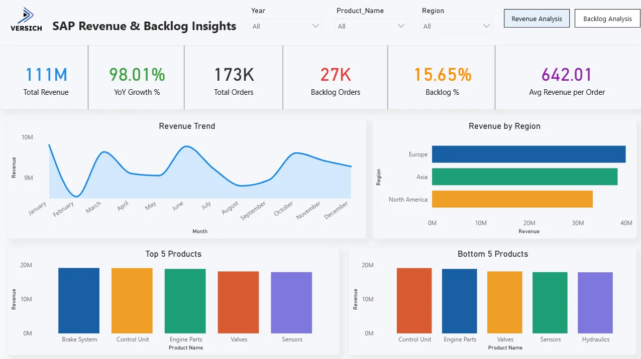
A SAP Revenue and Backlog Insights Dashboard built in Power BI changes that. It pulls SAP data into a connected model and presents $111M of revenue, 173K total orders, and 27K backlog orders across two dedicated tabs, filterable by year, product name, and region so any commercial or operations question gets answered in seconds.
At Versich, we built this SAP Revenue and Backlog Insights Dashboard in Power BI for commercial teams, operations managers, and senior leadership who need to see revenue performance and backlog health side by side without opening SAP or waiting for a weekly extract.
Why SAP Teams Are Still Working Without Clear Visibility
Here is what we hear from commercial and operations leads before they have a proper SAP analytics dashboard. Revenue by region is pulled from one SAP report. Backlog volumes come from another module entirely. Product-level comparisons require exporting both to Excel and building charts manually. Year-over-year growth is calculated in a spreadsheet that gets updated once a month. And when a regional manager asks why backlog is building in Europe, the answer takes a day to compile.
SAP has the data. Power BI gives it a form that is actually usable for daily decisions rather than monthly reports.
The Dashboard We Built
This dashboard has two tabs because revenue analysis and backlog analysis serve two different decision-making contexts. Revenue Analysis is for the commercial team tracking sales performance. Backlog Analysis is for operations teams managing order fulfilment pressure. Three filters sit across the top of both tabs: Year, Product Name, and Region. Every visual updates simultaneously when any filter is applied.
Here is the interactive version of the SAP Revenue and Backlog Insights Dashboard: SAP Revenue & Backlog Insights: Power BI Solutions | Versich
Revenue Analysis Tab The Commercial Picture
The first tab is for commercial leads, regional managers, and senior leadership who need to understand how revenue is performing across products and regions throughout the year.
1. KPI Row Six Numbers That Define Commercial Health
Total Revenue ($111M) in blue, YoY Growth % (98.01%) in green, Total Orders (173K), Backlog Orders (27K) in red, Backlog % (15.65%) in orange, and Avg Revenue per Order (642.01) in purple sit across the top. A 98.01% year-over-year growth rate is the headline. Revenue has nearly doubled compared to the prior year, which immediately raises the question of whether that growth is driven by one region, one product, or broadly distributed. The 15.65% backlog rate tells you that 27K of 173K total orders have not yet been fulfilled, which is an operational pressure point sitting alongside strong commercial growth.

2. Revenue Trend
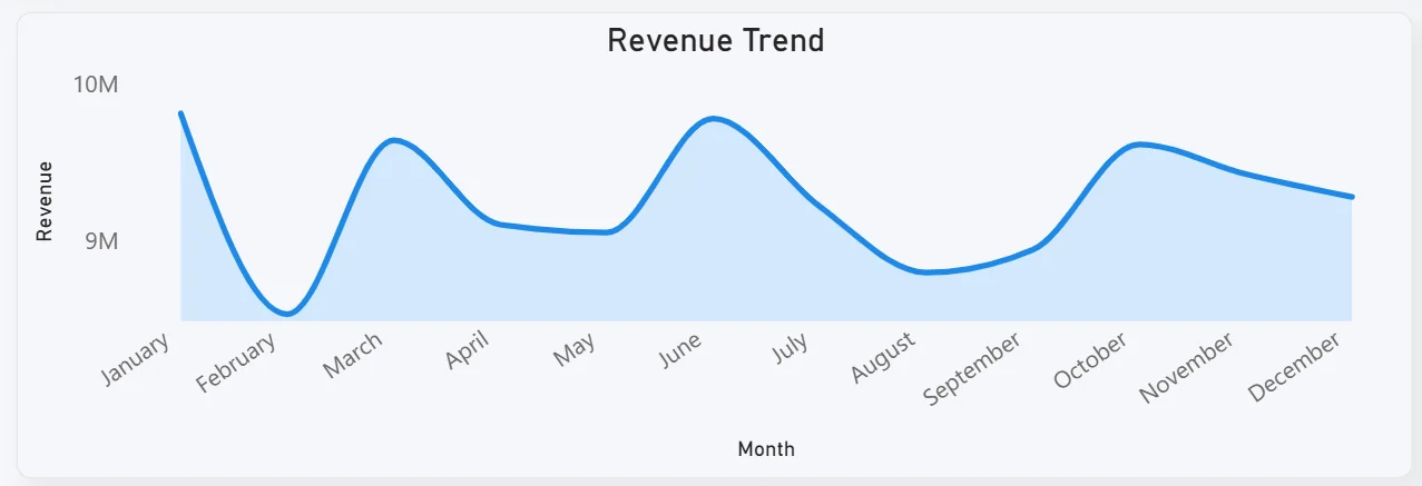
The area chart tracks monthly revenue from January through December. Revenue starts high in January around $9.5M, dips in February, recovers through March and April, peaks around June, drops sharply in July and August, then climbs again from September through October before tapering off in November and December. That mid-year dip in July and August is the most significant feature in this chart. For a commercial team, understanding what drives that consistent seasonal drop, whether it is demand seasonality, product availability, or regional market patterns, is a direct input for next year's revenue planning.
3. Revenue by Region
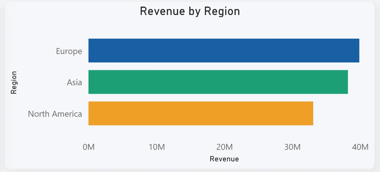
The horizontal bar chart ranks three regions: Europe leading at nearly $40M, followed by Asia, and then North America. Europe generating the most revenue is the key commercial finding on this tab. North America trailing behind both Europe and Asia tells you either North America is a newer market, a smaller addressable market, or an underperforming region relative to its potential. Filtering by product name while viewing this chart shows whether Europe's lead is consistent across all products or concentrated in specific ones.
4. Top 5 and Bottom 5 Products
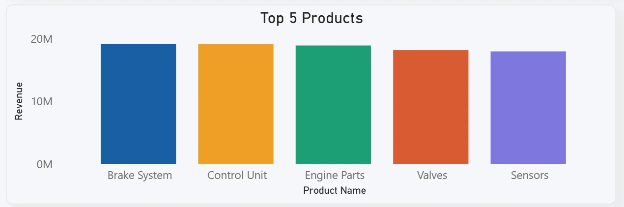
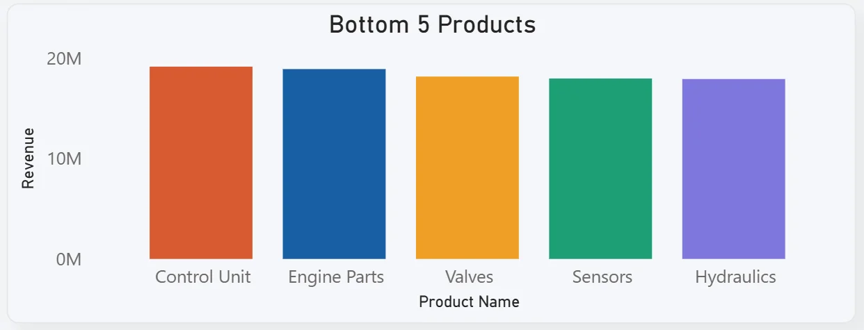
Two bar charts sit side by side showing top and bottom performing products by revenue. The top 5 Brake System, Control Unit, Engine Parts, Valves, and Sensors are closely clustered between $17M and $19M each, meaning no single product dramatically outperforms the others. The bottom 5 Control Unit, Engine Parts, Valves, Sensors, and Hydraulics tell an interesting story because Control Unit and Engine Parts appear in both lists. That likely means these products appear across multiple categories or regions and their total performance varies significantly depending on the filter applied. This is the kind of nuance that a flat product ranking table would never surface.
Backlog Analysis Tab The Operations Picture
The second tab is for operations managers, supply chain leads, and fulfilment teams who need to understand where backlog is building, which products and regions are most affected, and how backlog is trending month by month.
5. Backlog Trend
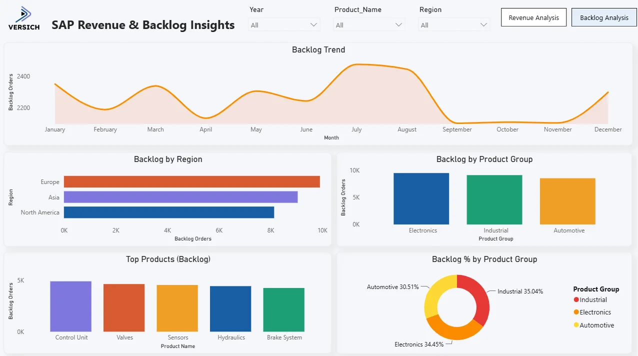
The area chart tracks backlog orders month by month from January through December. Backlog stays relatively flat between 2,200 and 2,400 orders through the first half of the year, spikes sharply to a peak of around 2,500 in July, then drops dramatically in September and October to its lowest point before recovering again toward December. That September and October low is significant. It tells you that either fulfilment significantly outpaced new backlog creation in those months, or a large batch of long-standing backlog was cleared. Cross-referencing this with the revenue trend chart, which also shows a dip in the same period, helps distinguish between a fulfilment improvement and a demand slowdown.

6. Backlog by Region
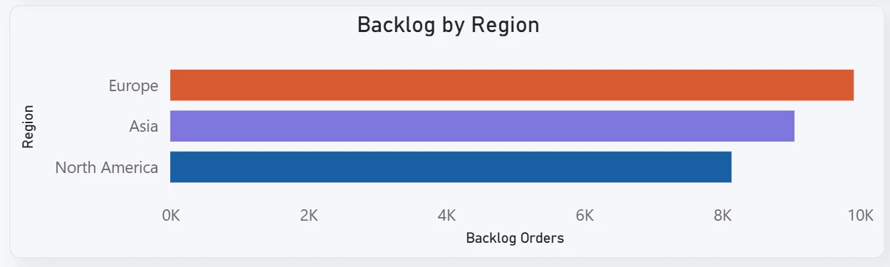
The horizontal bar chart shows Europe carrying the highest backlog volume at nearly 10K orders, followed by Asia and North America. Europe leading on both revenue and backlog tells you it is the most active market in both directions. High revenue and high backlog in the same region means demand is strong but fulfilment capacity may be stretched. For operations, this chart immediately tells you where to focus capacity planning conversations.
7. Backlog by Product Group
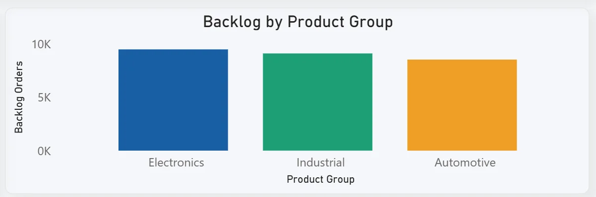
The bar chart breaks backlog across three product groups: Electronics, Industrial, and Automotive each carrying roughly equal backlog volumes of around 9K to 10K orders. The near-equal distribution across all three product groups tells you backlog pressure is not concentrated in one category. It is a portfolio-wide operations challenge rather than a product-specific issue, which changes the nature of the intervention needed.
8. Top Products by Backlog
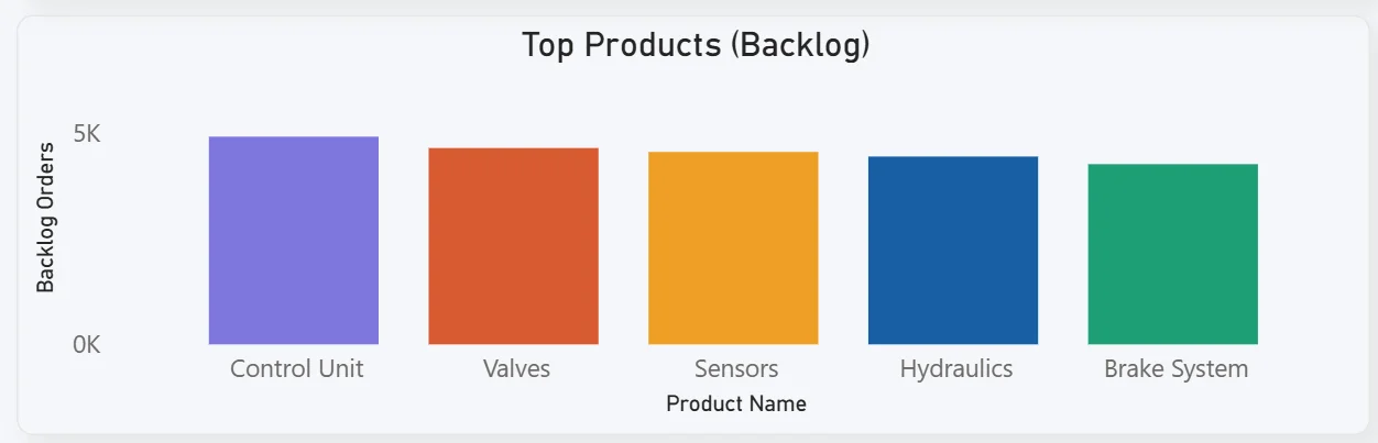
The bar chart ranks the five products with the highest backlog orders: Control Unit leading, followed by Valves, Sensors, Hydraulics, and Brake System. Control Unit having the highest backlog is an interesting finding given that it appeared in the top 5 revenue products on the Revenue Analysis tab as well. High revenue and high backlog together suggest Control Unit is the most in-demand product and potentially the one where fulfilment constraints are most commercially impactful.
9. Backlog % by Product Group Donut
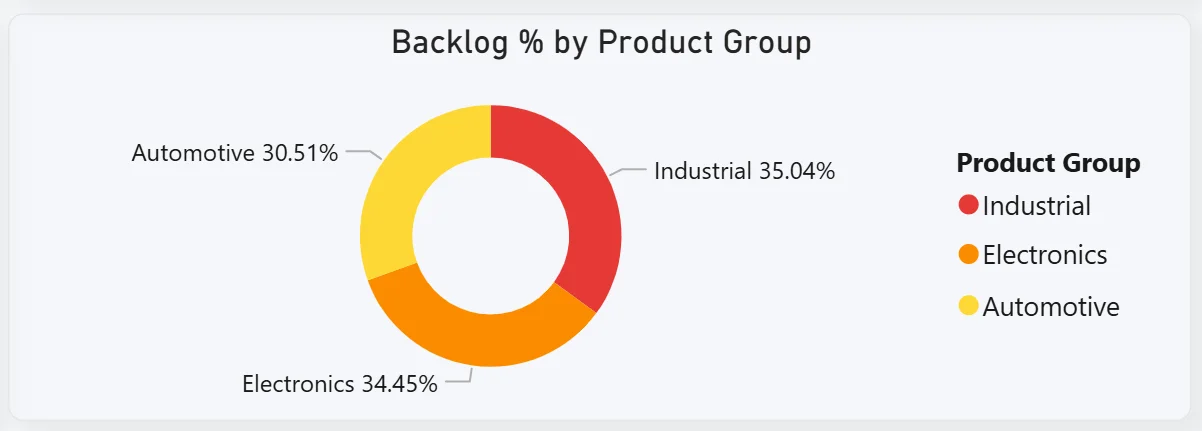
The donut chart shows backlog distributed as Industrial at 35.04%, Electronics at 34.45%, and Automotive at 30.51%. Industrial carrying the slightly higher backlog share relative to its product group despite roughly equal volumes in the bar chart suggests Industrial products have a slightly lower fulfilment rate than Electronics and Automotive. For supply chain teams, this is the chart that focuses the procurement and production planning conversation on the right product group.
How It Works Under the Hood
The dashboard connects to SAP data through direct database connections, SAP Business Warehouse, or structured data exports into a Power BI data model. DAX measures calculate YoY growth, backlog percentages, average revenue per order, and regional totals consistently across all filters. The three filters at the top of both tabs connect to every visual simultaneously so any year, product, or region selection updates the entire current tab in one action.
Business Benefits
What changes when your team has this dashboard
- Commercial reviews start with the YoY growth and regional revenue breakdown already on screen rather than pulled from a SAP report that morning.
- The top and bottom product charts surface underperformers alongside leaders so product mix conversations are grounded in actual revenue data.
- Operations teams see backlog by region and product group in one view so capacity planning decisions are made before backlog pressure compounds.
- The backlog trend chart shows whether backlog is building or clearing month by month so fulfilment performance is tracked continuously rather than at quarter end.
- Europe's dual position as highest revenue and highest backlog region is visible in both tabs so the connection between commercial success and operational pressure is made explicit.
- Filtering by product name across both tabs shows a single product's full commercial and operational picture in seconds.
Strategic Advantages for Commercial and Operations Leaders
Beyond the weekly review improvements, having this kind of SAP analytics dashboard available over months and quarters changes how commercial and operations leaders make longer term decisions.
When you can see the revenue trend dipping every year in July and August on the area chart, you can build that seasonality into next year's targets and production planning rather than treating it as a surprise each time. When Europe consistently leads both revenue and backlog across every period you filter, you can make a strategic case for regional fulfilment investment rather than treating European backlog as a one-off operations issue. When Control Unit appears in both top revenue and top backlog lists quarter after quarter, you can prioritise it for capacity investment rather than treating it as an equal priority alongside products with neither the revenue performance nor the backlog pressure.
This is the difference between a dashboard that replaces a SAP report and one that drives better commercial and operational strategy over time. The Versich SAP Revenue and Backlog Insights Dashboard is built to do both.
Conclusion
SAP holds the data that drives commercial and operational decisions. The challenge has always been getting that data out of SAP and into a form that is fast, visual, and filterable in real time rather than in a weekly report that is already outdated.
This dashboard solves that across two tabs. Revenue Analysis gives commercial teams the full picture: $111M in revenue, 98% YoY growth, regional rankings, and top and bottom product performance. Backlog Analysis gives operations teams the fulfilment picture: 27K backlog orders trended by month, broken down by region and product group, with the top backlog products and category distribution visible in one view. Both tabs respond to the same three filters and draw from the same SAP data model.
If your commercial and operations teams are still pulling separate SAP reports and reconciling them manually, the data is already in your system. A well-built Power BI dashboard just makes it usable before decisions need to be made rather than after.
If you want to see what a SAP Revenue and Backlog dashboard could look like for your organisation, get in touch with the Versich team and we can walk you through it.