Why SAP and Power BI Are Worth Pairing
SAP systems are built to run the business: transactions, inventory, finance, supply chain, all flowing through in real time. What they're not built for is visualization. Power BI fills exactly that gap, turning SAP's operational depth into something a strategy team, a regional manager, or an executive can actually read at a glance.
The combination shows up most often in organizations that already run SAP HANA or SAP BW as their system of record and want reporting that moves faster than SAP's own native tools allow, without giving up the underlying data's accuracy. Getting there means understanding which SAP system holds the data, how Power BI reaches it, and what kind of dashboard is actually worth building once the connection exists.
The Two SAP Systems You'll Actually Connect To
Power BI connects to SAP in more than one way, and which path applies depends entirely on which SAP system is holding the data. Before any of them work, an ODBC driver needs to be installed locally, that's the one prerequisite that applies across the board.
SAP HANA
Reaching data stored in SAP HANA requires the SAP HANA ODBC Driver, installed on the same machine running Power BI Desktop. Once that's in place, Power BI can query HANA directly, and SAP itself hosts the driver download through its own support portal.
SAP BW
SAP BW Warehouse works differently: connecting through either the Message Server or Application Server route in Power BI Desktop requires the SAP .NET Connector, version 3.0 or 3.1. During that install, it's worth specifically selecting the option to install assemblies to the GAC under the optional setup steps, skipping it is a common cause of connection failures that otherwise look unrelated to the actual setup step that caused them.
Import or DirectQuery, and the HANA-Specific Choice
Both the HANA and BW connectors support Power BI's two standard connection modes, Import and DirectQuery, the same trade-off between speed and freshness that applies across any Power BI source. HANA connections carry one further decision on top of that, though: whether to treat the HANA source as multidimensional or relational, and that choice shapes what's possible in the report well beyond just connection speed.
Multidimensional or Relational: Picking a Lens for HANA
Treating HANA as multidimensional is the default for new DirectQuery reports, and it works the way Power BI treats other multidimensional sources like SAP Business Warehouse or Analysis Services: pick a single analytic or calculation view, and every measure, hierarchy, and attribute inside that view becomes available in the field list, with aggregation handled directly by HANA itself.
Treating it as relational instead, a setting found under File, Options and Settings, Options, DirectQuery, opens up considerably more flexibility: multiple tables and views can be connected and related to each other, and queries can be shaped more precisely. That flexibility comes with more responsibility, aggregation logic and performance both need closer attention than the multidimensional path requires.
| Multidimensional | Relational | |
|---|---|---|
| Setup | Automatic, one view selected | Manual, enabled under DirectQuery options |
| Flexibility | Limited to the chosen view's fields | Can connect and relate multiple tables or views |
| Aggregation | Handled directly by HANA | Needs to be checked and configured carefully |
| Best fit | Straightforward reports built quickly | Reports needing custom relationships or queries |
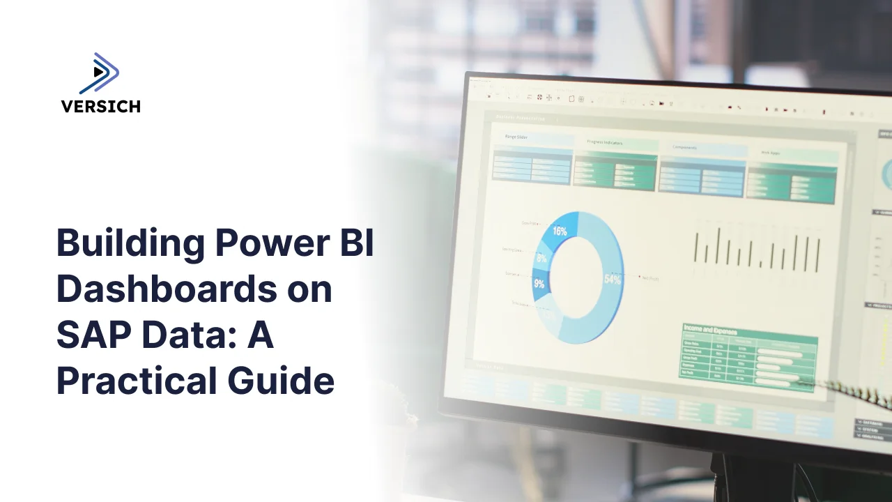
What a Strategy Dashboard Built on SAP Data Usually Needs to Show
Versich has built Power BI reporting on SAP data for strategy teams before, and a consistent pattern shows up regardless of the specific company: the same handful of analytical needs keep recurring, just applied to different KPIs depending on the business. Rather than walking through one specific dashboard layout, it's more useful to look at the categories of analysis a strategy-focused SAP dashboard typically needs to cover.
Performance Over Time
Every strategy dashboard needs a baseline view of how core metrics, turnover, backlog, growth, are trending against both the current year and the prior year. This is usually the first page anyone opens: a fast, consolidated read on where the business stands right now, with year-over-year comparison built in rather than requiring a separate report.
Who's Driving It (and Who Isn't)
Aggregate numbers hide as much as they reveal, so a second layer typically breaks performance down by what's actually driving it: top and bottom performing product groups by growth, supplier performance over the current and prior year, and turnover broken out by material or product across several years. This is where a strategy team finds out which parts of the business are pulling results up and which are dragging them down.
Where It's Happening
Geography usually gets its own view, turnover or other core metrics mapped by country, plus the same figures broken out by sales group, with growth tracked the same way. Filters for year, month, sales group, and product family let users narrow that picture down to whatever slice actually matters for the question being asked.
Everything in One Place
Larger organizations tend to need one more layer: a consolidated comparison of total performance against specific product hierarchies or regions, letting a viewer see how an individual region or product line stacks up against the whole company. Table views covering prior year, year-to-date, and the delta between them, alongside backlog and order-on-hand figures, tend to round this out, exportable to Excel for anyone who needs to work the numbers further outside Power BI.
What Separates a Dashboard People Use From One They Ignore
Plenty of SAP dashboards get built and then quietly stop being opened. The difference usually comes down to a handful of decisions made early, not anything to do with how much data is behind the report.
- A clear purpose, set before the design work starts. A dashboard built to answer a specific business question stays useful; one built to show off everything available usually doesn't.
- A small set of KPIs that actually matter. More metrics on screen rarely means more insight, it usually just means more scrolling.
- A layout that doesn't make people hunt. The most important numbers should be the easiest ones to find, not buried under three clicks.
- Visuals chosen for clarity, not decoration. Charts, color coding, and maps earn their place when they make a number easier to understand, not just easier to look at.
- A live connection, not a static export. A dashboard that's a week out of date trains people to stop trusting it, and eventually to stop opening it.
- Views built around who's actually looking. What a regional manager needs to see rarely matches what an executive needs, and one dashboard trying to serve both usually serves neither well.
- Real feedback, taken seriously. The people using a dashboard daily will find its rough edges faster than any amount of internal review.
Closing Thoughts
Power BI and SAP solve different problems well, SAP runs the operational core, Power BI makes sense of it visually, and connecting them properly turns raw transactional depth into something a strategy team can actually act on week to week. Getting the connection right is a one-time technical decision. Getting the dashboard right is an ongoing design discipline, and it's usually the second part that determines whether the investment in the first part actually pays off.