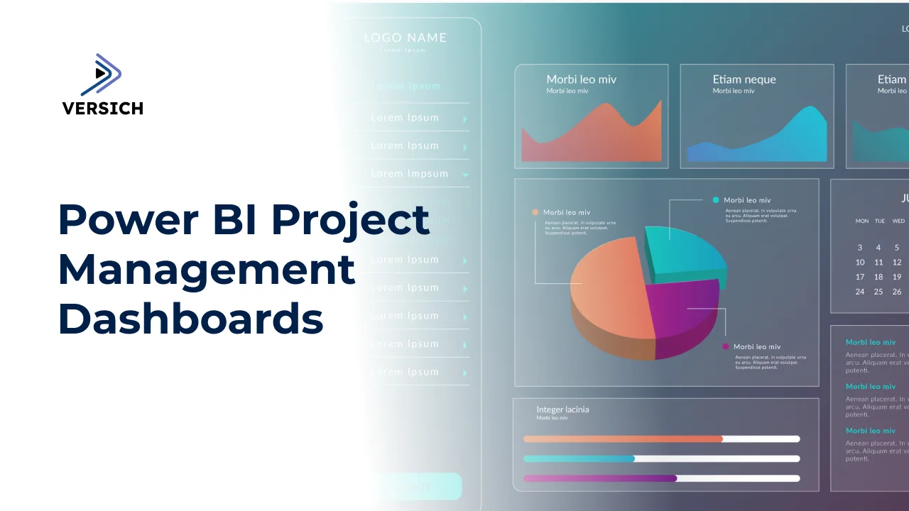
Power BI project management dashboards are crucial for offering clear insights into project advancement, performance, and possible risks. These tools furnish project managers with real-time information to oversee progress and make informed choices.
By visualizing project milestones, resource distribution, and risks, these dashboards enable project managers to keep track of every detail, ensuring that initiatives are completed on schedule and within their financial limits.
In this article, we will delve into 6 vital Power BI project management dashboard examples and discuss how they foster efficiency and clarity in project execution.
What is Power BI
Power BI is a business intelligence tool from Microsoft that allows users to create interactive visuals and glean valuable insights into their business operations. Its intuitive interface enables users to create tailored reports and dashboards without needing extensive technical skills. Power BI's integration capabilities allow users to connect to various data sources, providing a unified interactive dashboard for data analysis.
The platform offers several licensing options: a free version, Power BI Pro, and Power BI Premium. The capabilities and interface of Power BI make it an indispensable tool for organizations to monitor operations and identify data trends.
Benefits of Power BI For Project Managers
Implementing Power BI equips project managers with real-time data on budgets and timelines, enhancing resource allocation and minimizing unexpected budget overruns.
Templates for Power BI project management enhance accountability as they showcase team members’ progress and outcomes. This awareness boosts organizational confidence in the project's direction.
Moreover, monitoring risk indicators through Power BI dashboards assists in recognizing potential issues early, so teams can adjust their strategies and resources, ensuring better control over timelines.
Use Cases For Power BI Project Management Dashboards
Power BI is often used for project management reporting when organizations wish to pull data directly from ClickUp, Jira, and other platforms to create a cohesive view of project performance. Automated reporting and personalized dashboards enable teams to collaborate more efficiently and make quicker, data-driven decisions.
Let’s examine each use case in more detail.
Centralized Project Reporting
Power BI can link to multiple data sources, including Excel, SharePoint, Jira, and ClickUp, removing the necessity for manual data retrieval. This guarantees that all team members have access to consistent, updated information regarding project performance.
Reporting Automation
Power BI reports refresh automatically, allowing managers to continuously keep an eye on key metrics and take proactive actions based on real-time data signals.
Improved Collaboration
Dashboards can be securely shared across teams, fostering clear communication and alignment within the organization. Integrations with tools like Microsoft Teams and SharePoint further enhance collaboration and support timely decision-making.
Customizable Data Visualization
Custom visuals in Power BI permit organizations to develop visuals tailored to specific business requirements. Reports can also be created for diverse audiences; for instance, an overview for executives and a detailed view for project managers.
6 Key Power BI Project Management Dashboard Examples
Task Status Dashboard
The task status dashboard categorizes tasks by their status, project, and team member. Project managers utilize it to track pending tasks, time spent, and assess performance by individual contributors.
This Power BI project management dashboard displays tasks created each month, assigned personnel, and the time invested in each task and project.
It illustrates the count of completed versus pending tasks monthly. The trend line reflects the completion rate, assisting project managers in evaluating monthly progress.
This portion of the task status dashboard is aimed at analyzing the collective progress of the team, allowing comparisons of various team members’ performance to identify those who may complete fewer tasks or improperly log their activities.
The dashboard also incorporates a segment to analyze task statuses for individual employees. Project managers can use the filter at the top to select a specific team member.
This dashboard then evaluates the number of tasks across various statuses, filtering for those where the member is facing obstacles. Project managers can check the list of individual tasks in the table below and click to access the task in ClickUp.
Lastly, the upper bar chart displays the number of tasks per status across all projects, helping project managers quickly identify which projects are ongoing and which require their focus.
Resource Allocation Dashboard
The resource allocation Power BI project management template reviews how team members' hours are utilized. Hours are analyzed by resource, task type, project, and several other specifics.
Resource allocation Power BI dashboards are typically highly customized for each organization, but share some common elements:
Hours tracked by month
Actual hours against estimated hours
Average variance between actual and estimated hours
An example of a resource utilization Power BI dashboard is shown below, developed by our Power BI consultants for a corporate events organizing company in London.
The first segment analyzes the actual hours versus the quoted hours monthly, showing how many projects were completed 20% below the estimate, 10% below, etc.
This analysis assists project managers in gauging how accurately the team can estimate time for an average project, as well as their ability to deliver within the estimated period.
The bar chart below evaluates actual and estimated hours by employees, helping identify those struggling to meet projections.
Lastly, hours are detailed by project and task type, aiding in swiftly pinpointing challenging projects and task categories.
The next tab of the resource allocation Power BI project management template illustrates the percentage of time allocated to billable versus non-billable tasks. Billable tasks are related to service delivery, while non-billable tasks pertain to administrative duties and sales.
This segment aims to assess team members' utilization for billable and non-billable tasks, ultimately helping optimize overall team profitability by monitoring the percentage of billable hours to ensure it remains within targeted goals.
This section of the resource allocation dashboard examines the resource and departmental utilization percentages for billable versus non-billable tasks. It also tracks team utilization for billable tasks by month to ensure a consistent level of activity.
Overall, this Power BI Project Management Dashboard acts as a holistic reporting tool for executives, delivering a clear overview of how resources are utilized across projects. It grants project managers clear visibility into project efficiency and performance.
Milestone Progress Dashboard
The Milestone Progress Power BI Project Management Dashboard illustrates the movement of projects through vital phases and deliverables. It monitors the status of each milestone, enabling project managers and executives to track progress in real-time.
The dashboard visualizes milestones on a Gantt chart, providing a straightforward view of deadlines approaching.
The following tab offers project managers a summary of task progression for every milestone, along with completion percentages across ongoing projects.
It presents a table with current tasks, a graph showing task completion percentages, overall completion rates, task assignments, and cards with remaining days to complete tasks, overdue tasks, newly added tasks, and tasks completed within the specified timeframe.
This Power BI project management dashboard aids in early identification of potential delays, helping keep projects on course. It highlights deliverables requiring attention to ensure timely completion and greater accountability throughout teams.
Risk and Issues Dashboard
This Power BI project management dashboard centers on evaluating the risk levels of individual tasks and their effect on delivery schedules. It offers project managers a clear summary of high-risk tasks, associated resources, and risk ratings.
This Power BI project management template allows project managers to monitor risk elements and implement corrective actions before concerns escalate.
Project Budget Tracking Dashboard
This Power BI project management dashboard aids project managers in monitoring financial metrics to maintain project budgets. It assesses actual project costs, compares them to the approved budget, and clearly displays the Remaining Budget.
The dashboard's primary function is to track project expenses in real-time, ensuring projects are completed within financial constraints. Many organizations combine reporting tools like Power BI with dedicated project management systems for effective financial tracking during project management, assisting with budgeting, forecasting, invoicing, and profitability analysis.
The project budget tracking dashboard illustrates actual and projected costs monthly, helping organizations anticipate expenditures. Costs are subsequently categorized by department, resource, and initiative to clarify spending details.
Overall, this project management dashboard empowers businesses to efficiently track expenses, compare actual costs against budgets, and assess financial performance.
Gantt Chart Dashboard
Our Gantt Chart Power BI Project Management template provides vital insights regarding tasks' KPIs. This dashboard delivers a comprehensive view of task progress, deadlines, assignments, and overall project performance.
It offers leadership teams a thorough understanding of ongoing activities and timelines. The Gantt chart aids in tracking each task’s progress, delivering a clear graphical representation of project milestones and timelines.
The first segment of this Power BI project management dashboard showcases the Gantt chart itself while summarizing it with the accompanying graphs.
The Gantt chart illustrates overdue deliverables in red and completed ones in green, simplifying the assessment of progress by milestone.
The upper charts reveal the total number of tasks by status, broken down by project and assignee, to highlight which initiatives are most affected.
The subsequent tab of the Gantt Chart Power BI project management dashboard offers an in-depth breakdown of individual tasks and their timelines.
It displays the same Gantt chart alongside a summary of tasks by category, emphasizing immediate focus areas.
Businesses can export this data for further analysis. Additionally, this section provides KPIs for task categories and highlights tasks coming due in the upcoming week, aiding in prioritization.
The Gantt Chart Power BI dashboard enables project managers to monitor task progress effectively, identify potential delays proactively, and optimize scheduling and resource allocation.
Ready To Build Your Power BI Project Management Dashboards?
Effective reporting is essential for successful project management, offering critical insights into progress, resource use, and financial results. Power BI elevates this with its dynamic visuals and real-time analysis.
We specialize in developing comprehensive reports and streamlining and automating data processes to ensure smooth and accurate information flow. Our expertise enables businesses to gain actionable insights and enhance their project management practices.